An effective Amazon Storefront isn't just a digital catalog; it's a curated brand experience. It's your flagship store inside the world's biggest marketplace, designed to guide shoppers, tell your story, and ultimately drive sales. This strategic foundation is what separates a forgettable product page from a memorable brand destination.
Building Your Brand's Foundation on Amazon
Before you touch a single design module in the Store Builder, the real work begins. A high-performing Storefront isn't built on slick graphics alone—it’s built on a clear, purposeful strategy.
Jumping straight into design without this groundwork is like building a house without a blueprint. It might look okay at first, but it will lack structure and fail to achieve its main purpose. The goal is to create an intentional experience, not just a random collection of product listings.
Every decision you make, from the hero image to the page layout, should be a direct extension of your brand’s story and business goals. Skip this foundational thinking, and your Storefront risks becoming a confusing, disjointed page that sends shoppers clicking away to a competitor who put in the effort to create a clear and engaging journey.
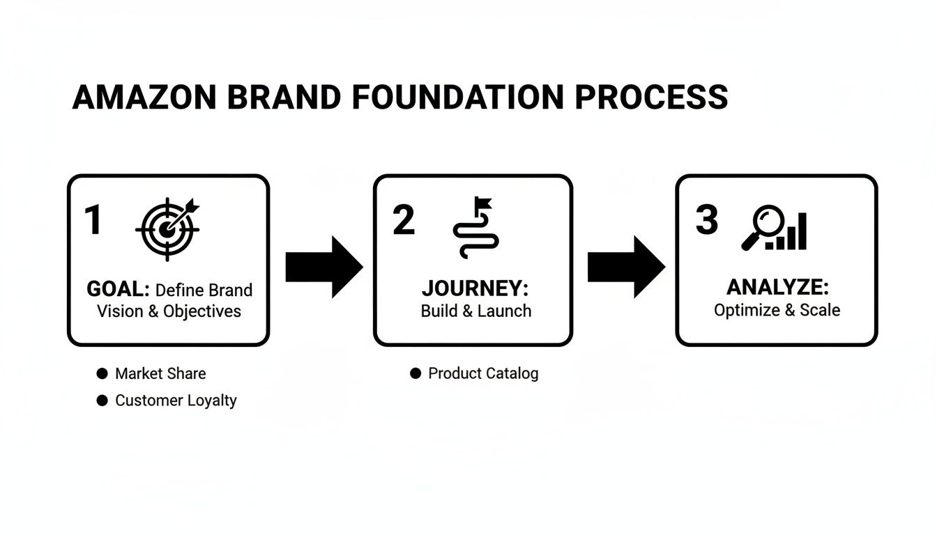
Define Your Primary Goal
First things first: what is your Storefront's single most important job? Are you trying to launch a new product line and need to generate some serious buzz? Or is your focus on building a community and driving repeat purchases from loyal fans? Maybe the goal is simply to be the ultimate showcase for your entire catalog, all in one organized place.
Nailing down this primary objective from the start acts as your compass for every design decision that follows.
- Launch-focused: Your design will put the new line front and center on the homepage with bold visuals and unmissable calls-to-action.
- Loyalty-focused: The layout might lean into brand story modules, user-generated content, and "bestseller" categories to reinforce what your existing customers already love.
- Catalog-focused: A design with crystal-clear navigation, multiple category pages, and intuitive sub-menus becomes the top priority.
This simple flowchart breaks down the three core pillars of this foundational process: defining your goal, mapping the customer journey, and analyzing the competition.
This process ensures your design efforts are always tied to a specific business outcome, moving you from reactive design to proactive brand building.
Map the Ideal Customer Journey
With a clear goal locked in, it's time to walk in your customer's shoes. Imagine a shopper landing on your Storefront homepage for the very first time. Where do you want their eyes to go? What should they do next? The path from the homepage to a purchase should feel completely effortless and logical.
To get this right, you first need to understand your target audience and define your Ideal Customer Profile. This clarity helps you anticipate what they need and design a journey that clicks.
A common mistake I see is creating "dead ends"—pages that don't link to other relevant products or categories. Every single page should offer a clear next step, encouraging shoppers to explore deeper rather than hitting the back button.
Mapping this journey helps you spot potential friction points. For instance, if a customer clicks on a cool lifestyle image, can they easily find and buy the products in it? Using shoppable image modules solves this, creating a seamless path from inspiration to conversion. For more on this, our guide on how to increase sales on Amazon has practical strategies that go hand-in-hand with a strong Storefront design. https://npoint.digital/how-to-increase-sales-on-amazon/
Analyze Competitor Strengths and Weaknesses
Finally, do a quick audit of your top competitors' Storefronts. But you're not looking for ideas to copy; you're looking for opportunities to stand out.
- What are they doing well? Take note of their navigation structure, use of video, and brand messaging.
- Where are the gaps? Maybe their mobile experience is clunky, or they completely fail to tell a compelling brand story.
These gaps are your openings. If a competitor's store is purely transactional, you can win by creating a rich, narrative-driven experience. If their photography is generic, you can stand out with authentic, high-quality lifestyle imagery that connects with your audience on an emotional level. This analysis isn't about imitation; it's about smart, strategic positioning.
Designing a High-Converting Store Layout
The layout of your Amazon Storefront is your silent salesperson. It’s what guides customers through a curated experience that should feel intuitive, engaging, and completely on-brand. This is where your brand’s visual story truly comes to life, so your first job is to pick a template that genuinely reflects who you are and what you sell.
A powerful hero section is non-negotiable. Think of it as your digital handshake—it needs to make an immediate impact. Combine a high-quality, emotionally resonant hero image or video with a crystal-clear value proposition. A brand selling premium kitchenware might use a stunning lifestyle shot of a family cooking together, with text that reads: "Create Memories, One Meal at a Time." That simple combination instantly connects the product to an experience, hooking the visitor from the very first second.

This initial hook is what sets the tone and encourages people to stick around. As you build out your Storefront, it's also smart to stay current on the latest Amazon image listing requirements to make sure every visual you upload is compliant and fully optimized.
Choosing The Right Amazon Storefront Template
Before you dive into the details, you need a solid foundation. Amazon offers several templates, each designed to serve different brand goals and catalog sizes. Picking the right one from the start will save you a ton of headaches later on.
| Template Type | Best For | Key Features |
|---|---|---|
| Marquee | Brands with a strong visual story and a diverse product range. | Large hero image/video, prominent brand logo, flexible content tiles. |
| Highlight | Brands wanting to feature a flagship product or a specific collection. | Focuses attention on a few key items with large, immersive modules. |
| Product Grid | Brands with a large catalog that want a straightforward shopping experience. | Simple, clean grid layout that makes browsing multiple products easy. |
Ultimately, the best template is the one that aligns with your story and makes it easy for customers to find what they need without getting lost.
Creating an Intuitive Visual Hierarchy
Beyond the hero section, your layout needs a clear visual hierarchy. This is the art of arranging elements to draw attention to what matters most, guiding the customer's eye down the page in a logical sequence. You're telling a story, not just listing products.
Think of your storefront like a magazine layout—it needs a mix of content to keep things interesting.
- Shoppable Image Tiles: These are perfect for showing products in a real-world context. A fashion brand could show a complete outfit and let customers click on the jacket, jeans, and shoes to buy them directly.
- Lifestyle Photos: These build an emotional connection. A pet food brand might show a happy dog playing fetch, reinforcing the benefit of their product (a healthy, energetic pet) without a hard sell.
- Video Modules: Use video to show a product in action or tell your brand’s origin story. A quick, 30-second clip demonstrating how a complex gadget works is far more effective than a wall of text.
Your layout's primary job is to reduce friction. Every click should feel like a natural next step. If a shopper has to stop and think about where to go, you've likely lost them.
A well-structured hierarchy prevents your page from feeling like a cluttered mess. It guides shoppers from broad brand messaging to specific product categories and, finally, to individual items. For a deeper dive into driving purchases, check out these https://npoint.digital/conversion-rate-optimization-tips/ that you can apply directly to your Storefront's structure.
Prioritizing a Flawless Mobile Experience
Let's be clear: designing for mobile isn't an afterthought; it's the only thought that matters. With a huge portion of Amazon traffic coming from smartphones, a clunky mobile experience is a guaranteed sales killer. Your amazing desktop design means nothing if it’s unreadable or impossible to navigate on a small screen.
An analysis for 2025 found that storefronts maintaining a unified user experience between desktop and mobile platforms see an 11% lower bounce rate compared to stores with disjointed designs. That consistency is critical because any friction in the mobile journey hits your bottom line directly.
Always use Amazon’s preview tool to check how your layout looks and feels on a mobile device. Pay close attention to:
- Image Legibility: Do your detailed images become pixelated or too small to be useful?
- Text Readability: Are your headlines and descriptions easy to scan without pinching and zooming?
- Tap Targets: Are buttons and links spaced far enough apart to be easily tapped with a thumb?
A seamless, mobile-first design ensures you capture sales from every customer, no matter what device they’re using.
Mastering Your Storefront Content Modules
Amazon gives you a powerful toolbox of content modules, but knowing how to use them is what separates an average storefront from a truly professional one. Your goal is to move beyond simply listing products. You want to build a dynamic, layered experience that pulls customers into your brand’s story and encourages them to explore your entire catalog.
Choosing the right module at the right time is everything.
Each module has a specific job, from showing products in a real-world setting to laying out detailed tech specs. A common mistake I see is brands overusing one type of module, like a simple product grid. This makes a store feel flat and uninspired. The best storefronts mix and match these elements to create a rich, multimedia journey for the shopper.
Choosing the Right Module for the Job
Not all modules are created equal, and their effectiveness depends entirely on your goal for that specific section of the page. You have to get inside the customer’s head. Are they looking for inspiration, or are they trying to compare specific features? Your module selection should answer that question.
For instance, a shoppable image is perfect for a lifestyle-focused brand. Let's say you sell outdoor gear. You could show a complete campsite setup—tent, sleeping bags, lanterns—and let customers tap each item to see its price and add it to their cart. This creates a seamless path from inspiration straight to purchase.
On the other hand, a simple product grid works best when customers already have a good idea of what they want and just need to browse their options quickly. It’s ideal for category pages with lots of similar items, like a page dedicated to different styles of coffee mugs.
Pro Tip: Stop treating your storefront pages like a standard product listing. Use the modules to tell a story. Guide the user from a broad lifestyle image down to a specific product collection, and then use something like a comparison chart to help them lock in that final decision.
This strategic layering is what keeps shoppers engaged and moving through your brand’s ecosystem instead of clicking away.
Optimizing Your Creative Assets
Once you’ve picked your modules, the content you put inside them has to be flawless. This means paying close attention to creative specs to avoid blurry images, slow-loading videos, and text that’s impossible to read on a phone.
- Image Quality: Always upload high-resolution images that meet Amazon's minimum size requirements. A pixelated lifestyle photo instantly kills your brand's credibility. It just looks cheap.
- Video Content: Keep videos short and sweet, ideally under 30 seconds. The most effective ones are often simple product demos or quick tutorials, not flashy brand ads. Research shows customers who watch a video are 3.6x more likely to buy, so it's an investment that pays off.
- Concise Copy: Text inside image tiles or video modules needs to be brief and powerful. Use it to highlight a key benefit or a unique selling point, not to write a novel.
The details really matter here. While a product grid is a fundamental part of any store, the quality of your product photography is what actually sells the item. For some practical advice on this, you can learn more about how to optimize Amazon product listings to make sure every single image and piece of copy is working as hard as possible.
Using Advanced Modules to Stand Out
Basic modules like images and text are essential, but Premium A+ Content modules can take your storefront to the next level. These interactive features create a much more immersive and informative shopping experience.
Key Advanced Modules to Use:
- Comparison Charts: These are invaluable for helping customers decide between similar products in your lineup. Instead of making them open a bunch of tabs, you can present key specs like dimensions, features, and materials side-by-side. It makes their life easier.
- Clickable Carousels: Use these to showcase a product's multiple uses or to highlight a full collection. A brand selling blenders could use a carousel to show it making smoothies, soups, and nut butters, with each slide linking to a relevant recipe or another product.
- Q&A Sections: Get ahead of customer questions by using a Q&A module. This helps break down purchase barriers and can even lower your return rate by ensuring customers are making confident, informed decisions.
By thoughtfully combining these basic and advanced modules, you create more than just a page of products. You build a destination that educates, inspires, and ultimately converts, turning casual browsers into loyal brand followers.
Weaving SEO into Your Storefront's DNA
A lot of sellers see their Storefront as a pretty digital brochure, but its real power is as a serious SEO asset. When you optimize it correctly, your Storefront can actually rank on Google, driving organic traffic straight to your brand's turf and completely bypassing the crowded Amazon search results.
This isn't just about looking good; it's about getting found.
The trick is knowing all the overlooked spots where keywords can make a real difference. We're talking about more than just product descriptions—this is about weaving search terms into the very fabric of your store's structure and content.

When you do this, your Storefront shifts from a passive catalog into an active tool for bringing in new customers. Your brand becomes discoverable to shoppers who are already looking for the exact solutions you offer.
Uncovering High-Intent Keywords
Before you can optimize anything, you need to know what your customers are actually searching for. Good keyword research is the foundation here. It's all about getting inside your customer’s head and speaking their language.
Start by brainstorming broad "seed" keywords for your products. If you sell yoga mats, your seed keywords might be "yoga mat," "exercise mat," or "non-slip yoga mat." Then, fire up a keyword research tool and expand these into long-tail keywords. These are the more specific, lower-competition phrases that signal someone is ready to buy.
- "Yoga mat for hot yoga" is way more specific than just "yoga mat."
- "Eco-friendly cork yoga mat for travel" targets a niche audience that knows exactly what they want.
These long-tail keywords are your secret weapon. They pull in highly qualified traffic and are usually much easier to rank for, both on Amazon and Google.
Integrating Keywords Naturally
Once you've got your list of target keywords, it's time to work them into your Storefront. The golden rule? Write for humans first, search engines second. Nobody wants to read a block of text stuffed with keywords—it feels robotic and will get you penalized.
Instead, focus on these key areas:
Your Amazon Storefront page titles and meta descriptions are one of the most powerful—and most frequently missed—SEO opportunities. Each page should have a unique, descriptive title that includes your primary keyword for that category.
For example, don't use a generic page title like "Our Mats." Go for something descriptive and keyword-rich, like "Premium Non-Slip Yoga Mats for Every Practice." It’s far more effective for both shoppers and search engine crawlers.
If you need a refresher, our overview of ecommerce SEO best practices provides a solid framework that you can apply right here.
Optimizing Beyond the Text
Storefront SEO isn't just about the words you write. Search engines can't "see" images or videos, so you have to give them text-based context to understand what they're looking at. This is where media optimization comes in.
Critical Media SEO Checklist:
- Image Alt-Text: Every image you upload gives you an option for "alt-text." Use it. Write a short, descriptive sentence that includes a relevant keyword. For an image of your travel mat, the alt-text could be: "Lightweight, foldable cork travel yoga mat on a wooden floor."
- Image Filenames: Before you even upload your images, name the files descriptively. Instead of
IMG_8432.jpg, rename it toeco-friendly-cork-yoga-mat.jpg. It's a small but valuable SEO signal. - Video Titles and Captions: If you're using video modules, make sure the video's title and any text alongside it are optimized with keywords. Better yet, upload a transcript or captions, since search engines can crawl that text.
These little technical tweaks add up. They put every single element of your Storefront to work, helping you attract more organic traffic and making your brand that much easier to discover.
How to Measure and Continuously Improve Your Store
Launching your Amazon Store is a huge milestone, but it's really just the starting line. Turning that beautiful design into a relentless sales machine requires an ongoing commitment to measurement and refinement. A storefront should never be a "set it and forget it" asset; it’s a living brand hub that needs regular attention to perform at its peak.
Your primary tool for this is Amazon Storefront Insights, the built-in analytics dashboard. This is where you move beyond simple vanity metrics like page views and start digging into the data that actually drives business decisions. Insights tell you not just who is visiting, but how they got there and what they did once they arrived.
Digging into Your Traffic Sources
The first place I always look is traffic sources. The Insights dashboard breaks down exactly where your visitors are coming from, which is critical for understanding your marketing ROI. It clearly separates traffic from different campaigns, giving you a direct line of sight into what’s actually working.
For example, you’ll see traffic coming from places like:
- Sponsored Brands: Clicks from your headline search ads.
- Sponsored Display: Traffic from display ads shown across Amazon.
- Organic Amazon Traffic: Shoppers who found your store through on-Amazon search.
- External Sources: Clicks from your social media ads, email newsletters, or influencer collaborations.
This data is incredibly powerful. You might discover that while your Facebook ads are driving a lot of clicks, your Sponsored Brands campaigns are generating 50% more sales per visitor. That's a clear signal to reallocate your ad spend to the channels that deliver real results, not just traffic.
To get the most out of this information, our complete guide to analyzing Amazon sales data can help you connect the dots between your traffic and actual revenue.
Identifying Your Star Performers
Beyond where traffic comes from, you need to understand shopper behavior within your store. Storefront Insights shows you which pages and products are getting the most views. This is your audience telling you exactly what resonates with them.
Maybe your "New Arrivals" page gets twice the traffic of any other category page. That’s a clear signal to keep that page fresh and feature it prominently on your homepage. Or perhaps a single product in a crowded category is getting all the attention. This could be a hero product you should build a dedicated marketing campaign around.
Analyzing these patterns reveals your store's "hot spots." These are the pages and products that act as magnets for customer engagement. Your job is to understand why they're so effective and replicate that success across the rest of your store.
By focusing on these high-performers, you can make data-driven decisions about your merchandising and promotions, ensuring you're always showcasing what your customers want to see most.
A Framework for Simple A/B Testing
Continuous improvement is all about testing. While Amazon's platform doesn't have a built-in A/B testing tool for storefronts, you can easily run your own simple tests to find what works. The key is to change only one element at a time so you can clearly attribute any changes in performance.
Start with your most impactful elements, like the main hero image.
- Test a Lifestyle Image: For two weeks, run a hero image that's focused on lifestyle. Track your store's overall sales and views per visitor.
- Swap for a Product-Focused Image: For the next two weeks, switch to a hero image that highlights a specific bestselling product.
- Compare the Data: Did one version lead to a higher add-to-cart rate or more sales on a specific product? The numbers will point you to the more effective creative approach.
You can apply this same logic to headlines, module layouts, and featured product collections. Small, iterative tests over time lead to significant gains.
The Power of Regular Refreshes
Finally, a static storefront signals a stagnant brand. Keeping your content fresh is crucial for both customer engagement and Amazon's algorithm. Regularly updating your store shows that your brand is active and relevant.
In fact, consistent updates can have a direct impact on your bottom line. When storefronts are updated within a 90-day window, sellers often see a 35% increase in attributed sales per visitor. Additionally, stores with optimized designs can experience a 25% boost in sales in their first quarter alone. For more on this, you can explore the findings on effective Amazon storefront strategies.
This doesn't mean you need a complete overhaul every month. Simple updates like swapping out your hero banner for a new seasonal promotion, adding a page for a new product launch, or refreshing your "Bestsellers" list are enough to keep things dynamic. These regular refreshes keep customers coming back and can even improve your visibility across the platform.
Common Questions About Amazon Storefronts
Diving into Amazon Storefronts for the first time usually brings up a few questions. From who can build one to how much it costs, getting the basics sorted out first helps you focus on what really matters: your amazon storefront design.
Let's clear up the most common questions sellers ask so you can move past the logistics and get to the creative part.
Do I Need to Be Brand Registered to Create a Storefront
Yes, this is non-negotiable. Your brand must be enrolled in the Amazon Brand Registry program before you can even see the Storefront builder in Seller Central. This means having an active, registered trademark.
Amazon puts this rule in place to make sure only true brand owners are creating these experiences. Once you’re in the program, the Storefront feature unlocks automatically in your account.
How Much Does It Cost to Build a Storefront
This is one of the best parts—the tool itself is 100% free for every Brand Registered seller. Amazon handles the hosting, templates, and analytics dashboard at no charge.
Your only investment will be in content creation. This might mean professional photoshoots, video production, or hiring a copywriter to nail your brand's voice. But the actual platform for building your multi-page brand hub on Amazon won't cost you a dime.
Think of it this way: Amazon provides the retail space for free. Your investment is in the high-quality fixtures, displays, and storytelling you fill it with. This is where a strong amazon storefront design truly pays off.
Can I Drive External Traffic to My Amazon Storefront
Absolutely, and you really should be. Once you publish your store, Amazon gives you a clean, shareable URL that’s perfect for off-Amazon marketing. It's a powerful tool for sending targeted traffic exactly where you want it to go.
Here’s how you can use that link:
- Social Media Ads: Run campaigns on Instagram or TikTok that send shoppers directly to a curated product page in your Store.
- Email Marketing: Announce a new collection to your subscribers and link them to a shopping environment free of competitor ads.
- Influencer Collaborations: Arm your influencers with your store link so their followers land in a space that’s all about your brand.
- QR Codes: Put them on your packaging or marketing inserts to connect your physical products to your digital brand story.
Sending traffic here is a smart move because it puts customers in a branded bubble, far away from the distracting competitor ads you see on a typical search results page.
How Long Does Amazon Take to Approve a New Storefront
The review process usually takes somewhere between 24 and 72 hours. Every single submission—whether it’s a brand-new store or a simple update—is moderated by Amazon’s team to check for compliance.
To avoid getting stuck in review purgatory, do a quick self-audit before you hit submit. Check for common mistakes like typos, broken links, grainy images, or any unproven claims (like "number one best-seller"). You’ll get an email as soon as your store gets the green light and is officially live.
Building a high-converting Amazon Storefront requires a blend of strategy, design, and continuous optimization. At Next Point Digital, we specialize in transforming your brand's presence into a powerful sales engine. Book a discovery call today and let’s build a storefront that converts clicks into loyal customers.