If you want to boost your ecommerce conversion rate, stop obsessing over driving more traffic. Seriously. The real win is in optimizing the journey for the visitors you already have.
This means rolling up your sleeves and systematically finding—and fixing—every little friction point in your sales funnel. We're talking about the entire path, from the moment someone discovers a product to the second they see that "thank you for your order" page. Even tiny, data-backed tweaks to the user experience can lead to massive revenue growth without spending another dime on ads.
Why Your Ecommerce Conversion Rate Is So Important
In a market this crowded, focusing on conversion rate optimization (CRO) is one of the smartest, most sustainable ways to grow. Instead of just throwing more money at ads to get new eyeballs on your site, you’re making every single visitor count. This approach goes straight to your bottom line and makes every dollar you spend on advertising work harder.
Think about it: every visitor represents not just a potential sale, but a cost. Customer acquisition costs are climbing, making it more expensive than ever to get people through your virtual door. If your site isn't built to turn those hard-won visitors into customers, you're just letting your marketing budget walk away.
The Real Impact of Small Improvements
It’s easy to shrug off a 1% increase, but the compound effect on your revenue is no joke.
Let’s say your store brings in $500,000 in annual revenue with a 2% conversion rate. A modest bump to 3% doesn't just mean a few more sales. It translates to an extra $250,000 in revenue. That’s the power of optimization—making your existing traffic pull its weight.
You can learn more about turning traffic into profit by reading our comprehensive guide on boosting your online sales for e-commerce.
The goal isn't just to sell something. It's to create an experience so smooth and trustworthy that clicking "buy" feels like the most natural next step for your visitor. Every single element, from your navigation menu to your checkout button, plays a part.
Understanding Industry Benchmarks
You can't improve what you don't measure. The first step is knowing where you stand.
As of 2025, the global average eCommerce conversion rate hovers between 2.5% and 3.0%. While some platforms might report lower numbers, established sites often perform much better, which really drives home how much a polished user experience and solid trust signals matter.
This focus on the customer experience comes down to a few key areas:
- Building Trust: This means putting security badges, customer reviews, and clear return policies front and center. No hiding the important stuff.
- Simplifying the Journey: Your site navigation should be dead simple. The checkout process needs to be so easy a toddler could do it (almost).
- Providing Support: When a customer has a question or hits a snag, you need to be there to help—instantly.
If you want to understand why real-time support is a non-negotiable for modern stores, digging into the benefits of live chat for ecommerce will show you how direct engagement builds the confidence needed to drive sales.
Finding and Fixing Your Conversion Roadblocks
Before you can boost your ecommerce conversion rate, you need to think like a detective. Your standard analytics reports are great for seeing what is happening on your site, but they rarely tell you the why. To really understand the friction points that stop visitors from buying, you have to see your store through their eyes.
This means digging deeper than surface-level metrics like bounce rate. Your goal is to pinpoint the exact moments of frustration—the confusing navigation link, the slow-loading product image, or the broken promo code field that makes a potential customer give up and leave. This isn't about guesswork; it's about gathering qualitative data that reveals the human experience behind the numbers.
Uncovering User Behavior with Visual Tools
The best way to start is by using tools that let you see exactly how users behave on your site. Heatmaps and session recordings are your two best friends in this investigation.
-
Heatmaps: These tools create visual overlays on your pages, showing where users click, move their mouse, and how far they scroll. A heatmap might reveal that everyone is clicking on a non-clickable element—a clear design flaw—or that nobody is scrolling far enough to even see your main call-to-action.
-
Session Recordings: Think of these as a DVR for your website. Session recordings are anonymized videos of real user visits, letting you watch their entire journey from start to finish. You can see where they hesitate, where they rage-click in frustration, and the exact page they are on when they decide to abandon their cart.
Watching just a handful of session recordings can give you more actionable insights than a week of staring at spreadsheets. You might discover a bug that only appears on a specific browser, see users struggling with your filtering options, or realize your shipping information is nearly impossible to find.
The infographic below shows how conversion rate optimization is the critical link between driving traffic and actually making more money.
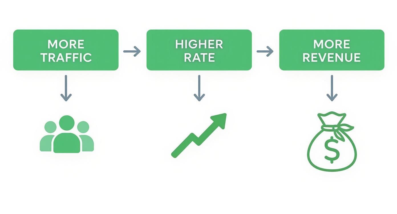
It’s a powerful reminder that just getting more visitors isn’t the answer. Optimizing their journey is what unlocks real profitability.
Analyzing Key Drop-Off Points
Once you have your visual tools running, it’s time to zero in on your site's leakiest pages. Head over to your analytics platform and look for pages with unusually high exit rates. These are the spots where a ton of visitors decide they’ve seen enough and bounce.
Pay close attention to the pages inside your sales funnel:
- Product Pages: Are people leaving without adding items to their cart? Maybe the product descriptions are confusing, the images are low-quality, or the price isn't what they expected.
- Cart Page: A high exit rate here often points to sticker shock from unexpected shipping costs or a layout that’s hard to navigate.
- Checkout Pages: This is the final boss. If users are dropping off here, it’s usually because of forced account creation, a ridiculously long form, or a lack of trusted payment options.
When you find a page with a high exit rate, your job is to form a hypothesis. For example: "I believe users are abandoning the cart page because the shipping costs are shown too late in the process."
These educated guesses, formed by blending quantitative data (exit rates) and qualitative insights (session recordings), become the foundation of your A/B testing strategy. Instead of randomly changing button colors, you're now running targeted experiments designed to solve real, observed user problems.
For even deeper insights, you can go straight to the source with a customer feedback questionnaire for your online store.
By combining these methods, you create a data-driven roadmap. You'll end up with a prioritized list of conversion roadblocks to fix, each backed by solid evidence. This systematic approach is how you make meaningful changes that actually improve your ecommerce conversion rate.
Turning Product Pages into Persuasive Sales Tools

Your product page is where casual browsing ends and a real purchase decision begins. It’s your final pitch before a shopper clicks "add to cart," so it needs to do more than just list features—it has to build trust and create desire.
A great product page answers a customer's questions before they even think to ask them. It tackles any potential doubts about quality, fit, function, and value, leaving no reason for hesitation.
Writing Descriptions That Sell
Forget the dry, technical specs for a moment. While those details have their place, your main product description needs to be about benefits, not just features. You should be framing your copy around the problem your product solves or the feeling it delivers.
For example, instead of just saying, "Made with 100% ripstop nylon," try something like, "Built with ultra-durable ripstop nylon, this backpack is ready for any adventure you throw at it, keeping your gear safe from tears and rough terrain." See the difference? One is a fact; the other paints a picture and connects the feature (nylon) to a clear benefit (durability and peace of mind).
Here’s a simple structure that works wonders:
- Start with a benefit-driven summary. Kick things off with a sentence or two that gets right to the core value.
- Use scannable bullet points. Pull out the top 3-5 key features and translate them into benefits. This is perfect for skimmers.
- Tuck away the details. For shoppers who want the nitty-gritty, use an expandable section for specs, dimensions, and care instructions.
This layered approach works for all types of shoppers, giving them the info they need without overwhelming them. If you're ready to take it a step further, check out our guide on product optimization for maximum impact for more advanced techniques.
The Power of High-Quality Visuals
In ecommerce, your photos and videos have to do all the heavy lifting. Customers can't touch, feel, or try on your products, so your visuals need to bridge that sensory gap. Low-quality, blurry, or just plain boring images are a guaranteed conversion killer.
You absolutely need professional photography that shows your product from every angle. I’m talking close-ups of the stitching, shots that show texture, and in-context photos of the product being used. If you sell apparel, showing your items on different body types can build incredible confidence and slash your return rate.
Your product visuals aren't just window dressing; they're a critical trust signal. High-resolution images and professional video tell customers you're a serious, quality-focused brand that cares about their experience.
To really make your visuals work for you, consider investing in specialized professional ecommerce photo editing services that know what it takes to sell online. And don't sleep on more advanced formats like 360-degree views or short product videos—they let customers interact with your product in a way that static images just can't match.
Building Unshakable Trust with Social Proof
Let's be honest, social proof isn't a "nice-to-have" anymore. It's an absolute must. With 2.77 billion people expected to be shopping online by 2025, trust is everything. In fact, a staggering 99% of customers read reviews before making a purchase. That stat alone shows you just how crucial social proof is for your conversion rate.
Here are the trust signals your product page can't go without:
- Real, Unfiltered Customer Reviews: Don't be afraid to show both the good and the bad. A page with nothing but five-star ratings can feel fake. Responding professionally to negative feedback is a great way to show you listen to your customers.
- User-Generated Content (UGC): Encourage your customers to share photos of themselves using your products. Featuring these on your product pages is pure gold—it’s authentic, real-world proof that people love what you sell.
- Clear Trust Badges: Display secure payment logos like Visa, PayPal, and Apple Pay right where people can see them. Badges for money-back guarantees or free returns also work wonders to reduce friction at that critical moment of decision.
When you combine persuasive copy, stunning visuals, and undeniable social proof, you create product pages that don't just display items—they sell them.
Designing a Frictionless Checkout to Stop Cart Abandonment

You’ve done the hard work of getting a customer from a product page all the way to the checkout. This is the moment of truth—the final hurdle where a curious browser becomes a paying customer. But this is also where most ecommerce stores bleed money. A clunky, confusing, or surprising checkout process is the number one reason people abandon their carts.
The goal is to make the entire experience so smooth and intuitive that finishing the purchase feels like an afterthought. Every field they have to fill out, every click they have to make, and every second they have to wait is another chance for them to second-guess the purchase and walk away.
Eliminate Surprises and Build Trust
One of the fastest ways to kill a sale is with unexpected costs. Your customer has a price in their head when they hit the checkout button, and watching that total jump from taxes and high shipping fees is a leading cause of abandonment. Transparency is non-negotiable.
Show all costs, including taxes and shipping estimates, as early as you possibly can—ideally right on the cart page. This manages expectations and prevents the sticker shock that sends shoppers scrambling for the “X” button.
Alongside pricing, trust signals are your best friend. Prominently display security badges, accepted payment logos (Visa, PayPal, Apple Pay), and clear reminders of your return policy. These small visual cues are huge for reassuring anxious buyers that their information is safe and their purchase is risk-free. If you need help integrating these elements securely, exploring professional web services can ensure your checkout is both trustworthy and technically sound.
Simplify and Streamline Every Step
Think of your checkout form as an obstacle course. Your job is to remove as many hurdles as possible. A long, complicated form is a massive conversion killer, especially on mobile where tapping out details is a pain.
Here’s how to create a streamlined flow:
- Offer Guest Checkout: Forcing users to create an account is a surefire way to lose a sale. Always offer a guest checkout option. You can always ask them to create an account after the purchase is complete.
- Minimize Form Fields: Do you really need their phone number? Or a second address line? Cut every field that isn't absolutely essential. Use tools like address autofill to cut down on manual entry even further.
- Use a Progress Bar: A simple visual indicator showing shoppers where they are in the process (e.g., Shipping > Payment > Confirm) reduces anxiety and makes the whole thing feel shorter and more manageable.
The ultimate checkout is one the customer barely remembers. It should be so logical and fast that there's no time for doubt to creep in. Remove a field, combine two steps, autofill a city—every simplification is a win.
A confusing or lengthy checkout is a major source of frustration for shoppers. The table below breaks down some of the most common friction points I see and gives you clear, actionable ways to fix them.
Common Checkout Friction Points and Their Solutions
| Friction Point | Impact on Conversion | Actionable Solution |
|---|---|---|
| Forced Account Creation | High abandonment rate | Offer a prominent "Guest Checkout" option. Allow account creation after the sale. |
| Unexpected Costs | Sticker shock and loss of trust | Display shipping fees, taxes, and all other costs upfront in the cart, not just at the final step. |
| Long/Complex Forms | User fatigue, especially on mobile | Remove all non-essential fields. Use address auto-fill APIs (like Google's) to reduce typing. |
| Lack of Mobile Optimization | Frustrating user experience | Design with a mobile-first approach: single-column layout, large tap-friendly buttons, and minimal text input. |
| Limited Payment Options | Inconvenience for shoppers | Integrate popular one-click options like Apple Pay, Google Pay, and Shop Pay alongside traditional credit card fields. |
| No Visible Trust Signals | Security concerns | Prominently display SSL certificates, security badges (e.g., McAfee, Norton), and payment provider logos. |
| Slow Page Load Times | Impatience and cart abandonment | Optimize images, use a content delivery network (CDN), and ensure your hosting can handle traffic spikes. |
By addressing these common issues, you can dramatically reduce the number of shoppers who drop off at the last minute and turn more of them into loyal customers.
Optimize for Mobile and Modern Payments
Let’s be clear: optimizing your checkout for mobile isn't just a nice-to-have anymore; it's essential for survival. Cart abandonment is a huge problem, averaging 71.3% globally, but it’s even worse on mobile at 77.2%. While desktops have traditionally converted better, mobile devices now drive the majority of traffic—73% worldwide. The data makes it obvious: the single biggest opportunity to improve your conversion rate is by perfecting the mobile checkout. You can dig into more of these ecommerce benchmarks on SpeedCommerce.com.
A mobile-first design means big, thumb-friendly buttons, single-column layouts, and as little typing as possible.
Beyond that, integrating one-click payment options like Apple Pay, Google Pay, and Shop Pay is no longer a luxury. These services automatically fill in shipping and payment details, turning a multi-step chore into a single tap. For your returning customers, this is the gold standard of a frictionless experience.
Using Personalization and Testing for Continuous Growth
The smartest ecommerce brands I've worked with get one thing right: they know conversion optimization is never really "done." It's a continuous cycle of learning, testing, and tweaking your approach based on what real customers are doing on your site. Once you’ve cleared the obvious hurdles, the next level of growth comes from getting personal and letting data drive your experiments.
This is where you shift from broad, one-size-fits-all fixes to creating experiences that feel tailor-made. Instead of treating every visitor the same, you start using data to build a shopping journey that feels uniquely relevant to each person. That's how you turn a good conversion rate into a great one.
Harnessing the Power of Personalization
Personalization isn’t just about dropping a customer's first name into an email subject line anymore. It's about using behavioral data to put the right products in front of them at exactly the right time. When shoppers feel like you "get" them, they're far more likely to click "buy."
A perfect place to start is with intelligent product recommendations. Forget showing generic bestsellers to everyone. AI-powered tools can suggest items based on a user's browsing history, past purchases, or even what other shoppers with similar tastes have bought. It's a simple change that can make the shopping experience feel incredibly intuitive.
Consider trying out these powerful personalization tactics:
- Dynamic Homepage Content: Show returning visitors products from categories they’ve already explored. If they spent ten minutes looking at running shoes last week, greet them with your new athletic arrivals.
- Tailored Offers: Use data you collect from quizzes or surveys to deliver hyper-relevant discounts. A shopper who tells you they have sensitive skin can be shown a special offer on your gentle skincare line.
- "Frequently Bought Together" Bundles: Automatically suggest complementary items on product and cart pages. This not only boosts your Average Order Value (AOV) but also helps customers find products they might have otherwise missed.
Building a Culture of Experimentation with A/B Testing
While personalization helps you create those tailored experiences, A/B testing is how you prove your ideas work with cold, hard data. The concept is straightforward: create two versions of a webpage (an "A" version and a "B" version) and show them to different segments of your audience to see which one performs better.
This approach takes all the guesswork out of optimization. Instead of your team debating whether a green or a red "Buy Now" button is better, you can test it and let your customers' actions give you the answer. Every test—win or lose—gives you valuable insight into what makes your audience tick.
A/B testing transforms your website from a static storefront into a living laboratory. Every element—from headlines and product descriptions to page layouts and CTAs—becomes an opportunity to learn and improve your ecommerce conversion rate.
To get started, I always recommend focusing on high-impact pages like your product pages, cart, and checkout. Then, form a clear hypothesis for each test. For instance: "Changing the CTA from 'Add to Cart' to 'Buy Now' will create a stronger sense of urgency and increase conversions by 5%."
Once you've run the test with enough traffic to be statistically significant, you'll have a data-backed reason to make a change. This disciplined process is what drives consistent, long-term growth.
Tracking What Matters for Meaningful Insights
Running tests and personalizing content is only half the battle. If you can't accurately measure the results, you're just flying blind. This is where a rock-solid analytics setup becomes non-negotiable. You need to track not just your overall site conversion rate, but also micro-conversions and key performance indicators (KPIs) for every single experiment.
For brands drowning in complex data from multiple sources, using customized reporting dashboards can be a game-changer. These tools help visualize test results and connect changes in user behavior directly to revenue, making it much easier to prove the ROI of your optimization efforts. By focusing on data, you create a feedback loop where every test informs the next, leading to smarter decisions and continuous improvement.
Still Have Questions About Improving Your Conversion Rate?
Jumping into conversion rate optimization can feel like drinking from a firehose. Once you start digging into your data and user behavior, a few key questions almost always bubble to the surface. Let's tackle them head-on.
This isn’t about fluffy theories. It's about giving you straightforward, practical answers so you can start making changes that actually move the needle.
What Is a Good Ecommerce Conversion Rate?
This is the million-dollar question, and honestly, the answer isn't a simple number. While you'll hear the industry average is somewhere between 2.5% and 3%, a "good" rate for you depends entirely on your business.
What you should aim for is shaped by a few key factors:
- Industry and Niche: A store selling custom furniture will naturally have a lower conversion rate than one selling phone cases. Big-ticket items just have a longer, more considered buying cycle.
- Traffic Source: Someone clicking a link from your email newsletter is usually much closer to buying than a person who stumbled on your site from a TikTok ad. That's why you have to segment conversion rates by source.
- Device Type: It’s totally normal to see higher conversion rates on desktop. A lot of shoppers browse on their phones but switch to a bigger screen to pull out their credit card and finalize the purchase.
Instead of obsessing over a universal benchmark, you're better off benchmarking against yourself. The real win is seeing your own conversion rate climb month-over-month. That's the only metric that truly matters.
Where Should I Start My Optimization Efforts?
With so many things you could fix—product pages, navigation, checkout—it's easy to get paralyzed by choice. The smartest way to start is by finding the biggest leaks in your sales funnel.
Don't just start A/B testing button colors because you read a blog post about it. Dig into your analytics and find the high-traffic pages where people are dropping off the most. Those are your golden opportunities. For most online stores, the usual suspects are:
- High-Traffic Product Pages: Are people looking but not adding to their cart? It might be time to level up your product descriptions, photos, or social proof.
- The Cart and Checkout Flow: This is where your highest-intent visitors hang out. Any friction here—like surprise shipping fees or forcing people to create an account—is like throwing money away.
Fixing the biggest drop-off points first guarantees your efforts will have the biggest possible impact on your revenue.
Which Metrics Are Most Important to Track?
Your overall conversion rate is the headline stat, but it doesn't tell you the whole story. To really understand what’s happening on your site, you need to look at a few other key performance indicators (KPIs).
Here are the metrics that give you a much clearer picture of your store's health:
| Metric | Why It's Important |
|---|---|
| Revenue Per Visitor (RPV) | This is a more sophisticated metric than conversion rate alone. It factors in your Average Order Value (AOV), giving you a much better sense of how profitable each visitor is. |
| Cart Abandonment Rate | This is a direct pulse check on your checkout process. A high abandonment rate is a massive red flag that something in your final steps is scaring buyers away. |
| Average Session Duration | While it’s not a direct conversion metric, it’s a great indicator of engagement. If people are sticking around longer, it’s a good sign that your content and site navigation are working. |
Tracking these numbers together gives you a much richer view of user behavior. It helps you see not just if people buy, but how they behave on their way to a purchase—which is exactly what you need to know to improve your ecommerce conversion rate.
At Next Point Digital, we specialize in turning data into actionable growth strategies. If you're ready to stop guessing and start making data-driven improvements that boost your bottom line, we're here to help. Learn how our ecommerce growth services can build you a clear roadmap to higher conversions.