Before you can fix a high bounce rate, you first have to figure out why visitors are leaving after seeing just one page. The real solution isn't a quick fix; it's about digging into your data—segmenting traffic sources, devices, and landing pages—and then making targeted improvements to things like page speed, mobile experience, content clarity, and ad alignment.
Why Your High Bounce Rate Is Costing You Sales
A high bounce rate is more than just a metric buried in your analytics report. It's a hole in your revenue bucket.
It signals a massive disconnect between what a visitor expected to find and what your ecommerce store actually delivered. Every single person who bounces is a lost opportunity—a potential customer who clicked your ad or a link, showed genuine interest, and then vanished before you even had a chance to make your pitch. This isn't just lost traffic; it's wasted ad spend and a hit to your brand's credibility.
For any ecommerce store, the entire game is about guiding users from a landing page to a product, and then smoothly into the checkout. A high bounce rate breaks that chain at the very first link.
Understanding the Financial Impact
Let's put it in real terms. Imagine 10,000 visitors land on your site. If you have a 60% bounce rate, that’s 6,000 people who leave without a second click.
Now, what if you could cut that bounce rate down to 40%? All of a sudden, you have 2,000 more engaged shoppers in your sales funnel without spending a single extra dollar on acquiring them. Lowering your bounce rate is one of the highest-impact activities you can focus on to directly increase your ecommerce sales.
A high bounce rate is essentially your website’s first impression gone wrong. It tells you that users didn't find what they were looking for, the page was too slow, or the design was untrustworthy.
Setting Realistic Benchmarks
It’s critical to know where you stand. The average ecommerce bounce rate hovers around 45.68%, which is much lower than other industries like blogging or news sites. That's because ecommerce sites are built for exploration—people are expected to browse categories, view products, and add items to their cart.
The best-performing stores often see bounce rates as low as 20%. That gap between "average" and "excellent" represents millions in potential revenue. Just look at beauty brand Glamnetic—they managed to reduce their bounce rate by over 77%, proving that huge improvements are entirely possible with the right focus.
You can find more industry data by checking out ecommerce bounce rate averages on mobiloud.com. This guide will give you a framework to get your store from average to exceptional.
Diagnose Why Visitors Leave Your Store
Before you can fix your bounce rate, you have to play detective. A high overall bounce rate is just a symptom; the real story is buried deeper in your data, waiting to tell you which visitors are leaving and why. Just staring at the site-wide average is like trying to fix an engine without ever popping the hood.
To get anywhere, you need to stop looking at that one big number and start segmenting your audience. This is how you turn a vague, overwhelming problem into a list of specific, solvable issues. It’s the difference between guessing what’s wrong and knowing what to fix first.
This diagram shows the direct line from a high bounce rate to lost revenue, which is why figuring this out is so urgent.
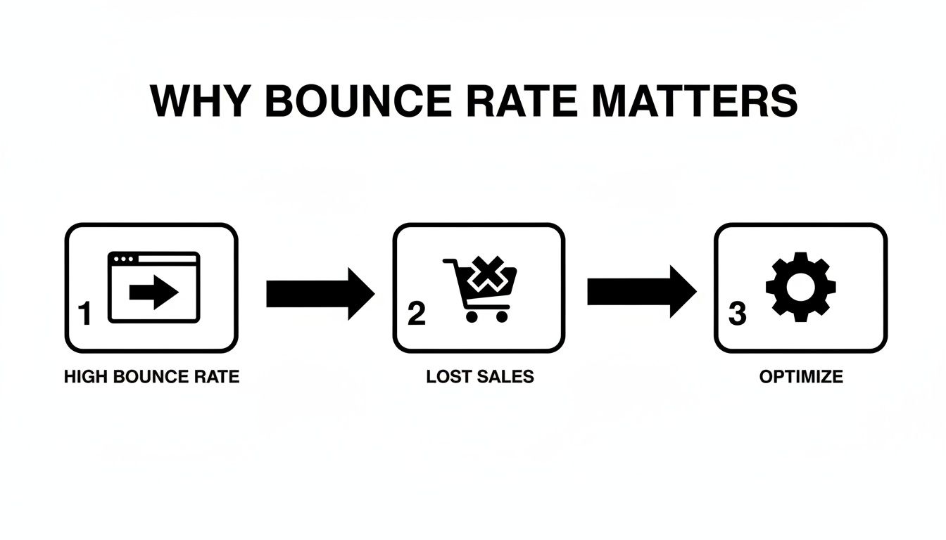
As you can see, every bounce is a direct hit to your sales potential. That makes this diagnostic phase the most important part of the entire process.
Segment Your Data for Actionable Insights
Your first move is to jump into your analytics platform, like Google Analytics 4, and start slicing up your traffic data. The goal is to find the pockets of users who are bouncing the most. When you compare different segments, the weak spots in your user journey become impossible to ignore.
Start by analyzing these critical segments:
- Traffic Source: Are visitors from your paid Facebook ads bouncing way more than your organic search traffic? This almost always points to a mismatch between your ad creative and your landing page.
- Device Type: Is your mobile bounce rate through the roof compared to desktop? That’s a classic sign of a clunky mobile experience—maybe your page loads too slowly or the navigation is a nightmare on a small screen.
- Landing Pages: Which specific pages are hemorrhaging visitors? A single problematic product page or a confusing category page can easily drag down your site’s entire performance.
By isolating these underperforming segments, you transform a big, intimidating problem ("our bounce rate is too high") into a manageable task ("we need to fix the user experience on our top three mobile landing pages"). This is the foundation of all successful optimization work.
Uncovering the "Why" Behind the Numbers
Once you’ve found a problematic segment, you can really start digging. For example, let's say you discover that visitors arriving from a specific Instagram influencer campaign have a shocking 90% bounce rate.
That number tells you there’s a massive disconnect. Did the influencer promise a discount that wasn't immediately visible on the landing page? Was the product they featured buried three clicks deep? The data points you directly to a broken promise.
Another all-too-common scenario involves device performance. If your bounce rate on tablets is 25% higher than on desktop, it’s time to grab a few different tablets and test the site yourself. You might find a critical "Add to Cart" button is unresponsive or a key product image fails to load, creating instant frustration for those users.
This is what building a data-driven marketing strategy is all about. You let the numbers guide your focus.
To make this process easier, you can use a checklist to guide your investigation.
Bounce Rate Diagnostic Checklist
This checklist helps you systematically look through your data segments to pinpoint what’s causing visitors to leave.
| Data Segment | What to Look For | Potential Cause for High Bounce Rate |
|---|---|---|
| Traffic Source | Compare bounce rates from Organic, Paid, Social, Referral, and Direct channels. | Mismatched ad copy and landing page content. Low-quality referral traffic. |
| Device Type | Check for significant differences between Desktop, Mobile, and Tablet bounce rates. | Poor mobile responsiveness, slow load times on mobile, or difficult navigation. |
| New vs. Returning | See if new visitors are bouncing much more often than returning ones. | Your site isn't making a strong first impression or the value isn't clear. |
| Landing Pages | Identify the top pages with the highest bounce rates. | Unengaging content, confusing layout, slow page speed, or technical errors on that page. |
| Browser | Look for unusually high bounce rates on specific browsers (e.g., Chrome vs. Safari). | A compatibility issue or bug is breaking the experience on a certain browser. |
| Geography | Analyze bounce rates by country or region. | Content isn't localized, currency isn't supported, or shipping info is unclear for that region. |
Going through these segments one by one gives you a structured way to turn raw data into a clear list of potential problems to tackle.
From Diagnosis to Hypothesis
The final step in this phase is to turn your findings into clear, testable hypotheses. This is what connects the problem you've found to a potential solution you can actually implement and measure.
Let's turn our earlier examples into concrete ideas:
- Problem: High bounce rate from a specific ad campaign.
- Hypothesis: Aligning the landing page headline and hero image with the ad creative will reduce the bounce rate by making the offer more consistent and recognizable.
- Problem: High bounce rate on mobile for a key product category page.
- Hypothesis: Implementing lazy loading for product images will improve mobile page speed and lower the bounce rate for this page.
This structured approach moves you from being a reactive site owner to a proactive optimizer. You're no longer throwing random fixes at the wall to see what sticks. Instead, you're running targeted experiments based on solid evidence—the fastest way to lower your bounce rate and win back lost sales.
Improve Page Speed and Mobile Experience
In e-commerce, a slow website is a closed store. Speed isn’t just a nice-to-have feature; it's a fundamental requirement for keeping potential customers from bouncing. When a page takes too long to load, visitors don’t wait around—they hit the back button, and your bounce rate climbs.
This problem gets even worse on mobile devices, which is where most of your traffic probably comes from. Shoppers on their phones are often multitasking and have zero patience for a sluggish experience. A delay of just a few seconds can be the difference between an engaged shopper and a lost sale.

Pinpoint and Fix Speed Bottlenecks
Generic advice like "make your site faster" isn't helpful. You need to know exactly what's slowing you down. This is where a tool like Google PageSpeed Insights becomes your best friend. Just pop in your product or category page URL, and it will spit out a diagnostic report with specific, actionable recommendations.
The usual suspects that these tools flag include:
- Oversized Product Images: High-resolution photos are great for showing off products, but they can absolutely murder your load times. A single uncompressed image can easily be several megabytes.
- Render-Blocking Resources: This is a technical term for CSS and JavaScript files that have to load before anything else on your page can appear. Too many of these force your visitors to stare at a blank white screen while they wait.
- Inefficient Hosting: If you’re on a cheap shared hosting plan that’s crammed with other websites, your store’s performance will suffer no matter how much you optimize.
Once you have your report, you can start making targeted fixes. If images are the problem, use a tool like TinyPNG to compress them without a noticeable drop in quality. If render-blocking code is the issue, you’ll want to work with a developer to defer non-critical scripts so they load after the main content is already visible.
Master the Mobile-First Experience
Optimizing for mobile is non-negotiable. Mobile devices now generate nearly 60% of all e-commerce traffic, yet their bounce rates average a painful 56.8% compared to 50% on desktop. Why? Because 74% of mobile users will ditch a site that doesn’t load within 5 seconds.
The data is pretty stark: the bounce rate jumps by 32% when loading time goes from just 1 to 3 seconds—a delay that’s all too common for mobile shoppers.
A truly mobile-friendly experience goes way beyond just having a responsive design that shrinks to fit a smaller screen. It requires a complete shift in thinking to prioritize what a mobile user actually needs.
A great mobile experience feels effortless. Navigation should be thumb-friendly, forms should be simple, and every tap should deliver an immediate, satisfying response. If a user has to pinch, zoom, or squint, you've already lost them.
Focus on these key areas to build a better mobile experience:
- Simplify Navigation: Use a clean, collapsible "hamburger" menu. Make sure your search bar is front and center and easy to tap. Prioritize the most important categories and tuck the rest away.
- Streamline Forms: Nothing is more frustrating than trying to fill out a long, complicated form on a tiny screen. Only ask for the absolute essentials, use autofill wherever you can, and make your buttons big and tappable.
- Implement Lazy Loading: For long category pages with dozens of products, lazy loading is a must. This technique only loads images as the user scrolls down the page, which dramatically improves the initial load time.
These mobile-focused improvements are critical for both cutting down your bounce rate and improving ecommerce conversion rates across the board.
Continuously Test and Refine
Optimizing for speed and mobile isn't a one-and-done project. New images, apps, and code get added to your site all the time, and any one of them can slow things down again. Make it a habit to run speed tests as part of your monthly maintenance routine.
Beyond just speed, continuously testing your mobile website for usability across different devices is essential. A button that works perfectly on an iPhone might be broken on an Android. By making performance a core part of your workflow, you ensure a fast, seamless experience that encourages users to stick around, browse, and ultimately, buy.
Enhance On-Page UX and Content Clarity
Once someone lands on your page, you have just a few seconds to prove they made the right click. A confusing layout, a weak headline, or crummy images will send them running for the back button, killing any chance of a sale. Getting the on-page user experience (UX) and content right is all about showing visitors they’re in the right place.
The goal is to build trust instantly and make it feel effortless for them to look around. Everything—from the headline down to the product photos—needs to work together to answer a visitor's unspoken questions and guide them confidently to the next step.

It all starts with making sure your page matches the visitor’s intent. If they clicked an ad for "waterproof hiking boots," your page had better scream that you offer exactly that, not just dump them on a generic shoe category page.
Craft Compelling and Clear Messaging
Your page's messaging is its first handshake with a potential customer. It needs to feel confident and direct. Vague headlines or product descriptions loaded with jargon are bounce rate magnets.
A great headline should be benefit-driven, not just a label. Instead of "Model X7 Drone," try something like, "Capture Stunning Aerial Shots with the Easy-to-Fly Model X7 Drone." The second version speaks directly to what the user wants to achieve, validating their click and making them want to learn more.
Product descriptions need to be scannable and answer questions before they’re even asked. Use a mix of short paragraphs and bullet points to break down the key features.
- Materials: What’s it made of? Will it last?
- Dimensions: Is it going to fit in my space?
- Key Benefits: How does this thing solve my problem or make my life better?
- Usage Instructions: Is it easy to put together or use right out of the box?
This kind of clarity removes friction and gives people the confidence they need to even consider making a purchase.
Build Unshakable Trust and Credibility
In a world full of online options, trust is your most valuable currency. A visitor who feels the slightest bit uncertain or unsafe will bounce without a second thought. You need to build that trust with both visual and written cues all over the page.
Social proof is one of the best ways to do this. Prominently featuring customer reviews, star ratings, and testimonials shows that real people have bought and loved your product. Don't be afraid of a few negative reviews, either—a perfect 5-star rating across the board can sometimes look a little suspicious.
Beyond reviews, other trust signals are critical:
- Security Badges: Displaying logos from trusted payment providers (like Visa or PayPal) and security companies (like Norton or McAfee) reassures users their data is safe.
- Clear Policies: Make your shipping and return policies dead simple to find. A generous, clearly stated return policy can ease purchase anxiety and shows you stand behind your products.
When you proactively address a user's worries about security and satisfaction, you remove huge psychological barriers. A visitor who feels safe is far more likely to stick around and explore.
Design an Intuitive and Guided Path
A great user experience feels like a guided tour, not a confusing maze. Your page layout should make it obvious what to do next. Cluttered designs, hidden menus, or a weak call-to-action (CTA) all create decision paralysis, and that almost always leads to a bounce.
Your site search is another make-or-break element. A user who heads for the search bar has high purchase intent. If that search delivers irrelevant results or comes up empty, they are gone. Make sure your search function is robust, can handle typos, and offers smart suggestions.
Internal linking is also a powerful tool for keeping users engaged. Thoughtfully placed "You might also like" sections or "Customers also bought" carousels can guide visitors to other relevant products, turning a potential one-page session into a deeper dive into your catalog. We cover more advanced CRO tactics in our guide to conversion rate optimization tips.
To truly dial in your on-page experience, you can also explore strategies on how to improve user experience beyond the basics, focusing on speed and accessibility. Ultimately, every click should lead somewhere logical and helpful, reinforcing their decision to stay on your site.
Align Traffic Sources with Landing Page Intent
One of the sneakiest—and most common—reasons for a high bounce rate is a broken promise. It’s what happens when your ad, social media post, or search result sets an expectation that your landing page completely fails to deliver on. That disconnect creates instant confusion and distrust, sending visitors straight for the back button.
Think of it like this: your traffic source is the sign outside the store, and your landing page is the store itself. If a massive sign screams "50% Off Everything," but customers walk in to find a tiny, picked-over clearance rack in the back corner, they’ll feel tricked. And they'll leave. Your website works the exact same way.
The Critical Role of Message Matching
This alignment between where a visitor comes from and where they land is called message matching. When you get it right, it reassures visitors they're in the right place and that the offer they clicked is real and easy to find. Get it wrong, and it feels like a classic bait-and-switch.
This plays out every single day in paid ad campaigns. Imagine a Google Ad targeting the keyword "luxury leather dog collars." The ad copy promises "Handcrafted, Italian Leather Collars for Your Dog." A user clicks, ready to buy, but the link dumps them on a generic "Pet Accessories" category page. Now they have to hunt for the specific collars they were promised.
Most won't bother. That click you just paid for? It’s now a bounce. The problem wasn’t your product or your site's design; it was the broken scent trail between the ad and the landing page.
Auditing Your Traffic Quality and Ad Spend
To fix this, you need to dig into your traffic sources, paying close attention to the campaigns driving the highest bounce rates. Open up your analytics and start segmenting traffic by campaign, ad group, and even the specific ad creative. You’re looking for the outliers—the campaigns burning through your budget while delivering visitors who leave instantly.
For each high-bounce source, ask yourself these questions:
- What promise did the ad make? Look at the exact headline, description, and image. What did it say they would get?
- Does the landing page headline echo that promise? The connection should be immediate.
- Is the hero image on the page consistent with the ad creative? Visual consistency is a huge trust signal.
- Is the offer or product from the ad front and center? No one should have to scroll or hunt for it.
Systematically reviewing your traffic sources lets you pause or rework the campaigns that are just driving unqualified clicks. This doesn't just lower your bounce rate; it makes your ad spend a hell of a lot more efficient.
From Mismatch to Perfect Alignment
Once you've spotted the mismatches, the fix is usually pretty straightforward. It's all about creating a seamless journey from that first click to the landing page experience.
For example, if you're running a Facebook ad promoting a new line of summer dresses, don't just link to your main "Dresses" category. That’s lazy. Instead, create a dedicated landing page or a filtered category view that only shows the new summer collection featured in your ad.
Let's break it down with a simple framework.
| Ad Campaign Theme | Weak Landing Page (High Bounce) | Strong Landing Page (Low Bounce) |
|---|---|---|
| "24-Hour Flash Sale on Sneakers" | A link to the generic "Shoes" category page. | A dedicated page with a countdown timer, featuring only the sale sneakers. |
| "Best Treadmills for Small Apartments" | A link to the main "Fitness Equipment" page. | A curated page showcasing compact, foldable treadmills with relevant specs. |
| "Organic Cotton Baby Clothes" | A link to the general "Kids & Baby" section. | A filtered view showing only products made from organic cotton. |
This level of precision does more than just lower your bounce rate. It validates the user's click, builds immediate trust, and dramatically increases the odds of a conversion. When you deliver exactly what you promised, you turn that low-quality, high-bouncing traffic into engaged visitors who are actually ready to see what you have to offer.
Continuously Test and Improve Your Site
Fixing the glaring issues that send visitors running is a massive step forward, but the work isn't over. Not even close. The most successful ecommerce brands treat optimization as an ongoing process of refinement, not a one-and-done project. Learning how to slash your bounce rate is really about building a system of continuous improvement, where today’s data fuels tomorrow’s experiments.
This is where A/B testing, also known as split testing, becomes your most powerful tool. It’s a straightforward method: pit two versions of a webpage against each other to see which one performs better. Instead of guessing whether a green "Buy Now" button will convert better than a blue one, you can run a controlled experiment and let your audience's behavior give you a definitive, data-backed answer.
Forming a Clear Hypothesis
Every good A/B test starts with a strong hypothesis. This isn't just a random idea you pull out of thin air; it's an educated guess based on the data you've already collected.
A solid hypothesis follows a simple framework: "If I change [X], then [Y] will happen, because [Z]."
Here are a few practical examples for an ecommerce site:
- Hypothesis 1: If we change the product page CTA from "Buy Now" to "Add to Cart," the bounce rate will decrease because "Add to Cart" feels like a lower commitment and encourages people to keep shopping.
- Hypothesis 2: If we add a trust badge showcasing "Free & Easy Returns" right below the CTA, bounces will go down because it will reduce the purchase anxiety new visitors feel.
- Hypothesis 3: If we rewrite the headline on our highest-bouncing category page to be more specific, the bounce rate will drop because it will better match the search intent of users coming from our paid ads.
Each hypothesis is a small, measurable experiment designed to improve a specific user behavior. This systematic approach takes the emotion and guesswork out of website design and lets real-world results guide your decisions.
Creating a Feedback Loop with Data
Running tests is only half the battle. The other half is tracking your results and using that information to decide what to do next. It's crucial to set up a simple dashboard to monitor your bounce rate alongside other key performance indicators (KPIs).
This creates a powerful feedback loop. You run a test, analyze the data to see its impact on bounce rate and conversions, and then use those learnings to form your next hypothesis.
Maybe you find that trust badges worked wonders. Your next test could be to see which badge resonates most. Or perhaps you could explore using one of the top ecommerce personalization software options to run more advanced, targeted tests. This ongoing cycle of testing, learning, and iterating is what turns a good store into a great one, ensuring you're always adapting to what your customers truly want.
Frequently Asked Questions
When you're digging into your site's bounce rate, a few questions always come up. Here are some of the most common ones I hear from clients.
What Is a Good Bounce Rate for an Ecommerce Site?
There’s no magic number here, but for an ecommerce store, you generally want to see a bounce rate between 20% and 45%. This is a solid benchmark because, unlike a blog where someone might read one article and leave, shoppers are expected to click around to different products and categories.
But context is everything. A 50% bounce rate on a blog post is probably fine. A 50% bounce rate on your checkout page? That’s a five-alarm fire. Use the industry average as a starting point, but pay more attention to your own trends and the performance of your most important pages.
How Long Does It Take to See Results?
This depends entirely on what you're fixing.
If you’re tackling technical issues like slow page speed, you can see an impact almost immediately. A faster site is an instantly better user experience, and your bounce rate should reflect that pretty quickly.
For changes to your content, UX, or ad targeting, you'll need to be more patient. You have to let an A/B test run long enough to gather meaningful data, which could take anywhere from a few days to several weeks, depending on how much traffic you get. Don't pull the plug on a test too early just because one version looks like it's winning.
The most common mistake I see in A/B testing is ending the test the moment one variation pulls ahead. You have to let it run its course to get reliable data that accounts for different user behaviors on weekdays versus weekends.
What Is the Most Common A/B Testing Mistake?
The biggest mistake by far is trying to test too many things at once. It's tempting to change the headline, the button color, and the product images all in one go, but if you do that, you’ll have no idea which change actually made a difference.
Good testing is methodical. You start with a clear hypothesis about a single element—like "Changing the CTA from 'Buy Now' to 'Add to Cart' will reduce friction"—and test only that. This approach gives you clean, actionable data you can actually learn from and build on for your next test. It’s all about smart, incremental improvements.
At Next Point Digital, we specialize in turning analytics into revenue. If you're tired of guessing why visitors are leaving and ready to build a high-converting ecommerce experience, let's talk. See how our data-driven approach can help you grow at https://npoint.digital.