The core elements of web design are the foundational pieces—layout, color, typography, and navigation—that shape your website's entire look, feel, and usability. Think of them as the architectural blueprints for a digital experience. They define how users will interact with your brand online, and a well-executed design uses these elements to create a site that’s not just beautiful, but intuitive and effective.
Why Your Website Design Is Your Most Important Salesperson
Your website is often the first "hello" a potential customer gets from your brand. It works 24/7, shaping perceptions and guiding visitors toward a purchase without ever taking a break. This first digital handshake is one of the most critical elements of web design, acting as your storefront and top-performing salesperson all in one.
Just like a physical store, the first impression is everything. A clean, professional, and well-organized website immediately builds credibility and trust. This isn’t just a gut feeling; user behavior backs it up. Research shows that 38.5% of users will judge a business based on its website's appearance alone. Even more telling, a staggering 94% of negative feedback about websites is design-related, not content-related.
The Foundation of Customer Perception
For ecommerce brands, this first impression sets the tone for the entire customer journey. A confusing layout or an outdated design can instantly signal a lack of professionalism, making potential buyers second-guess the quality of your products.
A great website doesn't just display products; it communicates value and builds confidence. It's the silent ambassador that convinces a visitor your brand is trustworthy before they even add an item to their cart.
A strong visual foundation isn't just one thing; it's how key components work together to build trust and guide the user. The table below breaks down the core visual elements and explains how they directly influence an ecommerce site's ability to convert visitors into customers.
Core Visual Elements and Their Ecommerce Impact
| Element | Description | Impact on Conversions |
|---|---|---|
| Strategic Layout | An intuitive structure that guides the user's eye naturally toward important information and calls to action. | A clear visual path reduces friction and makes it easier for users to find products and complete a purchase, directly boosting sales. |
| Purposeful Whitespace | The empty "negative space" around elements that prevents a cluttered feel and improves readability. | Ample whitespace creates a premium, organized look, which increases perceived value and makes users feel more comfortable browsing. |
| Brand Consistency | Using your brand’s colors, fonts, and logo consistently across all pages and marketing channels. | Reinforces brand identity and makes the experience feel cohesive, building trust and making your brand more memorable for repeat business. |
| High-Quality Imagery | Professional, clear, and relevant photos and videos that showcase your products and brand story. | Great visuals allow customers to see product details clearly, which builds confidence and reduces hesitation, leading to higher conversion rates. |
These elements aren't just decorative. They are functional tools that, when used effectively, create an environment where customers feel confident enough to make a purchase.
Turning Impressions into Revenue
Ultimately, every design choice should contribute to a seamless experience that encourages people to explore and buy. When visitors land on a site that’s easy to navigate and visually appealing, they’re far more likely to stick around, browse products, and make a purchase. This is how you can directly increase ecommerce sales through thoughtful design.
The goal is to improve ecommerce conversion rates by turning that positive first impression into lasting customer loyalty. A strong design foundation isn't just an expense; it's a direct investment in your brand's growth and profitability.
Creating a Blueprint for Conversions with Layout and Hierarchy
A great ecommerce site is never an accident. It's a carefully crafted environment, built from the ground up to guide visitors toward making a purchase. Your site's layout and visual hierarchy are the absolute foundation of that experience.
Think of it like a well-designed retail store. Popular products are front and center, special offers are in high-traffic areas, and the path to the checkout is clear and obvious. A strategic layout does the same thing online, creating an intuitive visual path for customers that feels effortless.
Directing the User’s Gaze
Here’s a hard truth: people don't read websites; they scan them. If you don't understand their natural scanning patterns, you're placing your most important content where it will never be seen. Aligning your layout with these behaviors reduces the mental effort for your visitors, making it far easier for them to find what they need.
Two of the most common patterns are:
- The F-Pattern: Users often scan in a shape resembling the letter 'F.' They read across the top of the page, then move down the left side, occasionally darting their eyes to the right to read headings or interesting phrases. This is prime real estate for your logo, navigation, and key value props.
- The Z-Pattern: On simpler, less text-heavy pages, the eyes tend to move from top-left to top-right, then diagonally down to the bottom-left, and finally across to the bottom-right. This makes the corners of your design incredibly valuable for things like your logo, contact info, and the final call-to-action.
These aren't rigid rules, but they are incredibly helpful guides. The goal is simple: anticipate where your user’s eyes will go, and put your most valuable information right there.
The Power of Visual Weight
Visual hierarchy isn’t just about where you put things; it's about making certain elements pop. You do this by giving them more "visual weight." Just like a bold newspaper headline grabs your attention first, you can use design principles to pull a user’s focus toward your most critical conversion points.
Visual hierarchy is the art of telling a user what to look at first, second, and third. It’s the silent director of your website, ensuring the main character—your call-to-action—always gets the spotlight.
This is all about using a combination of size, color, contrast, and whitespace. A large, brightly colored "Add to Cart" button will always draw more attention than small, grey text. Once you master this, the path to purchase isn't just clear—it's compelling.
This infographic breaks down how layout and other visual cues come together to create that all-important first impression.
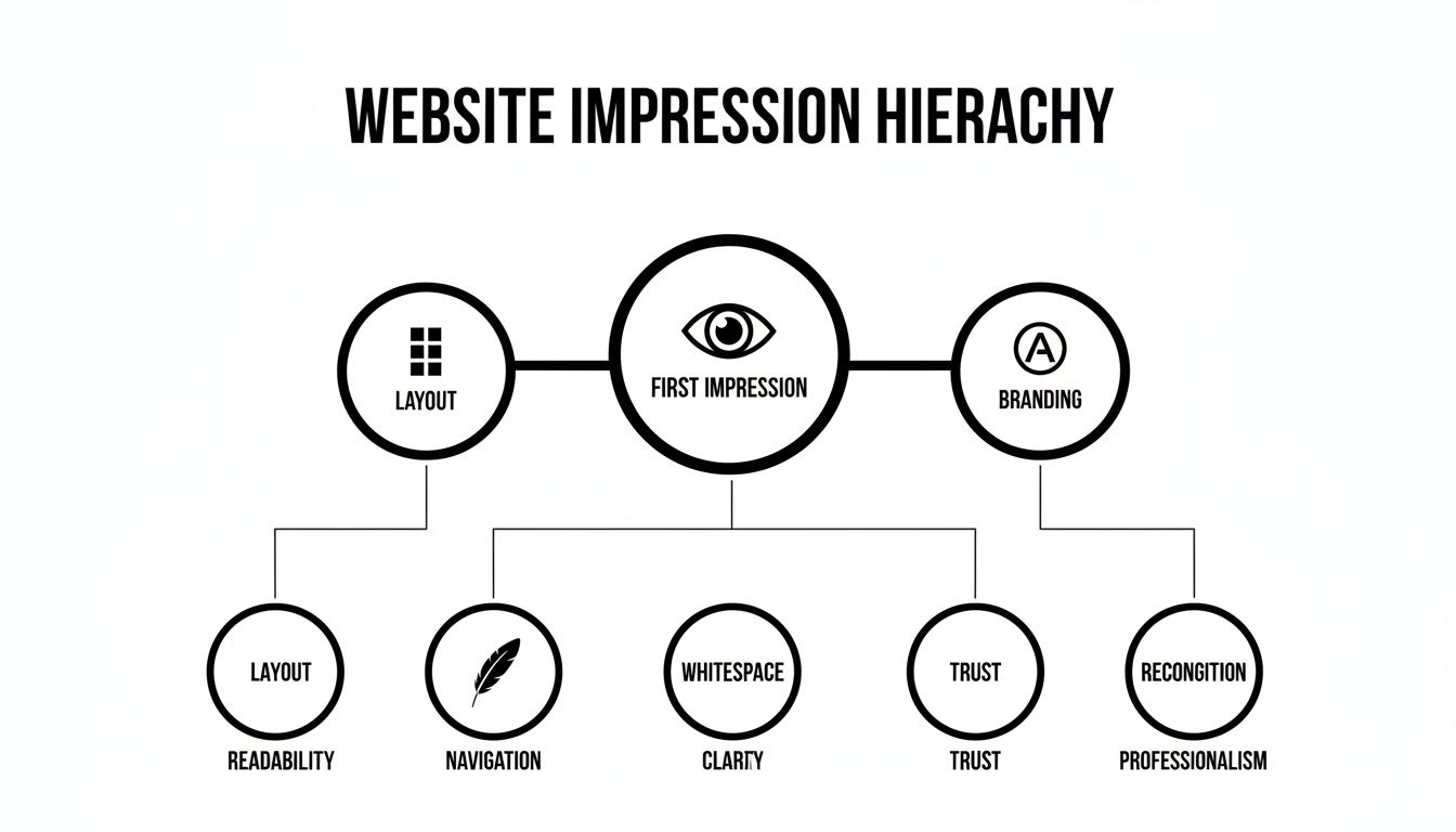
As the diagram shows, a user's initial judgment is a mix of branding, the breathing room from whitespace, and the overall structure. These elements work in harmony to create a feeling of professionalism and trust, which is non-negotiable for turning visitors into buyers.
If you’re looking to fine-tune your entire sales funnel, check out our complete guide on https://npoint.digital/conversion-rate-optimization-best-practices/.
And to really drill down into the interactive parts of your site, exploring web form design best practices will give you invaluable tips for reducing friction and getting more sign-ups and sales.
Building an Effortless Customer Navigation System
If your layout is the blueprint for your store, then navigation is the GPS that makes sure customers find what they’re looking for without a single wrong turn. A well-designed navigation system is one of the most vital elements of web design because it’s the digital guide that leads shoppers from your homepage straight to checkout with zero friction. The goal is to make finding products feel so easy, it’s almost subconscious.
For an ecommerce store, this isn’t just about making things convenient; it’s about making money. A confusing menu or a clunky search bar causes instant frustration, sending visitors straight to a competitor. On the flip side, an effortless system keeps people engaged, lowers your bounce rate, and makes it incredibly easy for them to add more items to their cart, directly boosting your average order value.
Choosing the Right Navigation Style
Not all navigation menus are created equal, and the right choice depends entirely on how big your product catalog is. Your menu should be a tool that simplifies choice, not one that overwhelms it.
Here are a few common styles and when they make the most sense:
- Standard Top Menu: This is the classic horizontal menu you see everywhere. It’s perfect for sites with a limited number of core categories (think 5-7). It’s clean, familiar, and works great for niche D2C brands.
- Mega Menu: If you’re a large retailer with a massive inventory, like an electronics or department store, this is your go-to. These giant drop-down panels can show multiple levels of categories, subcategories, and even featured products all at once.
- Sidebar Menu: This is the workhorse of product category pages. A vertical sidebar menu lets users filter down their options by things like size, color, or price, which is absolutely critical for improving the experience on sites with thousands of products.
The key is to match the navigation style to your business. Using a mega menu for a site with ten products is total overkill, while a standard menu for a huge marketplace would be completely unusable.
The Unsung Hero of Conversions: The Search Bar
While a clear menu is essential, a powerful search bar is a non-negotiable for any serious ecommerce site. A lot of shoppers land on your site already knowing exactly what they want, and they expect to find it instantly. A prominent, intelligent search bar is their express lane to making a purchase.
A great search bar doesn't just find products; it anticipates what the user is trying to do. Features like autocomplete, typo correction, and visual search results transform a simple search box into a powerful conversion tool.
When a user types in "red runing shoos," your search should be smart enough to show them "red running shoes." That small detail prevents a dead-end search and saves a potential sale. For ecommerce brands, ignoring design and functionality like this means losing out in a competitive market. Globally, the web design market soared to $58.5 billion in 2022 and is projected to hit $92.06 billion by 2030, driven by user demands for better experiences. You can learn more about the impact of web design trends from recent statistics.
Best Practices for Intuitive Navigation
Creating a seamless navigation system comes down to a few proven principles. These small adjustments can have a massive impact on usability and, ultimately, your bottom line.
- Use Descriptive and Simple Language: Don't get cute with clever marketing terms in your main navigation. Use clear, user-focused labels like "Men's Shoes" instead of "Footwear for Him." People scan, they don't decipher.
- Ensure Consistency Across All Pages: Your navigation menu should be in the same place with the same options on every single page. This consistency builds familiarity and makes users feel confident as they browse your site.
- Optimize for Mobile: Mobile navigation is a different beast and often requires a "hamburger" menu (the three-line icon). Make sure it’s easy to tap, the text is readable, and it includes all the same core categories as your desktop version.
When you focus on clarity and user-friendliness, you create a navigation system that acts as a silent partner in your sales process. When you improve conversion rates for your ecommerce store, it often starts by simply making the customer’s journey easier.
Using Visuals to Shape Brand Perception and Desire
Once you've nailed down the structure and navigation, it's time for your brand's personality to shine through. This is where you connect with customers on an emotional level, using the powerful trio of color, typography, and imagery. These aren't just decorative elements; they're potent sales tools that build desire and tell a memorable brand story.
Think of these visuals as your website's body language. They communicate feelings, set expectations, and can influence a buyer's mood long before they read a single word of your product description.
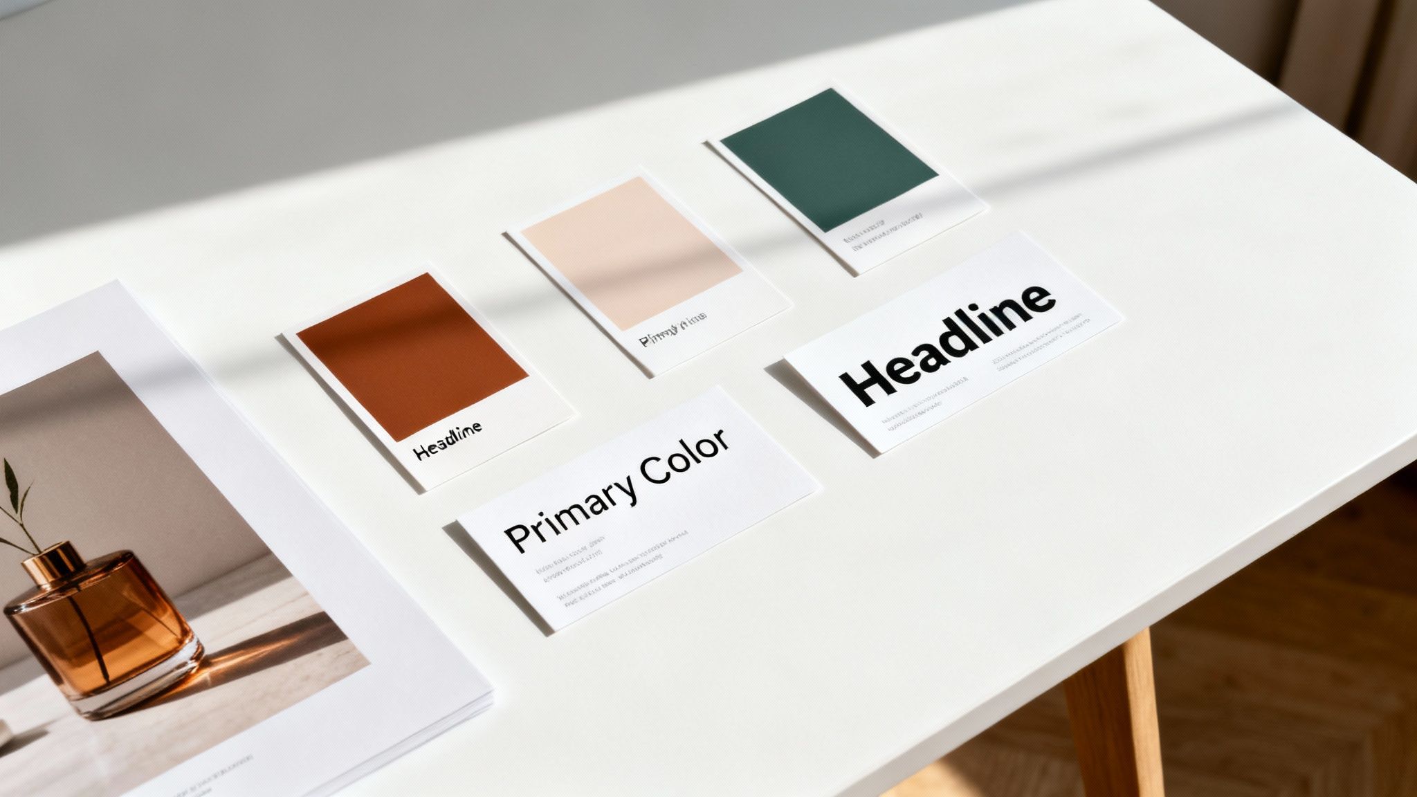
The Psychology of Your Color Palette
Color is one of the fastest ways to send a message. It triggers immediate emotional and psychological responses, making it a cornerstone of brand identity. Your color palette shouldn't be an afterthought; it needs to be a deliberate choice that reflects your brand's values and connects with your target audience.
A luxury brand, for instance, might use black, white, and gold to communicate sophistication and exclusivity. On the flip side, a wellness brand might lean on greens and earthy tones to evoke feelings of nature, health, and calm. The goal is to build a color scheme that feels authentic to your brand and creates the right emotional atmosphere for shopping.
More Than Just a Font: Setting the Tone with Typography
Typography is the voice of your brand. It does more than just display information—it sets the tone. A bold, modern sans-serif font can feel energetic and direct, perfect for a tech gadget store. A classic, elegant serif font, however, might communicate tradition and quality, making it a great fit for a high-end leather goods company.
But this choice goes beyond just a feeling; it directly impacts user experience. Readability is everything. If your font is too small, too decorative, or doesn't have enough contrast with the background, users will get frustrated trying to read product details and will probably just leave. Good typography makes information easy to digest, clearing the path to purchase.
Typography is the art of dressing up your words. The right font choice ensures your brand’s message is not just seen, but felt, turning simple text into a powerful part of your brand identity.
This isn't just theory; it has a direct impact on your bottom line. Trends in 2022 saw 61.5% of designers naming expressive typography as a top priority. We also know that simple changes, like using red for buy buttons, can lift sales by 34%.
Bringing Products to Life with Imagery and Video
For any ecommerce business, high-quality visuals are non-negotiable. Customers can’t touch or feel your products, so your photography and videos have to do all the heavy lifting. They are your primary tools for closing the gap between the digital and physical worlds.
Investing in professional visuals helps customers get over their hesitation by answering their questions visually.
- High-Resolution Product Photos: Clear, zoomable images from multiple angles show off product quality and details. This builds confidence that what they see is exactly what they’ll get.
- Lifestyle Images: Showing your products in a real-world context helps customers picture themselves using them. A model wearing a coat on a snowy day is far more compelling than a sterile shot on a white background.
- Product Videos: A short video can demonstrate how a product works, showcase its features in action, and give a much better sense of its size and scale. For complex or expensive items, a video can be the final nudge a customer needs.
These visuals don't just show off products; they sell a lifestyle and an experience. They help customers connect with your brand on a deeper level, transforming a simple transaction into something more meaningful. To see how visuals can create powerful user experiences, check out these examples of beautiful website interfaces. When you get it right, your site’s aesthetic becomes a powerful engine for building brand loyalty and driving sales.
The Technical Foundations That Power Performance
Behind every great ecommerce site is an engine humming along perfectly. While the visuals and layout are what people see first, the technical elements of web design are what keep them there and turn clicks into sales. These pieces—site speed, mobile responsiveness, and accessibility—are the invisible forces that decide whether a visitor sticks around or bounces.
For any online brand, having a site that's fast, reliable, and easy for everyone to use isn't just a nice extra. It's the core of what makes your website a real, conversion-focused asset. Without a solid technical backbone, even the most beautiful design will fall flat.
Speed Sells Everything
In ecommerce, every single millisecond matters. Page load time is one of the most direct and powerful factors influencing your conversion rate. Today's shoppers expect things to happen instantly, and a slow, clunky experience is the digital version of a massive checkout line—it sends customers running for the door.
This isn't just talk; the data backs it up. A website that takes more than two seconds to load can lose up to 60% of visitors before they even see a single product. Just a one-second delay can cut conversions by 7%, a number that quickly adds up to serious revenue loss. You can see more on how design impacts user behavior in this report.
A slow website doesn't just test a user's patience; it tests their trust. A fast, snappy experience signals professionalism and reliability, making customers feel more confident in their decision to purchase from you.
So, how do you make your site faster? It really boils down to a few key moves:
- Image Compression: Huge, unoptimized images are the #1 reason sites load slowly. Use modern formats like WebP and always run your images through compression tools to shrink file sizes without killing the quality.
- Lean Code: Minify your CSS, JavaScript, and HTML. This process strips out all the unnecessary characters and spaces, making your code files smaller and faster to load.
- Modern Hosting: Don't skimp here. Pick a hosting provider that offers a Content Delivery Network (CDN), which serves your site's files from servers physically closer to your users, slashing load times.
To give you a clearer picture of what to aim for, here’s a breakdown of the key performance metrics that matter most for an ecommerce store.
Key Performance Metrics and Optimization Goals
This table highlights critical website performance metrics, their definitions, and the ideal targets ecommerce sites should aim for to maximize user experience and conversions.
| Metric | What It Measures | Ideal Target |
|---|---|---|
| Time to First Byte (TTFB) | The time it takes for a user's browser to receive the first byte of data from your server. | Under 200ms |
| First Contentful Paint (FCP) | The time it takes for the first piece of content (text, image) to appear on the screen. | Under 1.8 seconds |
| Largest Contentful Paint (LCP) | The time it takes for the largest element on the page (usually a hero image or video) to load. | Under 2.5 seconds |
| Cumulative Layout Shift (CLS) | Measures visual stability, tracking how much content unexpectedly shifts around as the page loads. | Score below 0.1 |
| Total Page Size | The combined size of all assets on a page (images, scripts, etc.). | Under 1.5 MB |
Striving for these targets isn't just about pleasing search engines; it’s about creating an experience so smooth that your customers don’t even think about performance—they just shop.
Designing for a Mobile-First World
The game has changed. The majority of online traffic now comes from mobile devices. If your website isn't built to provide a seamless experience on a small screen, you are actively pushing away more than half of your potential customers. Mobile responsiveness isn't a feature anymore; it’s a non-negotiable requirement.
A responsive design automatically reconfigures your site’s layout, images, and text to fit any screen, from a huge desktop monitor down to the smallest phone. This ensures buttons are easy to tap, text is readable without pinching and zooming, and the entire experience feels natural.
Google also heavily favors mobile-friendly sites in its search rankings. A non-responsive site will get buried, which directly hurts your visibility and organic traffic. This makes mobile optimization a critical part of your SEO strategy. For a deeper dive, check out our guide on ecommerce SEO best practices.
Accessibility Is Smart Business
Web accessibility, often shortened to A11y, is about designing and building websites that everyone can use, including people with disabilities. This means your site needs to be navigable with a screen reader, have enough color contrast for visually impaired users, and include descriptive "alt text" for every image.
But here’s the thing: designing for accessibility isn't just the right thing to do—it's incredibly smart for your business. An accessible website opens your doors to millions of potential customers who might otherwise be unable to shop with you.
Even better, many accessibility principles double as SEO best practices. Using proper heading structures (H1, H2, H3) helps both screen readers and search engine crawlers understand your content hierarchy. Alt text on images helps visually impaired users and gives search engines crucial context about your visuals. By making your site accessible, you create a better experience for absolutely everyone and boost your search performance at the same time.
Designing for Action with CTAs and Trust Signals
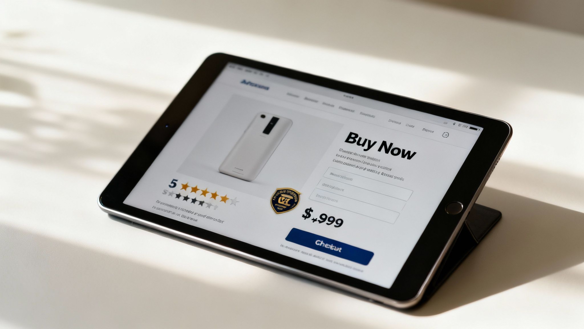
Now that you’ve built a solid foundation, it’s time for the final elements of web design—the ones that directly ask for the sale. This is where every choice you’ve made comes together to guide a visitor toward making a purchase. It all boils down to Calls-to-Action (CTAs), simple forms, and the trust signals that give people the confidence to finally click "buy."
Think of your CTA as the most important instruction on the page. It needs to be impossible to miss and dead simple to understand. A great CTA doesn't just sit there; it commands attention through a mix of smart design choices.
The Anatomy of an Effective CTA
A high-converting CTA is a masterclass in visual persuasion. It has to stand out from everything else on the page, drawing the user's eye and making the next step completely obvious. From the words you use to where you put it, every detail is an opportunity to encourage action.
To create a CTA that actually gets clicked, nail these three core components:
- Contrasting Color: The button color should pop against the background. If your site’s palette is mostly blues and grays, a bright orange or green button will immediately grab attention.
- Action-Oriented Copy: Ditch generic words like "Submit." Use clear, benefit-driven text like “Get Your Free Quote” or “Add to My Cart” that tells people exactly what will happen next.
- Strategic Placement: Your main CTA should always live "above the fold" on product and landing pages so it’s visible without any scrolling. Keep it right next to the product price and key details.
When these elements work together, they remove any guesswork, making the path to purchase clear and compelling.
A powerful CTA doesn't just suggest the next step; it creates a sense of urgency and clarity. It’s the final, crucial nudge that turns a passive browser into an active customer.
Building Confidence with Trust Signals
Before a customer clicks that button, they need to feel safe. This is where trust signals come in. These are the visual cues that reassure shoppers that your business is legitimate, their data is secure, and their purchase is protected.
Ignoring these signals is a huge mistake. In fact, 17% of shoppers who abandon their carts do so because they don’t trust the site with their credit card information. You can easily overcome this hesitation by displaying trust badges and social proof right where people can see them.
- Security Badges: Logos from well-known security providers (like Norton or McAfee) and familiar payment options (Visa, PayPal) provide instant reassurance.
- Customer Reviews: Displaying authentic star ratings and testimonials shows that other people have had good experiences with your products.
- Clear Policies: Make your return and shipping policies easy to find. This transparency shows you stand behind what you sell and lowers the perceived risk for the buyer.
By mastering these final, conversion-focused elements, you transform your website from a simple online catalog into a powerful engine for generating consistent, measurable revenue. This is how you scale an ecommerce business.
Frequently Asked Questions
Even after covering the core elements of web design, it's normal for specific questions to pop up when you start putting it all into practice. Here are the answers to a few common ones we hear from ecommerce store owners.
How Many Elements Should I Focus On at First?
If you're launching a new site, stick to the fundamentals that build trust and make it easy for people to use. Start with a clean layout, a simple and logical navigation system, and make sure your site is mobile-responsive.
These three areas have the biggest immediate impact on how a visitor perceives your brand and whether they can actually find what they're looking for and buy it. You can always circle back to fine-tune things like color psychology or advanced typography later. Get the basics right first, and you'll have a solid foundation to build on.
Think of it like building a house. You don't pick out paint colors and decor before you have a solid foundation, sturdy walls, and a logical floor plan. Web design works the same way; function has to come before flair.
How Do I Know if My Design Is Effective?
The best way to figure out if your design is working is to look at a mix of user behavior data and direct feedback. Your analytics dashboard tells a powerful story if you know where to look.
- Conversion Rate: Are people actually doing what you want them to do, like making a purchase? This is the ultimate test.
- Bounce Rate: Are visitors landing on your site and leaving after seeing just one page? A high bounce rate could signal anything from confusing navigation to slow load times.
- Time on Page: Are people sticking around and engaging with your content, or are they gone in a flash?
But don't stop at the data. Run a few simple user tests. Ask a handful of people to find a specific product and go through the checkout process. Watching where they get stuck or confused will give you priceless, real-world insights into which design elements need another look.
Ready to turn your website into a conversion machine? At Next Point Digital, we build high-performance ecommerce sites that combine beautiful design with data-driven strategy. Learn more at https://npoint.digital.