To get a real handle on cart abandonment, you have to tackle three core issues head-on: surprise costs, a complicated checkout process, and a lack of trust.
If you can show all your prices upfront, simplify the path to purchase, and build confidence with clear policies and secure payment options, you can make a serious dent in that nearly 70% average abandonment rate and start turning more browsers into buyers.
Understanding Why Shoppers Abandon Carts
Before you start changing buttons or rewriting copy, you need to get inside your customer's head and understand the "why" behind cart abandonment. It’s almost never just one thing. It's usually a cocktail of friction, unexpected costs, and a gut feeling that something isn’t right.
A lot of ecommerce managers jump straight to blaming high shipping fees. And yeah, that's a big one. But the root cause is often more psychological. It's not the cost itself, but the surprise. A shopper who has mentally committed to paying $50 for a product feels tricked when the final price suddenly jumps to $65 on the last page. That's an instant trust-killer.
This is a great breakdown of the main drivers, which fall into three buckets: friction, cost, and distrust.
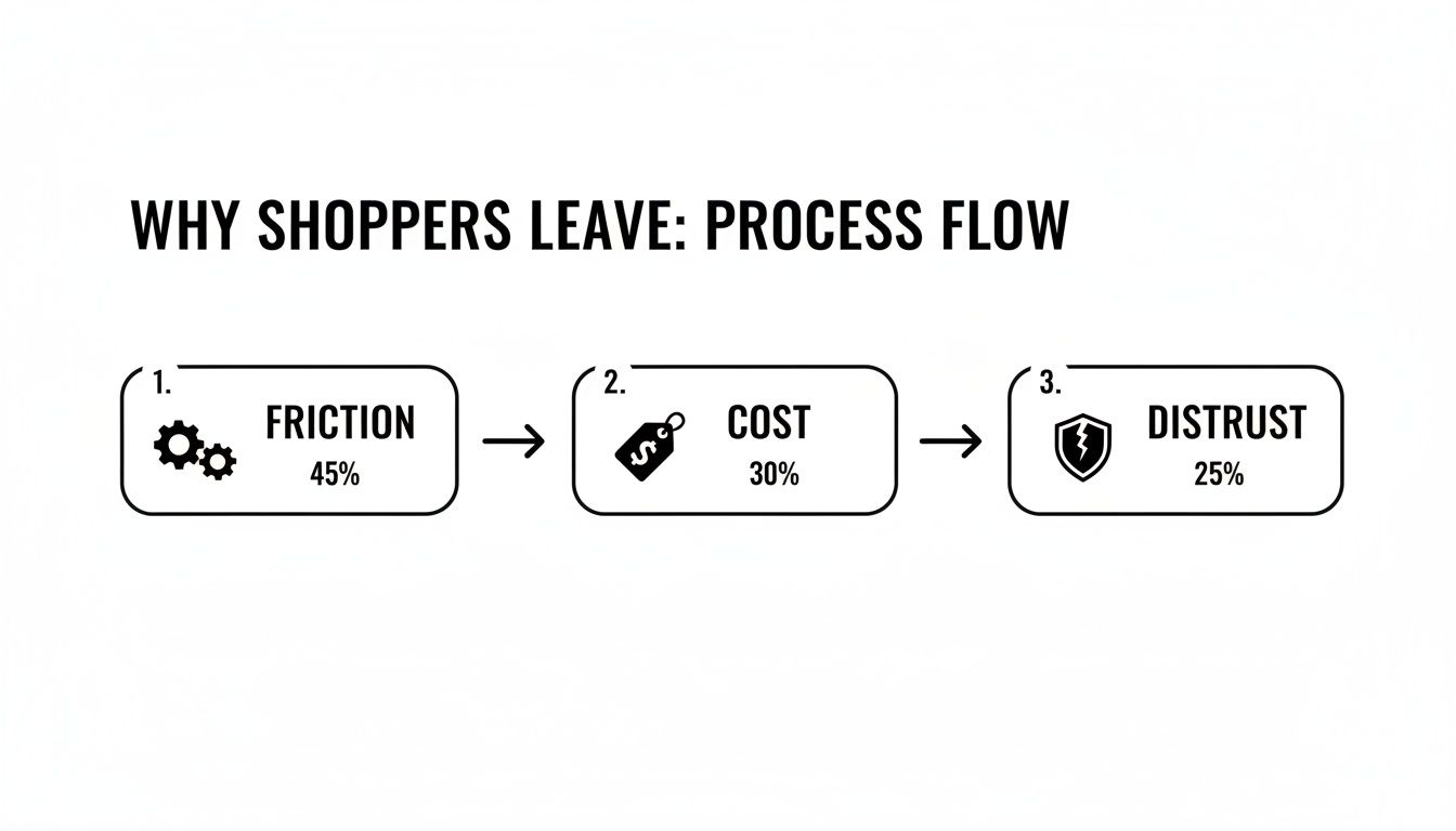
As you can see, a clunky user experience, last-minute price hikes, and a weak sense of security are more than enough to make an otherwise motivated buyer walk away.
The Psychology of Checkout Friction
Friction is anything that makes the checkout process feel like a chore. Every extra click, every unnecessary form field, every moment of confusion increases the odds they'll just give up.
Forced account creation is the classic example. It’s a huge barrier that serves your data collection goals but gets in the way of what the customer actually wants to do: give you their money.
Common sources of friction include:
- Mandatory Account Creation: Forcing someone to create a password just to buy something is a top reason for abandonment. Always, always offer a guest checkout.
- Long and Complex Forms: Asking for a phone number for a digital download or a birthday for a t-shirt just feels weird and adds needless steps. Keep it lean.
- Poor Mobile Experience: With most traffic coming from phones, a checkout that isn't built for thumbs is dead on arrival. Tiny buttons and endless typing are guaranteed to kill your conversion rate.
Key Takeaway: Treat every field in your checkout form as a potential exit point. Your goal is to make buying from you as easy as ordering a pizza online—simple, fast, and predictable.
The Impact of Hidden Costs and Distrust
Friction is one thing, but the final moments of a purchase are where trust is either cemented or completely shattered. This is where your store’s credibility is truly tested. A shopper needs to feel 100% certain that their financial information is safe and that your business is legitimate.
A lack of trust signals can sink a sale in seconds. And we're not just talking about security badges. We're talking about clear, easy-to-find policies. If a customer can't locate your return policy in two clicks, they'll assume the worst. To really nail this, digging into conversion rate optimization best practices provides a great foundation for building that confidence.
Likewise, not offering the right payment options is a modern-day dealbreaker. If your customer wants to use PayPal or Apple Pay but you only take credit cards, you've just put up a wall. Offering familiar and trusted payment gateways lowers the perceived risk and meets people where they are.
For a deeper dive into all of this, check out this actionable ecommerce guide on how to reduce cart abandonment. Once you understand these deep-seated reasons for abandonment, you can stop tinkering with surface-level fixes and start solving the core problems that are costing you sales.
Eliminate Surprise Costs to Build Customer Trust
Nothing kills a potential sale faster than a surprise fee.
We’ve all been there: you find the perfect item, add it to your cart, and head to checkout feeling good about your purchase. Then, right at the final step, the total price jumps. It’s frustrating, feels deceptive, and it's the number one reason shoppers abandon their carts. Building unshakable trust starts with being completely transparent about the total cost from the very beginning.
Sticker shock is a powerful deterrent, and that mismatch between expectation and reality is a problem you can—and should—solve proactively. For a deeper dive, there are plenty of guides that cover proven strategies to reduce cart abandonment, but tackling surprise fees is always the best place to start.

Display All Costs Upfront
The simplest fix is usually the most effective one. Show customers the all-in price as early as you possibly can. Don't make them wait until the final checkout screen to find out what shipping and taxes will cost them.
A great way to do this is with a dynamic shipping calculator right on the cart page. Let users pop in their postal code to get a real-time shipping estimate long before they’re asked for a credit card. This simple tool turns a potential negative surprise into a helpful piece of information.
The same goes for taxes. While you might need a full address for a perfect calculation, providing an estimate based on location data helps manage expectations. The goal is to make the final price look almost identical to the price they saw on the product page.
Turn Shipping Costs into a Strategic Advantage
High shipping costs are a massive pain point for customers, but you can actually flip this into a powerful marketing tool. The words "free shipping" remain one of the most compelling offers in all of ecommerce.
A free shipping threshold is a classic for a reason: it works. Instead of eating the cost on every single order, set a minimum order value to qualify. Think "Free shipping on orders over $75."
This tactic is brilliant because it accomplishes two things at once:
- It reduces cart abandonment by getting rid of that dreaded shipping fee.
- It increases your Average Order Value (AOV) because shoppers will often add one more item to their cart just to hit the threshold.
Of course, you need to know your numbers to make this work. The threshold should be set just a bit higher than your current AOV to encourage that small upsell without feeling impossible to reach. To get this right, you'll want to make sure your product pricing can support it. You can learn more about how to how to determine the price of a product to ensure your entire strategy is aligned.
The data doesn't lie: unexpected costs are the top reason people leave, with a staggering 47% of shoppers ditching their carts because of surprise charges. This contributes to a global average cart abandonment rate hovering near 70.2%. On the flip side, brands that get transparent with pricing or offer free shipping thresholds often see their recovery rates jump by 20-30%.
Offer Flexible and Optimized Shipping Options
Not every customer has the same priority. Some want their order tomorrow and are willing to pay for it, while others are happy to wait a week to save a few bucks. If your only option is expensive express shipping, you’re going to lose the budget-conscious crowd.
Empower your customers by giving them a menu of shipping choices at checkout. Let them feel in control of the final cost.
Consider offering a lineup like this:
- Standard Economy: Your most affordable (or free) option with a longer delivery time.
- Expedited Shipping: A mid-tier choice for a reasonable fee that gets it there faster.
- Express/Overnight: The premium option for anyone who needs their order now.
By presenting a range of choices, you cater to different needs and budgets. It shows you understand your customers, which is another crucial part of building the trust needed to secure the sale. At the end of the day, the price a customer sees should always be the price they expect to pay.
Design a Frictionless Checkout Experience
Once a shopper hits "buy," the checkout should feel like a victory lap, not an obstacle course. There's no faster way to lose a sale you've already won than with a clunky or confusing checkout process. In fact, research shows that 18% of consumers will ditch their cart right at the finish line if the process is too long or complicated.
Your mission is to engineer a checkout that feels completely effortless. Every extra field, every unnecessary click, is another opportunity for a customer to second-guess their purchase. You have to get inside their head and remove every single point of friction between the "Add to Cart" button and the "Thank You" page.
A smooth checkout isn’t just about slick design; it’s about respecting your customer’s time and making it incredibly easy for them to give you their money. This is where you close the deal. For a deeper dive into how this fits into the bigger picture, you can check out proven strategies to increase ecommerce conversion rates and see how small tweaks here can lead to massive gains overall.
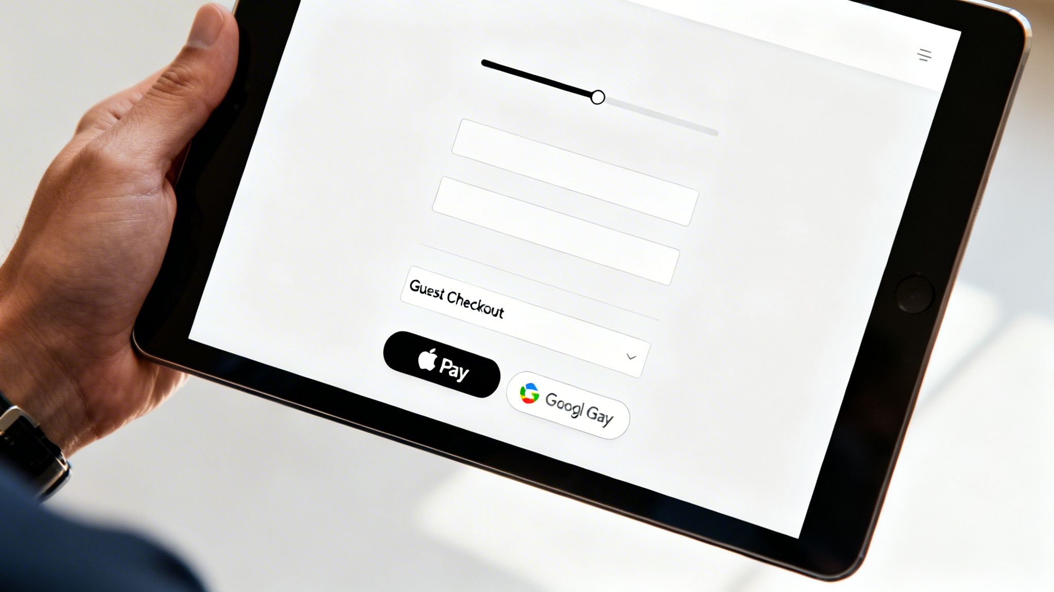
Make Guest Checkout the Default Option
Forced account creation is one of the most notorious conversion killers in ecommerce. Period. Picture this: you're ready to buy, card in hand, only to be hit with a form demanding you create a username and password. It’s an immediate roadblock that puts your long-term marketing goals ahead of the immediate sale. Bad move.
Always, always offer a prominent guest checkout option. This simple choice respects the customer's desire for a quick transaction and instantly removes a huge point of friction. You can always invite them to create an account after the purchase is complete—maybe even sweeten the deal with a small incentive like loyalty points or easier order tracking.
By making guest checkout the path of least resistance, you cater to first-time buyers and anyone in a hurry. Secure the sale first, then build the relationship.
Simplify and Streamline Your Forms
Your checkout form needs to be a masterclass in efficiency. Every single field should be absolutely essential to completing the order. If you don't need their phone number to ship a digital product, don't ask for it.
Here are some quick wins for your forms:
- Enable Autofill: Use the right HTML attributes so browsers can automatically fill in the customer's name, address, and payment details. This is a game-changer, especially on mobile, as it saves time and cuts down on typos.
- Use a Single Address Field: Ditch the separate fields for street, city, state, and zip. Instead, use a smart single-line address lookup that suggests verified addresses as the user types.
- Copy Shipping to Billing: Add a simple checkbox that says, "My billing and shipping address are the same." This is true for the vast majority of orders and eliminates frustratingly redundant data entry.
Pro Tip: Audit your checkout form today. Go through it field-by-field and ask yourself, "Is this information absolutely necessary to fulfill this order?" If the answer is no, get rid of it.
To help you prioritize, here’s a quick rundown of some of the most effective checkout fixes I've seen work time and time again.
High-Impact Checkout Optimization Tactics
| Friction Point | Tactical Solution | Potential Impact |
|---|---|---|
| Forced Account Creation | Offer a prominent guest checkout option as the default path. | High |
| Long/Complex Forms | Remove non-essential fields; enable autofill and address lookup. | High |
| Limited Payment Methods | Integrate one-click options like Apple Pay, Google Pay, and PayPal. | High |
| Lack of Progress Visibility | Add a visual progress bar showing clear steps (e.g., Shipping > Payment > Review). | Medium |
| Redundant Data Entry | Use a "Billing same as Shipping" checkbox. | Medium |
| Mobile-Unfriendly Design | Ensure forms are responsive with large, easy-to-tap buttons and fields. | High |
Focusing on these high-impact areas first will give you the biggest bang for your buck in reducing cart abandonment.
Integrate One-Click Payment Options
Today’s shoppers expect speed and flexibility. If you're limiting them to just traditional credit card entry, you're leaving money on the table. Integrating digital wallets and express payment solutions isn’t a nice-to-have anymore; it's a necessity.
Payment methods like Apple Pay, Google Pay, and PayPal let customers complete their purchase with a single tap or click using pre-saved information. This is absolutely critical for mobile shoppers, who have zero patience for manually typing in 16-digit card numbers on a tiny screen.
Offering these trusted, convenient options accomplishes three key things:
- It dramatically speeds up the process, leaving less time for second thoughts to creep in.
- It builds trust, as shoppers see familiar and secure payment brands they already use.
- It boosts mobile conversions, where checkout friction is felt most acutely.
Provide Clear Progress Indicators
Anxiety is a conversion killer. If a customer doesn't know where they are in the checkout process or how many steps are left, they’ll get frustrated and bounce. A simple visual progress bar or stepper is a powerful tool for managing their expectations.
Clearly label the steps—for instance, "Shipping," "Payment," and "Review"—so the user always knows what’s next and feels a sense of forward momentum. This small UX touch turns an unknown journey into a clear, guided path to purchase, encouraging them to see it through to the end.
Optimize for Mobile Commerce and Site Performance
If your ecommerce store isn't built for mobile first, you are actively leaving money on the table. It’s that simple. The modern customer journey almost always starts on a phone—scrolling through Instagram, clicking a link in an email, or searching Google on the go. When that journey leads to a clunky, slow, or frustrating mobile checkout, the sale is gone.
Optimizing for mobile is no longer a friendly suggestion; it's the most critical technical step you can take to slash your cart abandonment rate. The data is crystal clear: mobile shoppers bail on their carts at a staggering 84%, a full 12% higher than desktop users. Slow load times just pour gasoline on the fire, with sites taking longer than three seconds to load seeing 44% more abandons.
A flawless mobile experience isn't just about having a website that shrinks to fit a smaller screen. It’s about completely rethinking the path to purchase from the perspective of someone holding a device in one hand, probably multitasking, with zero patience for friction.
Prioritize Blazing-Fast Site Speed
In mobile commerce, speed is everything. Every fraction of a second a user waits for a page to load, the odds of them giving up skyrocket. A slow site just feels untrustworthy and amateur, creating enough doubt to kill a purchase right at the finish line.
You need to become obsessed with your site's performance, especially on mobile. Don’t just test it on your blazing-fast office Wi-Fi; see how it actually performs on a standard 4G connection out in the real world.
Here are the biggest levers you can pull to boost speed:
- Compress Your Images: Large, unoptimized product images are the number one killer of load times. Use modern formats like WebP and run everything through compression tools to shrink file sizes without wrecking image quality.
- Minimize Code: Every extra line of code, bloated plugin, or third-party script adds weight to your site. Regularly audit what you're running and get rid of anything that isn’t absolutely essential to the customer experience.
- Use a Content Delivery Network (CDN): A CDN is non-negotiable. It stores copies of your site on servers around the globe, ensuring it loads quickly for customers whether they're in New York or New Zealand.
Key Insight: Treat your site speed as a core feature of your product. A fast, responsive site feels premium and reliable, building the subconscious trust needed to get a customer to enter their payment information on a small screen.
Design for Thumbs, Not Cursors
A truly mobile-optimized design goes way beyond simple responsiveness. It demands a fundamental shift in how you think about user interaction. Clicks are replaced by taps, and precision goes out the window.
Your mobile checkout has to be designed for easy, one-handed use. That means big, chunky buttons that are impossible to miss, form fields with large tap targets, and a layout that doesn't force anyone to pinch and zoom.
Think about the entire journey, from a social media ad to your checkout page. That experience must feel seamless. If someone taps an ad for a specific blue sweater, they better land on a mobile-optimized page for that exact sweater—not your generic homepage. Any break in that flow introduces friction and gives them a reason to leave. This focus on the end-to-end journey is a crucial part of any strategy looking to increase ecommerce sales effectively.
Simplify Navigation and Checkout Steps
On a desktop, complex menus and multi-step checkouts are clunky but manageable. On a phone, they're a death sentence for your conversion rate. You have to be ruthless in your simplification.
Start by stripping your mobile navigation down to the bare essentials. Use a clean, concise menu and make your search bar impossible to miss. The goal is to get users from A to B with the fewest taps possible.
The checkout itself should be a masterclass in efficiency:
- Reduce Form Fields: Only ask for what is absolutely critical to process the order. Do you really need their phone number?
- Enable Digital Wallets: Options like Apple Pay and Google Pay are non-negotiable. They let users check out with a single tap or glance, bypassing the soul-crushing task of typing in credit card details on a tiny keyboard.
- Use a Single-Page Checkout: Whenever you can, consolidate the shipping, billing, and payment steps onto one scrollable page. It reduces clicks and makes the whole process feel less intimidating.
By focusing on speed and a user-first mobile design, you can eliminate the technical roadblocks that cause so many shoppers to abandon their carts and build an experience that actually converts.
Turn Abandonment Into Opportunity With a Solid Recovery Strategy
An abandoned cart isn't the end of the road; it's a massive opportunity. A shopper who puts something in their cart has shown you exactly what they want. They're practically raising their hand and saying, "I'm interested!" Something stopped them, sure, but that interest is still warm. A proactive, multi-channel recovery strategy is your best shot at turning that hesitation into a sale.
This isn't about being pushy. It's about being helpful. You're simply reminding them about the cool stuff they found and making it incredibly easy to pick up where they left off. With the right mix of automated emails, timely SMS alerts, and smart retargeting ads, you can claw back a huge chunk of what would otherwise be lost revenue.
Set Up Automated Cart Recovery Emails and SMS
Automated follow-ups are the absolute backbone of a good recovery plan. They’re your 24/7 sales team, working around the clock to re-engage shoppers who wandered off, delivering personalized reminders right to their inbox or phone.
The secret sauce here is personalization. A generic "You left something behind" email is better than nothing, but it's not going to move the needle much. An effective recovery email pulls in the exact items the customer abandoned—complete with product images, names, and a one-click link straight back to their pre-filled cart. That visual reminder is powerful and jogs their memory instantly.
Consider this proven cadence for your recovery sequence:
- Email 1 (1-2 hours after abandonment): This is a friendly, low-pressure nudge. A simple subject line like, "Did you forget something?" works great. The goal is to catch people who just got distracted.
- Email 2 (24 hours after): Time to introduce a little urgency or handle common objections. You could mention your easy return policy or pop in a few customer reviews for the items they left behind.
- Email 3 (48-72 hours after): This is your final shot. It's the perfect time to roll out a strategic incentive, like a small discount or a free shipping code, to give them that last nudge they need.
An automated abandoned cart series is one of the highest-revenue-generating flows you can possibly implement. Klaviyo's benchmark data shows they average a revenue per recipient of $3.07 and a 2.68% placed order rate. It's a non-negotiable for any serious ecommerce store.
Craft Messages That Actually Get a Click
The content of your messages matters just as much as the timing. Every single element, from the subject line to the call-to-action button, needs to be optimized to get someone to act.
For subject lines, test out a few different angles to see what your audience responds to:
- Direct and Simple: "Your cart is waiting for you."
- Question-Based: "Still thinking it over?"
- Benefit-Oriented: "Complete your order and get [Benefit]."
And don't forget SMS. With a near-perfect 98% open rate, texts are killer for quick, urgent reminders. Keep them short and sweet. Something like: "Hey [Name], your items from [Your Brand] are still in your cart! They're going fast. Finish your order here: [Link]".
Use Discounts and Incentives—But Be Smart About It
A discount can be a powerful motivator, but you shouldn't just throw one at every person who abandons a cart. If you do, you'll just train your customers to wait for a coupon, and you'll be giving away margin for no reason. You have to be strategic.
Save your best offers for the right moments:
- High-Value Carts: If someone abandons a cart that's way above your average order value, offering a 10% discount is a smart investment to reel in that big sale.
- First-Time Customers: A small incentive can be just the thing to get a new customer over the finish line so they can experience your brand for the first time.
- The Final Attempt: Hold your offer for the last email in your recovery sequence. Use it as a final push only after the initial reminders didn't do the trick.
And remember to think beyond simple percentage-off deals. Free shipping is often seen as more valuable than a small price cut. You could also try a free gift with purchase or bonus loyalty points. The right incentive comes down to knowing what your customers actually care about, which is where understanding your data is critical. Diving into different data-driven marketing strategies can give you a much clearer picture of what moves your specific audience.
Close the Loop With Retargeting Ads
Your recovery plan shouldn't stop at the inbox. Retargeting ads on platforms like Facebook, Instagram, and Google let you stay top-of-mind while shoppers are scrolling through their feeds or browsing other websites.
It's pretty straightforward. By installing a tracking pixel (like the Meta Pixel or Google Ads tag) on your site, you can build an audience of people who added an item to their cart but bailed before buying. Then, you can serve them dynamic ads that showcase the exact products they were looking at. This creates a seamless, multi-channel reminder that gently nudges them back to your store to finish what they started.
Got Questions About Cart Abandonment? We've Got Answers.
Even with a solid game plan, you’re bound to run into some tricky questions when you start digging into your cart abandonment problem. Let’s tackle some of the most common ones that come up for ecommerce teams.What Is a Good Cart Abandonment Rate to Aim For?
The industry average hovers around a jaw-dropping 70%, but a "good" rate really depends on what you sell. If you're in luxury goods, for instance, a higher rate is expected because the customer is going to take a lot longer to think it over.
For most ecommerce stores, getting your rate below 60% is a fantastic and realistic goal. The absolute best-in-class stores might hit numbers closer to 50%, but that takes an incredibly polished, frictionless experience.
Key Takeaway: Don't get hung up on a magic number. Benchmark where you are now and set a goal to lower it by 10-15% over the next quarter using the tactics in this guide. That's a huge win you can actually achieve.
How Long Should I Wait Before Sending a Recovery Email?
Timing is everything here. You want to be a helpful nudge, not a nagging pest. The data is pretty clear on this one, and there's a definite sweet spot for that first email.
You'll want to send that initial reminder within 1-2 hours after they've left. This timing is perfect for catching shoppers who got distracted by a phone call or ran into a quick technical snag. Wait much longer, and you risk them moving on or, worse, buying from your competitor.
A multi-email sequence almost always outperforms a single email. Here’s a cadence that works:
- First Email (1-2 Hours): A simple and friendly, "Did you forget something?" reminder.
- Second Email (24 Hours): Add a little more value. Maybe include a few product reviews or remind them about your easy return policy.
- Third Email (48-72 Hours): This is your last shot. If you're going to introduce an incentive like free shipping, now's the time to do it.
This approach gives them a few gentle nudges without feeling overwhelming.
Should I Offer a Discount in Every Abandoned Cart Email?
No, definitely not. Tossing out a discount right away is the fastest way to train your customers to abandon their carts on purpose. They'll just sit back and wait for the coupon to roll in, which eats away at your margins and cheapens your brand.
Think of discounts as a strategic tool, not your first line of defense. Save them for high-value situations where they'll make the biggest impact.
Only consider offering a discount when:
- The cart value is way higher than your average order.
- The shopper is a brand-new customer you really want to win over.
- Your previous, non-discounted reminder emails haven't sealed the deal.
Often, a simple reminder or an offer of free shipping can be just as powerful as a percentage-off discount, without costing you nearly as much. That's how you reduce cart abandonment smartly, not just reactively.
At Next Point Digital, we specialize in turning abandoned carts into completed sales. Our team combines data-driven strategies with expert execution to build frictionless checkout experiences and powerful recovery systems that boost your bottom line. Learn how we can help you convert more clicks into customers.