Before you can fix a leaky bucket, you have to find the holes. It’s the same exact principle with your sales funnel.
Throwing money at new ad campaigns or redesigning your homepage without understanding why visitors are leaving is just guessing in the dark. If you want to how to improve ecommerce conversion rates, the very first step is always diagnosis.
Finding the Leaks in Your Sales Funnel

This means you need to shift your focus away from broad metrics like "total traffic" and get granular with user behavior. Your goal is to become a digital detective, tracing the customer's journey to find the exact moments of friction that make them abandon their cart or just leave your site altogether.
Pinpointing High-Exit Pages in Your Analytics
Think of your analytics platform—like Google Analytics—as the crime scene. The clues you’re looking for are in the "Behavior Flow" and "Exit Pages" reports. These reports show the paths people take through your site and, more importantly, the last page they saw before bouncing.
You're looking for patterns here. Are way too many users dropping off from a specific product category? Is the shipping information page a revolving door? A high exit rate on any page that isn't a "thank you" or order confirmation page is a huge red flag.
Common culprits for high-exit pages often include:
- Product pages with unclear information: Vague descriptions, grainy photos, or missing details like size charts kill confidence.
- Complex or confusing navigation: If users can't easily find what they came for, they're gone.
- The first page of the checkout process: This is where surprise shipping costs and mandatory account creation scare off even the most motivated buyers.
Once you’ve identified these problem pages, you finally have a clear starting point for your optimization efforts. If you're interested in blending user experience with analytics, check out these data-driven marketing strategies.
Seeing Your Store Through Your Customers’ Eyes
Analytics tell you what is happening, but they rarely explain why. For that crucial context, you absolutely have to see your website from your customer's perspective. This is where qualitative tools make all the difference.
Heatmaps and scroll maps show you exactly where users click, move their mouse, and how far they bother to scroll. A heatmap might reveal that nobody is clicking your main call-to-action, while a scroll map could show that 80% of visitors never even see the critical product details sitting just below the fold.
Session recordings are even more powerful. These are anonymized videos of real user sessions on your site, and watching them can be a truly eye-opening experience. You might see a user rage-clicking a non-clickable image or struggling to find the checkout button on their phone.
These tools turn abstract numbers into real, actionable human stories. They help you build empathy for your users and uncover frustrating usability issues that you—being so familiar with your own site—would have never noticed on your own. By combining quantitative data with these qualitative insights, you create a complete picture of your conversion bottlenecks.
Crafting Product Pages That Compel Action
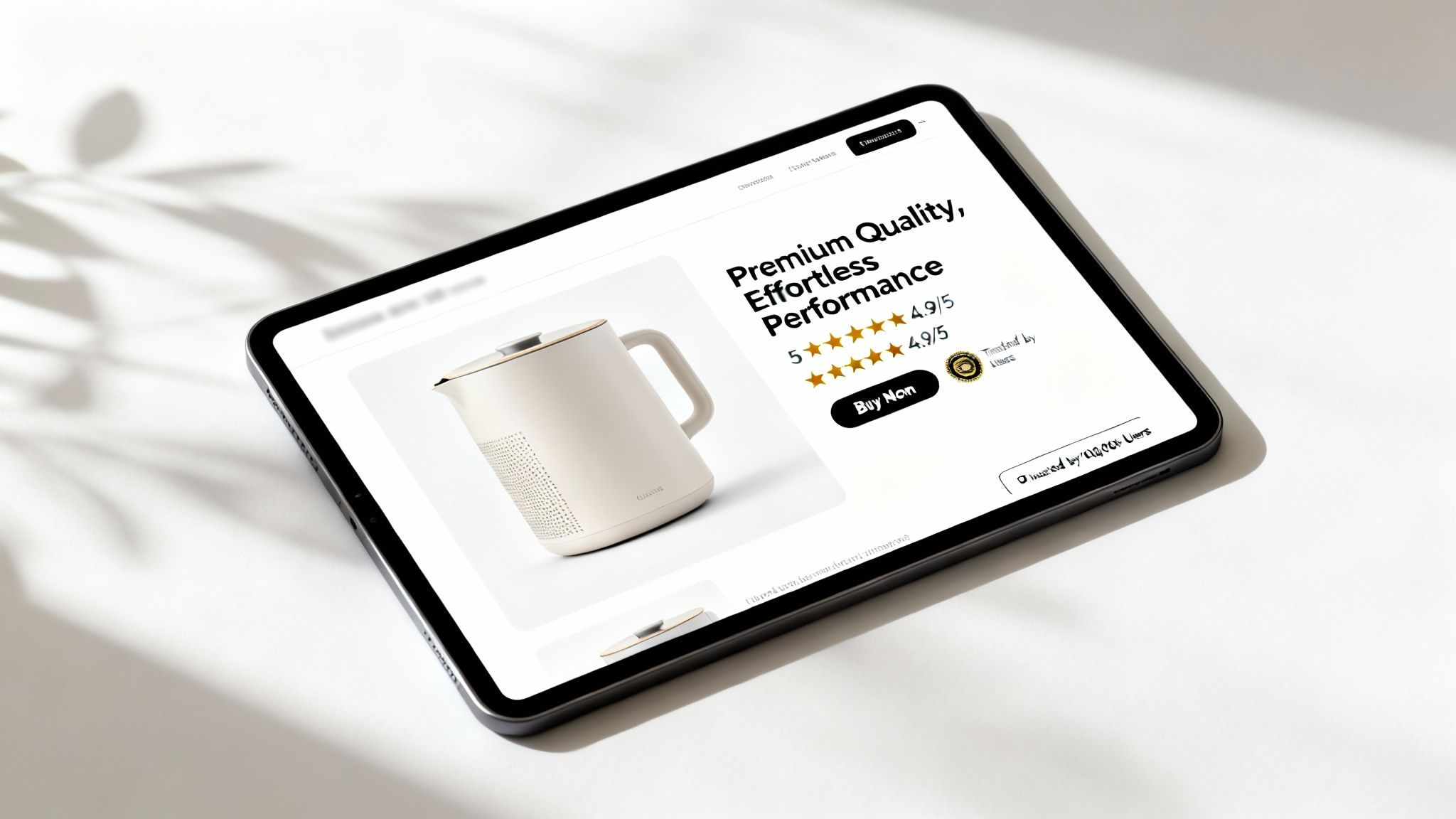
Think of your product page as your best (and only) digital salesperson. It's the final step where a browser's casual interest has to turn into a decisive purchase. A weak product page leaks revenue, no matter how much traffic you throw at it.
The key is to treat it less like a data sheet and more like a conversation with your customer. You need to anticipate every question, calm every hesitation, and make the value so obvious that buying feels like the natural next step. This is a core pillar when you want to improve ecommerce conversion rates, turning interested visitors into confident buyers.
Write Descriptions That Sell the Outcome
Too many brands fall into the trap of listing features instead of selling benefits. Your customer doesn't just want a "lithium-ion battery"; they want a vacuum that "cleans the whole house on a single charge." Don't make them do the mental gymnastics to connect your specs to their needs.
Your product copy should paint a clear picture of the problem it solves or the desire it fulfills. Speak directly to your ideal customer, using their language and hitting on their pain points.
- Before: "Made with 100% merino wool."
- After: "Stay warm without the itch. Our ultra-soft merino wool feels incredible against your skin and keeps you comfortable on the coldest days."
That simple shift from a technical detail to a tangible benefit can have a massive impact on how a customer sees your product.
Elevate with High-Quality Visuals
In ecommerce, your images and videos are the product until it’s in the customer's hands. Grainy, poorly lit photos scream untrustworthy. You need a mix of high-resolution visuals that leave absolutely nothing to the imagination.
A study found that 93% of consumers consider visual appearance to be the key deciding factor in a purchasing decision. Your visuals aren't just for show; they are a critical part of the sales process.
Show your product from every possible angle. Use lifestyle shots to put it in a real-world context, helping customers visualize themselves using it. Videos are even better—show it in action, do an unboxing, or walk through its best features. This kind of visual storytelling builds the confidence they need to click "Add to Cart."
Leverage Social Proof and Urgency
People are social creatures. We look to others for cues on what to buy, what to trust, and what's worth our money. Placing social proof strategically on your product page is one of the most powerful conversion drivers you have.
This includes:
- Customer Reviews and Ratings: Display star ratings right up top near the product title. Feature a good mix of detailed reviews—even the constructively critical ones. A page full of nothing but five-star raves can feel less authentic than one with a more realistic spread.
- User-Generated Content (UGC): Encourage customers to share photos of themselves with your product. A gallery of real people happily using your item is often more persuasive than any polished ad you could run.
- Scarcity and Urgency Signals: Simple phrases like "Only 3 left in stock!" or a countdown timer for a sale can motivate hesitant buyers to act now instead of putting it off.
Maximize Your Marketplace Presence
For brands selling on platforms like Amazon, the same principles apply, but you have a different set of tools. Amazon’s A+ Content (or Enhanced Brand Content) lets you break free from the standard text description. You can use it to tell your brand story with rich images, comparison charts, and detailed feature callouts.
Using A+ Content effectively turns a basic listing into a branded landing page right inside the Amazon ecosystem. For a deeper dive, our guide on how to optimize Amazon product listings gives you a complete walkthrough. It's a game-changer for standing out from competitors and boosting your conversion rates on the world's biggest marketplace.
Designing a Frictionless Checkout Experience

You did all the hard work. You got a visitor to your site, helped them find the perfect product, and even got them to click "Add to Cart." But a shocking number of those sales will simply vanish right at the finish line.
The checkout process is where motivated buyers turn into frustrated drop-offs. It's easily one of the most critical areas to fix if you want to improve ecommerce conversion rates. Every extra field, surprise cost, or confusing step is an open invitation for a customer to leave. Your only mission here is to remove every single piece of friction, making the path from cart to confirmation feel so seamless they never have a reason to second-guess their purchase.
Ditch Mandatory Account Creation
The biggest conversion killer I see in most checkout flows? Forcing people to create an account before they can pay you. For a new customer, this is a huge, annoying barrier. They came to buy a product, not sign up for a long-term relationship with your brand.
A guest checkout option isn't just nice to have—it's non-negotiable. It shows you respect the customer's time and gives them a fast lane to the finish. You can always ask them to create an account after the purchase is complete, using the information they've already provided to make it a one-click process.
Don't let a simple form stand between you and a sale. The Baymard Institute found that 24% of users ditched their cart because the site wanted them to create an account. That’s nearly one in four potential sales lost to a completely avoidable roadblock.
Simplify Your Forms Relentlessly
Take a hard look at every single field on your checkout form and ask one question: "Is this absolutely essential to complete the order?" You'll be surprised how many aren't.
Get rid of fields for company names, second address lines, and even phone numbers unless they're strictly required for shipping or payment. A shorter form just feels less intimidating and gets the customer to the finish line faster.
Here are a few quick wins:
- Use Autofill: Make sure your forms play nice with browser autofill for addresses and payment details.
- Go Single-Column: A simple, top-to-bottom layout is much easier for users to scan and complete than multiple columns.
- Clearly Mark Optional Fields: If you can't get rid of a field entirely, make it obvious that it's optional so people don't waste time on it.
A cleaner, more direct path to payment is one of the best ways to improve ecommerce conversion rates.
The following table breaks down some of the most effective checkout optimizations and how they directly address the reasons customers abandon their carts.
Key Checkout Optimizations and Their Impact on Cart Abandonment
| Optimization Tactic | Primary User Benefit | Impact on Conversion Rate |
|---|---|---|
| Guest Checkout | Saves time; no commitment required | Directly reduces abandonment by removing the #1 friction point for new customers. |
| Progress Indicator | Manages expectations; shows the end is near | Reduces anxiety and makes the process feel shorter, keeping users engaged. |
| Digital Wallet Integration | Speed and convenience (one-click) | Significantly boosts mobile conversions by eliminating manual form entry. |
| Security Badges/Trust Seals | Builds confidence and trust | Eases concerns about data security, especially for first-time buyers. |
| Address Autofill/Validation | Reduces typing and prevents errors | Speeds up the process and prevents frustrating shipping delays from typos. |
By implementing even a few of these changes, you're not just making the checkout process easier; you're actively building trust and showing customers you value their time.
Offer Diverse and Secure Payment Options
Today’s shoppers expect choices and security. If your checkout only accepts one or two major credit cards, you're practically guaranteed to be leaving money on the table. People use all sorts of payment methods, and your store needs to reflect that.
Integrate digital wallets like Apple Pay, Google Pay, and PayPal. These are game-changers, often allowing for a one-click payment that bypasses manual entry of shipping and billing info altogether. You should also prominently display recognizable security badges from providers like Norton or McAfee alongside clear icons for the payment methods you accept. It’s a simple way to build instant trust.
And remember, while mobile traffic is huge, desktop is still where most people pull the trigger. Globally, desktop users convert at 4.8% compared to just 2.9% on mobile, even though mobile accounts for 73% of all traffic. This gap just hammers home the need for a checkout that works perfectly, no matter the device.
Making Every Buying Journey Unique with Personalization
Today’s shoppers expect more than just a catalog of products; they're looking for an experience. A generic, one-size-fits-all storefront is the digital version of a salesperson turning their back on a customer who just walked in. If you really want to improve ecommerce conversion rates, you have to make every single visitor feel seen, understood, and catered to.
This is about way more than just sticking a first name in an email subject line. Real personalization means building an adaptive sales funnel that shifts based on who the visitor is, where they came from, and what they've already looked at. It’s about showing them the perfect product at the perfect time.
When you get it right, the shopping journey stops feeling like a cold transaction and starts feeling like a helpful, one-on-one conversation.
Put Dynamic Product Recommendations to Work in Real-Time
One of the most effective ways to personalize the experience is by showing visitors products they actually want to see. Ditch those static "Related Items" carousels and start using systems that analyze a user's real-time browsing habits.
Did someone just spend two minutes looking at a specific pair of running shoes? Your recommendation engine should immediately start suggesting complementary items—think high-performance socks, running shorts, or even a GPS watch from the same brand.
This isn't just about showing similar stuff. It's about smart upselling and cross-selling that feels genuinely helpful, not pushy.
- Behavioral Triggers: If a user adds a winter coat to their cart, your site should instantly suggest matching gloves and a hat.
- "Frequently Bought Together" Bundles: Amazon perfected this. They package items that are almost always bought together, making it a no-brainer for the customer to add them all with a single click.
- "Customers Also Viewed" Logic: This taps into social proof by showing a visitor what other shoppers with similar tastes found interesting.
These dynamic recommendations do more than just improve the experience; they can seriously bump up your average order value (AOV) and introduce shoppers to products they never would have found otherwise. For brands looking to get started, there is a ton of great ecommerce personalization software out there that can automate this whole process.
Shoppers are more open to this than you'd think. Research shows that 48% of consumers spend more when their shopping experience is personalized. This isn't just a nice-to-have feature anymore; it’s a core driver of sales.
Align Your Ad Creative with Your Landing Page
A personalized journey often starts way before a visitor even gets to your site. A huge conversion killer I see all the time is a jarring disconnect between the ad someone clicked and the page they land on.
Imagine a customer clicks a Facebook ad for a 20% discount on blue hiking boots. If that click takes them to your generic homepage or a messy category page with every shoe you sell, you’ve just created a wall of friction. The "scent" of the offer is gone, and now they have to start their search from scratch. Most people won't even bother.
AI-powered ad platforms can help create a seamless path from the first click to the final purchase.
This means dynamically matching the headline, the images, and even the hero section of your landing page to the specific ad creative the user engaged with. If they clicked the ad for blue hiking boots, the page they see should have those exact boots front and center, with the 20% discount repeated loud and clear. This concept, known as message match, is absolutely fundamental to a high-converting experience. It reassures the visitor that they're in the right place and makes taking the next step feel obvious and easy.
Building a System for Continuous A/B Testing
If you want to really improve ecommerce conversion rates, you have to stop looking for one-off fixes and start thinking like a scientist. Conversion optimization isn't a project with a start and end date; it's a constant process of making educated guesses, testing them like crazy, and letting the data tell you what actually works.
This approach, known as A/B testing (or split testing), takes all the guesswork and opinions out of the equation. Instead of your marketing team endlessly debating whether a green or orange button is better, you can run a clean experiment and know for sure. It’s all about building a repeatable system for making small, smart improvements over time.
Start Every Test with a Strong Hypothesis
Jumping into A/B testing without a clear plan is just a good way to waste time and traffic. Every single experiment needs to start with a solid, measurable hypothesis. A good hypothesis doesn't just state what you're changing; it predicts why that change will lead to a specific, measurable result.
Here's a weak hypothesis: "Let's test a new headline on the product page." It’s vague and directionless.
Now, here’s a strong one: "By changing our product headline from feature-focused ('Durable Ripstop Nylon') to benefit-focused ('Never Worry About Tears on the Trail Again'), we will increase 'Add to Cart' clicks by 10% because the new copy directly addresses a major customer anxiety about product failure."
See the difference? This structure forces you to think about the user psychology behind the change and gives you a clear metric to track.
Prioritize Your Tests for Maximum Impact
You can't test everything at once, and you shouldn't try. A disciplined CRO program demands ruthless prioritization to make sure you’re working on changes that will actually move the needle. The simplest way to do this is by weighing the potential impact of a test against the effort it'll take to get it live.
Don't get stuck in a cycle of testing tiny, insignificant changes. Sure, button colors can make a small difference, but a test on your core value proposition or checkout flow has a much higher ceiling for potential gains. Focus on the big rocks first.
Create a simple scoring system to rank your testing ideas. High-impact, low-effort changes should always jump to the top of the list. These are your "quick wins" that can deliver an immediate lift and build momentum for your whole optimization program. If you need a framework for organizing your ideas, exploring various conversion rate optimization best practices can provide a structured starting point.
The flow chart below shows how a personalized experience should ideally work—from tracking what a user does, to recommending the right products, and finally, getting that conversion.
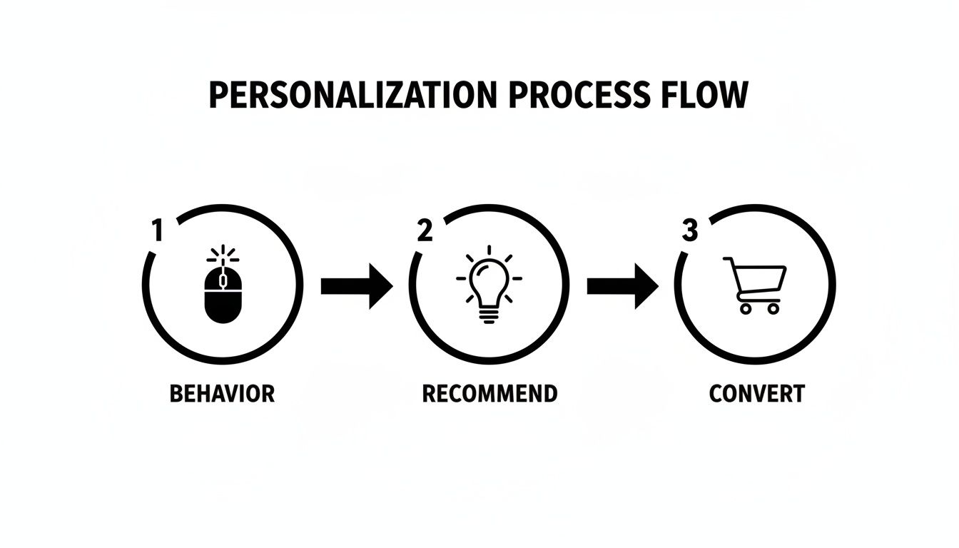
This process is a great example of how a systematic approach, guided by testing and personalization, can steer users straight toward a purchase.
To help your team stay focused on what matters, a simple prioritization matrix is a game-changer. It keeps everyone aligned on which tests offer the most bang for your buck.
A/B Testing Prioritization Matrix
| Test Idea | Potential Impact (High/Med/Low) | Implementation Effort (High/Med/Low) | Priority Score |
|---|---|---|---|
| Redesign Homepage Value Prop | High | High | Med |
| Change Checkout Button Color | Low | Low | Low |
| Simplify Checkout Form Fields | High | Low | High |
| Add Trust Badges to PDP | Med | Low | High |
By mapping out your ideas this way, the "High" priority tests—the ones with big potential and little effort—become obvious. This is where you should start.
Analyze the Results and Learn from Everything
Once a test is done and you’ve reached statistical significance, the job isn’t over. Of course, you need to analyze the results, declare a winner, and roll out the successful version. But just as important is understanding why a test won or lost.
Every experiment, pass or fail, is a chance to learn something. A failed test might prove that an assumption you had about your customers was completely wrong—and that's incredibly valuable information. Document every result and use those insights to build smarter hypotheses for your next round of tests.
This is also where knowing your industry benchmarks gives you crucial context. Data shows that conversion rates are all over the place, with personal care leading at 6.8% while home decor lags at a mere 1.4%. The global average is around 2.95%, and organic search traffic often converts almost twice as well as some paid ads. Knowing where your niche stands helps you set realistic goals and spot opportunities to pull ahead of the competition.
By building this continuous loop of hypothesizing, prioritizing, testing, and learning, you stop thinking of your website as a static brochure. Instead, it becomes a dynamic conversion engine that’s constantly getting smarter.
Common Questions About Improving Conversion Rates
Diving into conversion rate optimization always kicks up a storm of questions. There's so much advice out there, it's easy to get stuck wondering what to tackle first, what a "good" result even looks like, or where to begin. This section is here to cut through that noise.
Think of this as your quick-reference guide. We'll give you direct, no-fluff answers to help you set realistic expectations and make smarter decisions as you start turning more visitors into customers.
What Is a Good Ecommerce Conversion Rate?
This is the million-dollar question, and the honest answer is always: “it depends.” While you’ll see the global average hovering somewhere between 2% and 4%, a truly “good” rate is a moving target that changes drastically based on your business.
A few key factors will define what you should be aiming for:
- Industry: The personal care industry can pull in conversion rates as high as 6.8%, while fashion and apparel often land closer to 1.9%. Your niche really sets the baseline.
- Traffic Source: Visitors coming from organic search usually have higher intent and might convert around 4%. In contrast, some paid ad campaigns could see rates closer to 2-3%.
- Device: Believe it or not, desktop still packs a punch, converting significantly higher than mobile. We see averages around 4.8% on desktop versus 2.9% on mobile, even though phones drive most of the traffic.
The best way to think about this is to stop chasing some universal number. Instead, focus on your own baseline. A "good" conversion rate is one that's consistently improving month over month because of the work you're putting in.
To get a real handle on where you stand and set some benchmarks, a reliable conversion rate calculator is a great tool to have in your back pocket. It helps ground your goals in actual data.
How Long Does It Take to See CRO Results?
There's no magic timeframe here. How quickly you see an impact from your CRO efforts really comes down to the scale of your changes and how much traffic your site gets. Generally, results fall into two buckets.
Simple, high-impact tweaks can show results pretty fast. For example, A/B testing a new call-to-action button color or a punchier headline on a popular product page might give you a statistically significant winner within a few weeks. These are the quick wins that build momentum and get everyone excited.
Bigger, more strategic shifts, on the other hand, take more time. A complete checkout redesign, rolling out a new personalization engine, or overhauling your site's navigation could take one to three months just to implement. After that, you'll still need to gather enough data for a clear analysis. Patience is key for these bigger bets.
Website or Marketplace Listings: Where to Start?
Prioritization is everything. The right place to start optimizing comes down to one simple question: where is most of your revenue coming from right now? You want to put your effort where you’ll see the fastest and biggest return.
If you’re driving a ton of traffic to your own D2C website but the conversion rate stinks, that's your starting line. You're leaving money on the table every single day.
But if 80% of your sales come from Amazon, then optimizing your product listings, investing in killer A+ Content, and dialing in your Amazon Ads strategy is the highest-leverage move you can make.
Ideally, you'll build out a CRO strategy for every channel. But when you're just starting, follow the money. Focus your energy on the platform that will have the biggest immediate impact on your bottom line.
What Are the Most Common CRO Mistakes to Avoid?
Knowing what not to do is just as important as knowing what to do. So many well-intentioned CRO programs fizzle out because they fall into the same common traps.
Steering clear of these pitfalls is critical for building an optimization program that actually works.
- Acting on Opinions, Not Data: This is the big one. Making changes based on what the CEO likes or what a competitor is doing is a recipe for disaster. Every single change should be tied to a data-backed hypothesis.
- Stopping Tests Too Early: Calling an A/B test before it reaches statistical significance is just asking for misleading results. You have to let the data mature.
- Testing Too Many Things at Once: If you change the headline, image, and CTA all at the same time, you'll never know which element actually caused the lift (or the drop). Isolate your variables.
- Ignoring the Mobile Experience: With most of your traffic coming from phones, a clunky or slow mobile site is a guaranteed conversion killer. Always design and test with a mobile-first mindset.
- Focusing Only on Small Tweaks: Obsessing over button colors while your value proposition is confusing or your checkout is broken is a classic case of missing the forest for the trees.
At Next Point Digital, we specialize in transforming ecommerce traffic into profitable sales. Our data-driven approach to conversion rate optimization removes the guesswork, focusing on high-impact changes that deliver measurable results. Whether on your website or major marketplaces, we build frictionless buying journeys that boost your bottom line.
Ready to see what a systematic approach to CRO can do for your brand? Visit us at https://npoint.digital to learn how we make growth simple and significant.