If you want to improve your e-commerce conversion rates, you have to start by understanding your own sales funnel before you change a single thing. I've seen too many brands jump straight into tweaking button colors or copying a competitor's new feature, only to see their numbers go nowhere.
A data-first approach is the only way to win. You need to get into your analytics and find out exactly where you're losing people. Is it on the product pages? The cart? Or somewhere deep in the checkout process? Answering that question is the first step, and it ensures your efforts are targeted where they'll actually make a difference.
Why Most Ecommerce Conversion Efforts Fail
So many online stores fall into the trap of reactive changes. They see a trend, read a blog post about a "magic bullet" tactic, and immediately start redesigning things without a clear baseline. The problem with this approach is you have no idea if your changes are actually helping or hurting sales. It's just guesswork.
The real key to improving your conversion rate is to start with a thorough audit. This isn't about looking at vanity metrics like total traffic. It’s about digging into the data that tells the story of your customer’s journey.
Instead of asking, "How do I get more sales?" you should be asking, "Where am I losing the sales I should be getting?"
This is where a tool like Google Analytics becomes your best friend. By setting up conversion funnels and digging into user flow reports, you can pinpoint the exact pages where visitors are giving up and dropping off.
Starting With a Data-Driven Audit
The whole point of an audit is to replace assumptions with cold, hard facts. Are people bailing because of unexpected shipping costs? Is your product page missing a critical piece of information? Or is the mobile checkout just too clunky to get through? Your data holds the answers.
A solid audit should zoom in on a few key areas:
- User Behavior Flow: Trace the most common paths visitors take through your site. Look for weird exits or frustrating loops where they seem to get stuck.
- Checkout Funnel Analysis: Figure out which step in your checkout process has the highest drop-off rate. This is usually the lowest-hanging fruit for a quick conversion lift.
- Device Performance: Compare conversion rates between desktop, mobile, and tablet. If you see a big gap, it’s a massive red flag that the user experience is broken on one of those devices.
Here’s a look at a standard user acquisition report in Google Analytics, which is perfect for understanding where your best traffic is coming from.
This report breaks down which channels are driving the most users and engagement, allowing you to focus your optimization efforts on your most profitable traffic sources.
Setting Realistic Benchmarks
It's also critical to set realistic goals. Chasing some arbitrary "good" conversion rate is a recipe for frustration.
Globally, the average e-commerce conversion rate hovers somewhere between 2% and 4%. But that number swings wildly depending on the industry and what you're selling.
Check out the table below to see how your store stacks up against industry averages.
Ecommerce Conversion Rate Benchmarks by Industry
See how your store's performance compares to the average conversion rates across different ecommerce sectors.
| Industry Vertical | Average Conversion Rate |
|---|---|
| Personal Care Products | 6.8% |
| Electronics & Appliances | 3.6% |
| Home Decor & Furnishings | 1.4% |
| General Ecommerce Average | 2-4% |
Keep in mind these are just averages. A store selling low-cost, impulse-buy items will naturally have a higher conversion rate than one selling high-ticket, considered purchases.
Success isn't about hitting some universal number; it's about establishing your own baseline and achieving consistent, incremental improvements month over month. That's sustainable growth.
By understanding these benchmarks and doing a proper audit, you create a solid foundation for meaningful optimization. Before you start testing anything, you need to know what problem you're actually trying to solve. You can find more proven strategies to increase your ecommerce conversion rate that build on this data-first mindset.
This framework sets the stage for the specific, high-impact changes we'll cover next. For a more personalized starting point, our interactive online sales questionnaire can help you quickly identify the biggest opportunities in your store.
Turn Product Pages Into Conversion Engines
Your product page isn't just a digital catalog entry; it's your hardest-working salesperson, clocking in 24/7. To really move the needle on conversions, you have to treat these pages as powerful persuasion tools, not just informational listings. A great product page anticipates a customer's questions and answers them with compelling copy, immersive visuals, and undeniable proof.
When a potential buyer lands here, they’re already showing strong interest. Your job is to turn that curiosity into a confident purchase by leaving zero room for doubt. Every single element needs to work together to tell a story, solve a problem, and guide the shopper straight to the "Add to Cart" button.

Write Descriptions That Sell a Solution
Too many product descriptions read like a dry spec sheet. While the technical details matter, they don't sell the product—benefits do. Your copy needs to focus on what your product does for the customer. How does it make their life easier, more fun, or less stressful?
Instead of just saying, "Made with 100% merino wool," try framing it as, "Stay warm without the bulk, thanks to our ultra-soft and breathable 100% merino wool." The first is a feature; the second sells a feeling and a solution. This approach helps shoppers picture themselves actually using and loving the product, which is a huge step toward conversion.
Think of your copy as a conversation. Use short, scannable paragraphs and bullet points to hit the most critical benefits. A quick, benefit-led summary right at the top ensures even the skimmers get the main point instantly.
Showcase Products with High-Quality Visuals
In e-commerce, your customers can't touch, feel, or try on your products. High-quality visuals are the only way to bridge that sensory gap. Investing in professional photography isn't a luxury; it’s an absolute necessity for building trust and crushing purchase hesitation.
Your visual game plan should include:
- Multiple Angles: Show the product from every conceivable side—front, back, top, bottom, and get close-ups on the important details.
- Contextual Shots: Put the product in a real-world setting. If it's a backpack, show it on someone hiking. For a coffee mug, show it filled with steaming coffee on a cozy desk.
- Video Demonstrations: A quick, 15-30 second video can be incredibly powerful. It can show scale, demonstrate how something works, or highlight features in a way static images just can't. In fact, research shows that adding video can boost conversions by up to 80%.
These visuals don't just show what the product looks like; they help the customer imagine it in their own life. For brands ready to take their visual storytelling to the next level, a deep dive into product optimization for maximum impact can offer a clear path to creating truly compelling listings.
Leverage Social Proof for Instant Credibility
Shoppers trust other shoppers way more than they trust slick marketing copy. That's why social proof is one of the most effective tools you have for boosting conversions. Strategically placing reviews, ratings, and user-generated content (UGC) on your product pages builds instant credibility.
Don't hide your reviews on a separate page. Integrate them directly below the product description and slap a star rating right up top near the product title.
Key Takeaway: When shoppers see that other people have bought and loved a product, it validates their own interest and lowers their perceived risk. Highlighting customer photos or videos is even better, as it provides authentic, unbiased proof of product quality.
Craft an Unmistakable Call to Action
Finally, every single element on the page should point to one clear action: adding the product to the cart. Your call-to-action (CTA) button needs to be impossible to miss. Use a contrasting color that pops off the page, and make the button large enough to be easily clickable.
The text on the button should be direct and action-oriented. "Add to Cart" is the standard for a reason—it's clear and everyone gets it. You can also dial up the urgency with microcopy nearby, like "Only 3 left in stock!" or "Limited edition."
Make sure crucial info like the price, shipping details, and return policy are clearly visible near the CTA to remove any last-minute friction. Your goal is to make the decision to buy feel easy, obvious, and completely risk-free.
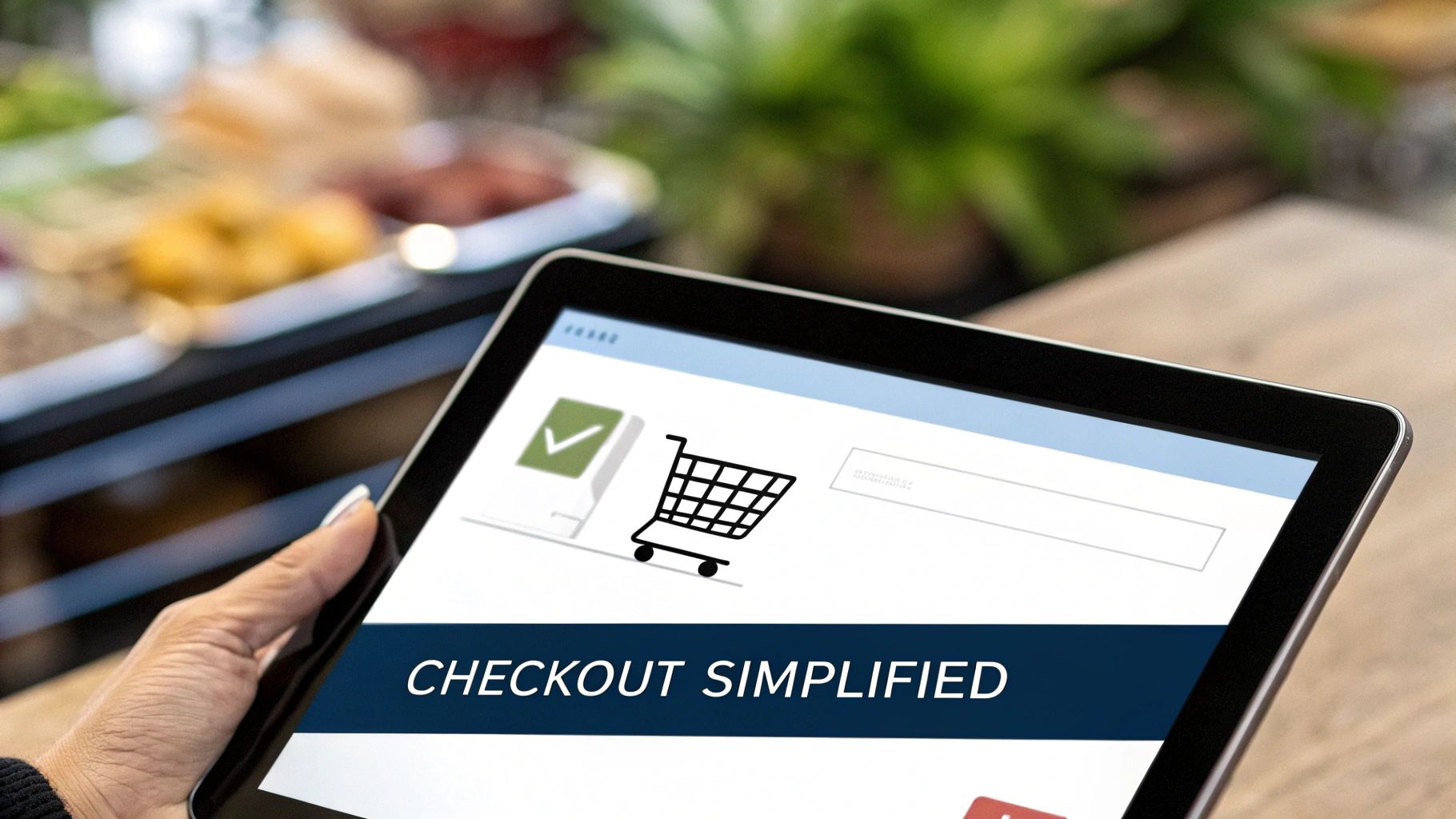
Design a Checkout Process People Actually Complete
The checkout is the final frontier. It’s the last hurdle between a casual browser and a paying customer, and it's also where most sales fall apart. The stats are pretty brutal: up to 70% of shoppers will add an item to their cart and then just… leave. Why? More often than not, it's because of a clunky, confusing, or downright frustrating checkout experience.
Your goal here is to remove every single piece of friction. Think of the checkout not as a form, but as a smooth, guided path to the finish line. Every field they have to fill out, every extra click, is a tiny invitation to second-guess the whole purchase. The best checkouts feel almost invisible.
Embrace the Power of Guest Checkout
One of the biggest roadblocks you can throw in front of a new customer is a "Create an Account" screen. Forcing registration before they can buy is a notorious conversion killer. People are busy, they don't want another password to remember, and they just want to complete their purchase and move on.
Making guest checkout a prominent, easy-to-find option is a massive win. It tells your customer you respect their time and are focused on getting them what they want, fast. You can always give them the option to create an account after the sale is complete, using the info they've already provided. It's a much softer ask.
Simplify and Streamline Your Forms
Every single field in your checkout form is a potential drop-off point. Be ruthless. Ask only for what you absolutely need to process the order. Do you really need their phone number? Is a "Company Name" field necessary for a B2C sale? Probably not.
A clean, logical form design makes the process feel shorter and less intimidating, which is a huge part of conversion psychology.
- Stick to a Single-Column Layout: A single, vertical column is far easier to follow than multiple columns, especially on a phone. It just flows better.
- Use Auto-Fill and Address Lookups: Leverage browser auto-fill capabilities and use tools that suggest addresses as someone types. This little feature saves a surprising amount of time and cuts down on typos.
- Provide Clear Error Messages: If a field is filled out wrong, show a clear, inline message right there explaining the problem. A generic "error on page" message at the top is a recipe for frustration.
Pro Tip: Keep the checkout page visually simple. A busy, cluttered page increases cognitive load and makes the whole thing feel overwhelming. Get rid of distracting navigation, headers, and footers. A minimalist design lets the customer focus on one thing: finishing their purchase.
If you're building a new store or overhauling an existing one, partnering with experts on a custom website design can ensure these best practices are baked into your site’s DNA from day one.
Eliminate Surprises and Build Trust
The number one killer of conversions at checkout? Unexpected costs. A shopper who has mentally committed to paying $50 for a product will feel blindsided when they suddenly see $15 in taxes and shipping tacked on at the very last second. It feels like a bait-and-switch.
Transparency is everything. Show all costs, including shipping fees and taxes, as early as you possibly can. A shipping calculator in the cart is a fantastic way to manage expectations before they even hit the final checkout page.
Beyond pricing, trust is critical when someone is about to hand over their credit card details. Use visual cues to reassure them that their information is safe:
| Trust Signal | Why It Works |
|---|---|
| Payment Logos | Showing logos for Visa, Mastercard, PayPal, and Apple Pay instantly communicates that you accept trusted payment methods. |
| Security Badges | A clear SSL certificate badge or a "Secure Checkout" icon provides visual proof of data encryption. |
| Contact Information | Making a phone number or support email easy to find shows there’s a real company behind the website, ready to help if needed. |
Finally, a simple progress bar showing the checkout steps (e.g., Shipping > Payment > Review) gives users a sense of control and momentum. They know where they are and how much is left, which reduces the anxiety of a seemingly endless form. When you design a checkout that is simple, transparent, and trustworthy, you turn a high-friction moment into a smooth final step.
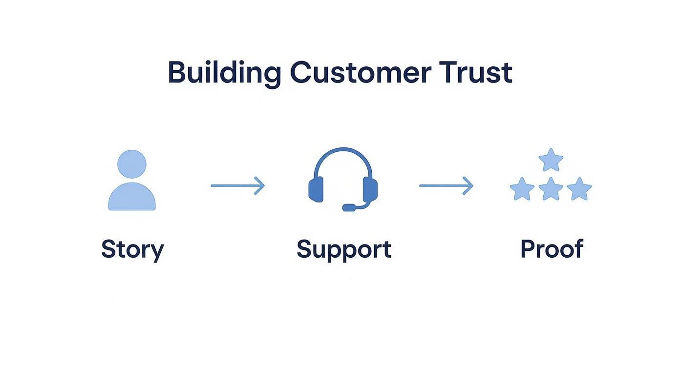
Build Unbreakable Trust with Your Customers
In e-commerce, a sale isn't just about exchanging money for a product—it's an exchange built on trust. A shopper won’t hand over their credit card details if they feel even a hint of uncertainty. Building that kind of unbreakable trust goes way beyond just having a secure checkout; it's about signaling credibility and humanity at every single touchpoint.
Your store needs to feel like it’s run by real people who stand behind their products. This means being transparent, accessible, and constantly reassuring the customer that they’re making a smart, safe choice. Think about it: every element, from your return policy to your 'About Us' page, is a chance to prove you’re a brand worth trusting.
Tell Your Story and Show Your Face
The 'About Us' page is one of the most underrated tools for building a human connection. Too many brands treat it as an afterthought, stuffing it with generic corporate jargon. This is a massive missed opportunity to tell your story and show the real people behind the curtain.
Share why you started the company. Talk about your mission and what you actually believe in. Most importantly, use real photos of your team, not sterile stock images. A compelling story turns a faceless website into a brand with a personality, making it far easier for a customer to feel connected and safe.
On that same note, your contact information should be incredibly easy to find. Don't bury it in the footer. A prominent "Contact Us" link with a physical address, a phone number, and a support email address signals that you are a legitimate business that is ready and willing to help.
Make Policies Clear and Customer-Friendly
Purchase anxiety is a major conversion killer, and it’s often fueled by unclear or scary-sounding policies. Customers are always thinking, "What happens if this isn't right? What if it breaks? What if it never shows up?" Your job is to proactively quiet those fears with simple, straightforward policies.
Your shipping and return policies should be written in plain English, not legal-speak. A simple Q&A format or clear bullet points can work wonders for answering the most common questions:
- How much does shipping cost?
- How long will it take to arrive?
- What is your return window?
- Is return shipping free?
Key Takeaway: The goal isn't just to have a policy, but to make it so easy to understand that it becomes a selling point. A generous, clearly communicated return policy can be the final nudge a hesitant shopper needs to click "buy."
To truly foster an unbreakable bond with your audience and encourage loyalty, consider the crucial role of accessibility in improving user experience and boosting sales for all customers.
Showcase Authentic Social Proof
At the end of the day, shoppers trust other shoppers more than they will ever trust you. This is exactly why authentic customer reviews are the most powerful trust signal you have. With around 2.77 billion online shoppers globally, reviews influence nearly all of them (99%), making social proof an absolute cornerstone of conversion optimization.
Integrating customer reviews directly onto your product pages is non-negotiable. Don’t hide them on a separate page. Display a star rating right up top near the product title and show the full reviews further down the page. Even negative reviews can build trust if you respond to them publicly and professionally—it shows you’re listening and you care about customer feedback.
User-generated content (UGC), like photos of customers actually using your products, is even more powerful. It provides unbiased, real-world evidence that your products are as good as you claim they are. This kind of authentic proof is invaluable, especially for brands selling on competitive platforms. If you're looking for platform-specific tactics, our guide on how to improve Amazon sales offers deeper strategies on leveraging reviews and UGC.
Use Testing and Personalization for Continuous Growth
Getting a solid conversion rate isn't a finish line you cross; it's a constant process of tweaking and improving. The engine that keeps this growth moving forward is a smart mix of systematic testing and personalization. It’s how you stop making changes based on gut feelings and start asking your audience directly what works best.
This is where your store evolves from a static website into a dynamic, ever-improving sales machine. By testing small changes—a different headline, a new product photo, or even just rewording a call-to-action—you can uncover what truly resonates with your customers. It's a simple cycle: hypothesize, test, and implement. That's what leads to steady, predictable growth.
Demystifying A/B Testing
At its core, A/B testing (also known as split testing) is a straightforward concept. You show two different versions of a webpage to two similar groups of visitors at the same time. From there, you just measure which version drives more conversions, whether that’s a sale, an email sign-up, or an "add to cart" click. It’s the most reliable way to prove that a change you made actually had a positive impact.
To run a clean test, you first need a solid hypothesis. A good one sounds something like this: "Changing the ‘Buy Now’ button text to ‘Get Your Kit Today’ will increase clicks because it's more specific and benefit-focused." This gives you a clear goal and a measurable outcome to track.
For example, here’s a peek at the interface for Google Optimize, a popular free tool for setting up these kinds of experiments.
This dashboard shows how you can create different "experiences" to test variations of your site, which is key to making decisions backed by data instead of just guesswork.
The trick is to test one thing at a time. If you change the headline, the main image, and the button color all at once, you’ll have no idea which change was responsible for the results. Patience is absolutely critical here. Running clean tests is a core component of most successful data-driven advertising solutions because it’s all about continuous, measurable improvement.
To help you get started, here are a few ideas that tend to deliver significant results.
High-Impact A/B Testing Ideas for Your Store
| Page Element to Test | Version A (Your Control) | Version B (A New Idea to Try) |
|---|---|---|
| Product Page Headline | Generic: "High-Quality Leather Wallet" | Benefit-Driven: "The Last Wallet You'll Ever Need" |
| Call-to-Action Button | Standard: "Add to Cart" | Urgent/Specific: "Add to Bag & Get 10% Off" |
| Product Images | Standard studio product shots | Lifestyle photos showing the product in use |
| Trust Badges in Checkout | No trust badges displayed | Prominently displaying SSL and payment logos |
| Shipping Information | Shipping costs shown at final checkout | "Free Shipping on Orders Over $50" in header |
These tests are a great starting point because they target key decision-making moments in the customer journey. Even a small lift from one of these can make a big difference.
Practical Personalization Strategies
Beyond testing, personalization is all about making each shopper feel like your store was built just for them. It involves using visitor data—like their browsing history, past purchases, or even their location—to tailor their shopping experience in real time. And it doesn't have to be overly complex to work.
Here are a few high-impact personalization tactics you can use:
- Recently Viewed Items: Showing a carousel of products a visitor just looked at is a simple way to keep those items top-of-mind and make it easy for them to jump back in.
- Behavior-Based Content: If someone has been browsing a specific category, like "women's running shoes," you can customize homepage banners and pop-ups to feature related products or offers.
- Geographic Targeting: Displaying seasonal items based on a visitor’s location—like showing winter coats to someone in a cold climate—makes your products feel instantly more relevant.
Personalization works because it shifts the experience from a generic catalog to a curated, one-on-one conversation. It shows the customer you understand their needs, which is a powerful way to build trust and drive conversions.
Focusing on Mobile-First Optimization
Understanding how customers shop on different devices is a massive piece of the conversion puzzle. Mobile phones now account for over 75% of retail site visits globally and generate about two-thirds of all online orders. The dominance is undeniable.
However, desktop still converts more efficiently, with rates around 3.35% compared to mobile’s 3.0%. This gap reveals a huge opportunity. While shoppers love to browse on their phones, many still hesitate when it's time to actually buy.
This friction often points to a mobile checkout process that’s clunky or a user experience that just isn't built for smaller screens. By A/B testing mobile-specific elements—like button sizes, form layouts, and payment options—you can close this gap and capture more sales from the massive volume of mobile traffic you're already getting. A true mobile-first mindset is non-negotiable for any modern ecommerce store looking to grow.
Frequently Asked Questions
When you're digging into ecommerce optimization, questions are bound to come up. Here are some straightforward answers to the ones we hear most often, designed to give you quick clarity on the challenges that matter.
What Is a Good Ecommerce Conversion Rate?
Everyone wants to know the magic number, but a "good" conversion rate is a moving target. The industry benchmark usually hovers between 2% and 4%, but that number can be misleading.
Your industry, product type, and price point change everything. A store selling affordable, impulse-buy accessories might easily hit 5%, while a brand selling high-end furniture with a long consideration cycle might celebrate a 1.5% rate.
The best approach? Stop chasing a universal number and start focusing on your own progress. Benchmark against your direct competitors if you can, but your real goal should be to consistently beat your own historical average. That’s the only metric that truly defines success for your store.
How Long Should I Run an A/B Test?
The perfect length for an A/B test comes down to one thing: traffic. Your goal is to collect enough data to hit statistical significance, which is just a fancy way of saying you can trust the results aren't a fluke. To do that, you typically need at least a few hundred conversions for each version you're testing.
Here’s a simple way to think about it:
- High-Traffic Sites: You could have reliable data in as little as one week.
- Smaller Stores: Be patient. It might take a month or even longer to get a clear winner.
Always run your tests for full weekly cycles—think 7, 14, or 21 days. This is non-negotiable. Shopper behavior on a Tuesday morning is completely different from a Saturday night, and running a test for a full cycle ensures you capture that natural rhythm, giving you a far more accurate picture.
What Single Change Has the Biggest Impact on Conversions?
There’s no magic bullet that works for every single store, but if you want the biggest bang for your buck, look no further than your checkout process. This is the final hurdle, where even the most motivated buyers will drop off if they run into friction.
If I had to pick just one area to overhaul, it would be one of these two game-changers:
- Offer a guest checkout. Forcing a new customer to stop and create an account is one of the fastest ways to kill a sale. It feels like a commitment they aren't ready to make.
- Show all shipping costs and taxes upfront. Nobody likes surprises, especially when it comes to their wallet. Unexpected fees are the #1 reason people abandon their carts. Be transparent from the start.
By removing these two massive roadblocks, you make it ridiculously easy for shoppers to finish what they started. The impact on your conversion rate is almost always immediate and substantial.
Ready to turn those clicks into loyal customers? The team at Next Point Digital builds conversion-focused websites and runs advertising that actually delivers. Find out how we can help you scale profitably.