If you want to reduce shopping cart abandonment, you need to get inside your customer's head. The quickest way to stop losing sales right at the finish line is to tackle the three biggest friction points: address unexpected costs, simplify the checkout process, and avoid forcing account creation.
Why Shoppers Really Abandon Carts
It’s a moment every ecommerce brand knows too well. A customer finds something they love, adds it to their cart… and then disappears. This isn't just a small hiccup; it's a huge revenue leak signaling that something went wrong between browsing and buying. The first step to plugging that leak is understanding exactly why they leave.

The numbers are staggering. Globally, a whopping 70.19% of online shopping carts are left behind before a purchase is made. The number one reason? Unexpected costs like shipping and taxes, which cause 47% of shoppers to bail. Right behind that is the dreaded "create an account" requirement, which can bump up abandonment by 25-30%.
Unpacking the Core Issues
At its core, cart abandonment is a symptom of friction and broken trust. A shopper who has spent their time picking out items expects a smooth, straightforward checkout. When they hit a roadblock, that excitement fizzles into frustration.
The biggest culprits are almost universal, no matter what you sell:
- Cost Shock: The price they agreed to in their head suddenly balloons with surprise shipping, handling, or taxes on the final page.
- Forced Commitment: Asking a new user to create an entire account is a huge ask. It feels like a chore they aren't ready for.
- Checkout Complexity: Long forms, confusing navigation, or not enough payment options can make finishing the purchase feel like too much work.
The moment a customer feels surprised or confused during checkout is the moment you're most likely to lose them. Transparency isn't just a best practice; it's the foundation of a high-converting checkout experience.
Top Cart Abandonment Reasons and Quick Fixes
You don't need a massive site overhaul to start making a difference. Small, strategic tweaks can deliver big results. The table below breaks down the most common reasons shoppers leave and the high-impact solutions you can implement right away.
| Abandonment Reason | Impact on Conversion | Effective Solution |
|---|---|---|
| Unexpected Costs | Very High | Display a shipping calculator or all-inclusive pricing in the cart. Offer a free shipping threshold. |
| Account Creation Required | High | Implement a prominent guest checkout option. |
| Complicated Checkout | High | Reduce form fields to only the essentials. Use a progress bar to manage expectations. |
| Security Concerns | Medium | Prominently display trust badges (e.g., SSL certificates, secure payment logos). |
| Limited Payment Options | Medium | Integrate popular digital wallets like Apple Pay, Google Pay, and PayPal. |
Each of these fixes targets a specific psychological barrier, from sticker shock to security anxiety. When you start removing these obstacles one by one, you create a much smoother path to purchase.
This foundational understanding is key to https://npoint.digital/improving-ecommerce-conversion-rates/ and turning those abandoned carts into completed sales. For a deeper look at specific strategies that work, check out these proven tactics to reduce shopping cart abandonment.
Designing a Frictionless Checkout Experience
Your checkout process should feel like an easy final step, not a final exam. After a customer has spent time browsing and selecting products, the last thing you want is for them to stumble at the finish line. This is where you transform a high-intent shopper into a paying customer by creating a seamless, transparent, and trustworthy path to purchase.

Far too many brands overcomplicate this critical stage, leading directly to frustration and lost sales. In fact, research shows that a complicated or long checkout process is responsible for 22% of all abandoned carts. The goal is simple: remove every unnecessary click, question, and moment of hesitation.
Welcome Everyone with Guest Checkout
One of the biggest conversion killers is forcing shoppers to create an account. For a new customer, being forced to create a username and password before they can buy is a huge, unnecessary commitment. It adds extra steps and raises privacy concerns, causing a staggering 26% of users to abandon their purchase.
The solution is simple: always offer a prominent guest checkout option.
- Reduce friction immediately: It lets first-time buyers complete their purchase without the upfront hassle of creating an account.
- Capture the sale now: You can always invite them to create an account on the post-purchase thank you page, after you've already secured their business.
Think of guest checkout as an express lane for new customers. It tells them, "We value your business and respect your time." This simple feature can dramatically reduce shopping cart abandonment.
Allowing a guest checkout doesn't mean you lose the opportunity to build a long-term customer relationship. After the purchase is complete, you can offer a one-click option to save their information and create an account for future orders. It’s a win-win.
Slim Down Your Checkout Forms
Every single field in your checkout form is a potential point of friction. The more information you ask for, the more work it feels like for the customer, and the higher the chance they'll just give up. Your mission is to strip your forms down to the absolute essentials needed to process the order.
Do you really need their phone number if you aren't offering SMS updates? Is a "company name" field necessary for a B2C transaction? Every field that isn't absolutely mandatory should be removed.
Essential Fields Only Checklist:
- Email Address: For order confirmation and communication.
- Shipping Information: Name, address, city, state, and zip code.
- Billing Information: This is often the same as shipping, so use a checkbox to auto-fill it.
- Payment Details: Credit card number, expiration date, and CVV.
By keeping your forms lean, you speed up the process and make it feel effortless, which is especially important for mobile users. A shorter form is way less intimidating and significantly increases completion rates. Our comprehensive guide on how to improve conversion rates for ecommerce offers more tips on optimizing every step of the customer journey.
Embrace Modern Payment Options
Today’s shoppers expect convenience, and that extends to how they pay. Relying solely on traditional credit card fields just isn't enough anymore. Integrating digital wallets is a powerful way to reduce cart abandonment because they offer a secure, one-click payment experience.
Apple Pay, Google Pay, and PayPal let customers complete their purchase using stored information, bypassing the tedious process of manually entering card and shipping details. This is an absolute game-changer on mobile, where typing on a small screen can be incredibly frustrating.
Offering these familiar and trusted options boosts confidence and speeds up that final step, capturing sales you might otherwise lose to impatience.
Build Unshakeable Trust with Security Signals
As customers get ready to enter their payment details, security becomes their top concern. Around 25% of shoppers abandon carts because they don't trust the site with their credit card information. You need to proactively reassure them that their data is safe.
Displaying security badges is a simple yet incredibly effective way to build this trust.
- SSL Certificates: Show a padlock icon and "https" in the URL.
- Payment Provider Logos: Display familiar logos like Visa, Mastercard, and PayPal.
- Security Seals: Include badges from well-known security companies like Norton or McAfee.
Place these trust signals visibly on the checkout page, especially near the payment information fields. This visual reassurance can be the final nudge a hesitant customer needs to click "Buy Now." To further refine your checkout and user experience, consider exploring these quick wins for e-commerce conversion rate optimization.
Mastering Price Transparency and Shipping Incentives
Surprise costs are the undisputed heavyweight champion of conversion killers. We've all been there: you find a product you love, agree to the price in your head, and then get hit with unexpected shipping and tax fees at the last second. It feels like a bait-and-switch.
That single moment of sticker shock is why a staggering 48% of shoppers ditch their carts. Building trust starts with being upfront about the real total cost, long before your customer hits the final payment screen.
Eradicate Sticker Shock Before It Happens
The goal here is simple: eliminate any and all guesswork around the final price. A customer should never have to get three-quarters of the way through checkout just to find out how much shipping will cost them.
The best way to do this is by integrating cost calculators right into your cart page, or even on the product pages themselves.
- Implement a Shipping Calculator: Let users pop in their zip code directly in the shopping cart. They'll get an accurate shipping estimate instantly, no surprises.
- Use Geolocation for Tax Estimates: Automatically estimate sales tax based on the user's location and add it right into the subtotal in the cart view.
- Be Upfront About All Fees: Got handling fees or other charges? Don't hide them. Display every single one as a clear line item from the very beginning.
This isn't just about avoiding a negative experience; it's about creating a positive and honest one. When a customer sees all the costs laid out, they feel informed and respected, making them far more likely to complete the purchase.
The moment a customer has to guess about the final cost, you've introduced friction. Total price transparency isn't a feature; it's a fundamental requirement for a trustworthy checkout process.
Turn Shipping from a Cost into a Conversion Tool
While unexpected shipping costs are a problem, free shipping is one of the most powerful psychological motivators in ecommerce. But offering it across the board isn't always profitable. The trick is to use shipping incentives strategically to not only close the sale but also boost your average order value (AOV).
A free shipping threshold is your best friend here. By offering free shipping on orders over a certain amount—say, $50 or $75—you give customers a compelling reason to add just one more item to their cart. It tackles a major pain point while directly increasing your revenue. Setting the right threshold, of course, means you need a rock-solid understanding of your margins, a topic we dive into in our guide on how to determine the price of a product for profit.
Gamify the Path to Free Shipping
Just stating "Free shipping on orders over $75" is good, but you can do better. Turn it into a mini-game with a dynamic progress bar or a clever message.
Picture this: a customer has $65 worth of products in their cart. Instead of just showing the subtotal, your site flashes a message:
"You're only $10 away from unlocking FREE shipping!"
That simple nudge completely reframes the situation. It’s no longer about spending more money; it’s about reaching a goal and earning a reward. This little trick is incredibly effective at getting customers to browse for one more small item to hit that magic number.
Effective Shipping Incentive Strategies
| Strategy | Primary Goal | Best For |
|---|---|---|
| Free Shipping Threshold | Increase Average Order Value (AOV) | Brands with a diverse product catalog and price points. |
| Flat-Rate Shipping | Simplify the buying decision | Stores where shipping costs are relatively consistent across orders. |
| Free Shipping on All Orders | Maximize conversion rate | Businesses with high-margin products where the shipping cost can be absorbed. |
By being transparent with every cost and using shipping as a strategic incentive, you can transform a major point of friction into a powerful tool for conversion. It’s all about building the trust needed to guide a shopper smoothly from their cart to a completed purchase.
Building Your Abandoned Cart Recovery Machine
A shopper who adds items to their cart and then disappears isn't a lost sale. Think of them as a highly qualified lead who showed clear intent to buy. Life simply got in the way, or a last-minute doubt crept in. This is where a proactive, automated recovery system turns that hesitation into a conversion, winning back customers who are just one nudge away from checking out.
The goal isn't to be pushy; it's to be helpful. A well-timed email, a relevant text, or a subtle ad reminds them of what they were excited about and makes it easy to pick up right where they left off. Research from top email marketing platforms shows that abandoned cart emails alone can pull in an open rate of over 41% and a click rate of nearly 10%—that’s a serious amount of revenue left on the table.
Crafting the Perfect Abandoned Cart Email Sequence
Email is the cornerstone of any solid recovery strategy. It’s personal, effective, and lets you build a narrative. The real key here is a multi-step sequence that escalates its message and value over time without driving your customer crazy.
A one-size-fits-all email blast just won't cut it. The timing and tone of your messages are everything.
- Email 1 (Sent 1-3 Hours After Abandonment): The Gentle Reminder. The first email should be a simple, friendly nudge. The best approach is to assume they were just distracted. Your only goal is to get them back to their cart with a clear, direct call to action. Keep the subject line straightforward—think "Did you forget something?" or "Your cart is waiting for you."
- Email 2 (Sent 24 Hours After Abandonment): Introduce Social Proof. If the first email didn't do the trick, the customer might be having second thoughts or looking at competitors. This is the perfect time to build their confidence. Of course, include the product images, but also add customer testimonials or star ratings directly in the email. Show them that other people love these products, reinforcing their initial good decision.
- Email 3 (Sent 48-72 Hours After Abandonment): Create Urgency or Offer an Incentive. This is your final shot. You can dial up the urgency with messages like "Your items are selling fast!" or "We can't hold your cart forever." Alternatively, a small, strategic incentive like a 10% discount or free shipping can be the final push they need to get over any price hangups.
Your recovery emails shouldn't just say, "Come back." They should anticipate and address potential objections. Remind them of your easy return policy, highlight key product benefits, and use social proof to build the trust they need to finally click "Complete Purchase."
Expanding Beyond Email with a Multi-Channel Approach
While email is powerful, relying on it alone means you're leaving money on the table. A true recovery machine meets customers wherever they are. Integrating SMS and retargeting ads creates a much more persistent and effective system.
This infographic shows just how transformative a simple incentive, like free shipping, can be. It shifts a customer's mindset from seeing high costs to actively looking for more items to add to their cart to hit that free shipping threshold.
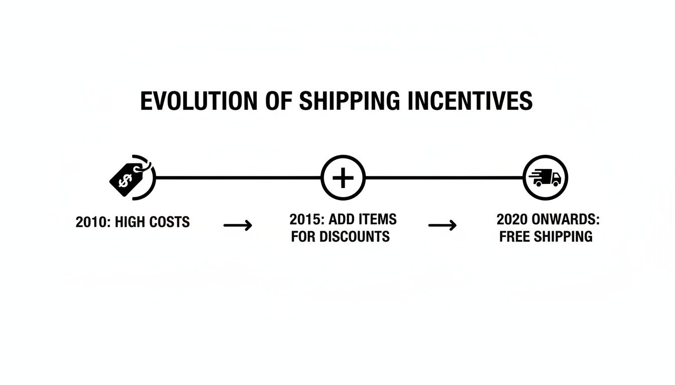
What was once a major barrier can be strategically turned into a powerful tool for conversion and upselling.
Using SMS Reminders for Immediate Impact
SMS messages have an almost unbelievable open rate, often within minutes of being sent. This makes them perfect for quick, time-sensitive reminders. An SMS sent a few hours after abandonment can be as simple as:
"Hey [Name]! Still thinking it over? Your items from [Your Brand] are saved and ready for you. Complete your order here: [Link]"
Keep your texts short, personal, and always include a direct link back to their cart. Just remember to use this channel sparingly—its impact comes from its rarity, and you don't want to feel intrusive.
Retargeting Ads to Stay Top of Mind
For shoppers who ignore your emails and texts, targeted retargeting ads are your next line of defense. These ads can pop up on social media or other websites they browse, showing them the exact products they left behind.
Retargeting Ad Campaign Ideas:
- Dynamic Product Ads: Show them pictures of the specific items they abandoned. This visual reminder is incredibly effective.
- Testimonial Ads: Pair the product image with a glowing review from a happy customer to tackle any lingering doubts about quality.
- Offer-Based Ads: If they've ignored everything else, an ad with a special offer like, "Complete Your Order Now for Free Shipping," might be the final trigger they need.
By combining these channels, you create a smart system that re-engages shoppers across different touchpoints. This approach respects their journey while persistently—and helpfully—guiding them back to the finish line. Building this machine is a core part of successful data-driven marketing strategies that turn abandoned carts into a reliable revenue stream.
Using Data to Continuously Reduce Abandonment
Fixing cart abandonment isn't a one-and-done project you can cross off your list. It's a constant cycle of improvement. The strategies that work today might lose their edge tomorrow, which is why the only way to stay ahead is to get obsessed with data.
This means turning hunches into hypotheses and gut feelings into measurable results. It’s the difference between reacting to problems and proactively hunting for optimization opportunities. Instead of just guessing why shoppers leave, you’ll know exactly where the friction points are and have a clear method for testing solutions.
Pinpointing the Leaks with Conversion Funnels
Your first move is to put on your detective hat. You need to map out the entire customer journey, from the moment they add an item to their cart all the way to the final thank-you page. The best tool for the job is a conversion funnel, which you can easily set up in Google Analytics or your ecommerce platform’s native analytics.
A checkout funnel gives you a visual breakdown of the steps a user takes and, more importantly, shows you the precise drop-off rate at each stage.
A typical checkout funnel looks something like this:
- Cart Page View: The user views their shopping cart.
- Begin Checkout: They click the "Checkout" button.
- Shipping Information: They enter their address.
- Payment Information: They proceed to the payment step.
- Transaction Complete: The purchase is made.
When you see a huge drop between two steps—say, 45% of users bail after entering their shipping info—you’ve found your biggest leak. That's not a guess; it's a data point screaming at you, telling you exactly where to focus your energy. A high drop-off at that stage is a massive clue that something's wrong with your shipping costs or delivery options.
Forming a Hypothesis and Running A/B Tests
Once you've zeroed in on a problem area, it's time to form a hypothesis. A hypothesis is just an educated guess about what change will produce a better result, and it usually follows a simple structure: "If I change [X], then [Y] will happen because [Z]."
Let’s stick with the payment page example. If you see a big drop-off there, your hypothesis might be:
"If we add digital wallet options like Apple Pay and Google Pay, then the checkout completion rate will increase because it removes the friction of manually typing in credit card details."
With a clear hypothesis in hand, you can run an A/B test (or split test). This is where you show two versions of your page to different segments of your audience at the same time. Version A is the original (the control), and Version B is the new version with your proposed change (the variation).
From there, you just measure which version performs better against your target metric—in this case, conversion rate. This scientific approach takes the guesswork out of the equation and ensures you're making decisions based on real user behavior, not just opinions.
What to Test for Maximum Impact
While you can test nearly anything on your checkout page, some elements have a much bigger impact on cart abandonment than others. You want to start with the high-impact changes that are most likely to move the needle.
| Element to Test | Why It Matters | Example A/B Test |
|---|---|---|
| Call-to-Action (CTA) Button | The CTA is the final instruction. Its color, text, and placement can dramatically influence clicks. | Test "Complete Purchase" vs. "Buy Now." Test a green button vs. an orange button. |
| Shipping Offers | Unexpected costs are the #1 reason for abandonment. How you present shipping is critical. | Test a "$50 free shipping threshold" vs. "Flat rate $5 shipping." |
| Trust Signals | Security concerns cause 25% of users to abandon. Reassuring them is key. | Test adding security badges (like Norton, McAfee) near the payment fields vs. having none. |
| Form Fields | A long, complicated checkout is a major friction point, deterring 22% of shoppers. | Test a single-page checkout vs. a multi-step checkout with a progress bar. |
Continuously testing these elements is fundamental to growth. For more ideas on what to test and how to structure your experiments, our guide on conversion rate optimization tips is a great place to start building a solid testing roadmap. By embracing a culture of experimentation, you can systematically plug the leaks in your funnel and turn more of those abandoned carts into completed sales.
Cart Abandonment Questions We Hear All the Time
Even with a solid game plan, you're bound to run into specific questions when trying to cut down your cart abandonment rate. Here are the answers to the questions we get asked the most, designed to give you quick, practical insights to fine-tune your strategy and get those sales back.
What’s the Single Most Effective Change I Can Make Today?
If there’s one thing you can do right now, it’s this: eliminate surprise costs.
You need to be completely transparent about shipping, taxes, and any other fees as early as you possibly can. We're talking on the product page or, at the very least, in the cart summary before the checkout process even begins.
Unexpected costs are the reason behind nearly 50% of all abandoned carts. Tackling this head-on builds instant trust, manages expectations, and almost always leads to a noticeable drop in abandoned carts right away.
How Important Is Mobile Optimization, Really?
It’s everything. Mobile shopping drives the majority of ecommerce traffic, but cart abandonment rates are always higher on phones. It makes sense when you think about it—smaller screens, clumsy typing, and shoppers who are way less patient than someone sitting at a desktop.
A fully mobile-optimized checkout isn't a "nice-to-have"; it's a must. It absolutely has to include:
- Large, easy-to-tap buttons that prevent those frustrating mis-clicks.
- Auto-fill for forms to cut down on manual typing.
- A simple, single-column layout that makes scrolling intuitive.
- Mobile wallet support like Apple Pay and Google Pay for true one-tap checkouts.
A clunky mobile experience is a guaranteed way to lose a sale from a customer who was 100% ready to buy.
What Is a Good Shopping Cart Abandonment Rate to Aim For?
The global average hovers around a pretty daunting 70%, but a "good" rate really comes down to your industry. Fashion and electronics, for instance, tend to have higher abandonment rates because people do a lot of comparison shopping. Niche industries, on the other hand, might see lower numbers.
Your real goal shouldn't be hitting a specific number, but rather achieving continuous improvement. Aim to get your rate below 60% to start, but the real win is seeing that number drop month after month.
Focus on systematically testing the strategies in this guide. A consistent downward trend is the true sign that what you're doing is working.
Are Discounts the Only Way to Recover Abandoned Carts?
Not at all. In fact, if you lean on them too much, you risk cheapening your brand over time. A small discount can be a great final push in a recovery email, but it’s just one tool in a much bigger toolbox.
Your recovery sequence should start with a simple, helpful reminder—no discount needed. From there, you can pull in other tactics that don't involve slashing your prices:
- Leverage social proof by adding a few glowing customer reviews for the items they left behind.
- Create a little urgency by letting them know stock is running low.
- Remind them why they should buy from you—highlight your easy returns, free shipping, or amazing customer support.
Use discounts as a strategic final offer, not your opening move.
At Next Point Digital, we turn your website's friction points into conversion opportunities. Our data-driven approach helps you figure out why shoppers are leaving, optimize your checkout, and build a powerful recovery machine that turns hesitant browsers into loyal customers. Let us build your roadmap to higher conversions at https://npoint.digital.