When people talk about “conversion-focused website design,” they’re talking about a strategic way of building a site. The primary goal isn't just to look good; it's to guide every single visitor toward a specific action, whether that's making a purchase, signing up for a newsletter, or requesting a demo.
It's a blend of user psychology, persuasive copywriting, and a genuinely intuitive user experience (UX). The entire point is to turn casual browsers into active, engaged customers. This approach is all about data, not guesswork, making sure every button, image, and headline has a clear purpose.
Building Your Foundation for High Conversions
A website that actually converts doesn't start with picking a color palette or a cool font. It begins with an almost obsessive understanding of your audience. If you guess, you'll end up with costly redesigns and a ton of missed opportunities. This foundational stage is all about creating a strategic blueprint based on who your customers really are, what they need, and how they behave online.
You have to move way beyond basic demographics. Knowing your customer is a 35-year-old male is useless. You need to understand his motivations, his frustrations, and the exact problem he’s trying to solve when he lands on your site. This is where the real work begins.
Creating Detailed Buyer Personas
A buyer persona is essentially a character profile for your ideal customer, built from market research and real data on your existing audience. This isn't just a list of facts; it’s a semi-fictional representation that brings your target user to life.
Your goal is to build a profile that feels like a real person you could have a conversation with. Make sure it includes:
- Pain Points: What specific frustrations or challenges keep them up at night? How does your product solve that?
- Goals and Motivations: What are they trying to accomplish? What's the end goal they're hoping to achieve by using your product?
- Psychological Triggers: What emotional drivers influence their buying decisions? This could be a fear of missing out (FOMO), a desire for social status, or a need for security.
- Watering Holes: Where do they hang out online? Think specific blogs, social media platforms, or industry forums.
Once you have a crystal-clear picture of who you're designing for, every decision becomes infinitely easier and more effective. You'll know exactly what kind of language to use, which visual style will grab their attention, and what features they'll actually care about.
Key Takeaway: A website designed for a specific, well-researched persona will always outperform one designed for a generic "everyone." You can't be everything to everybody, but you can be the perfect solution for somebody.
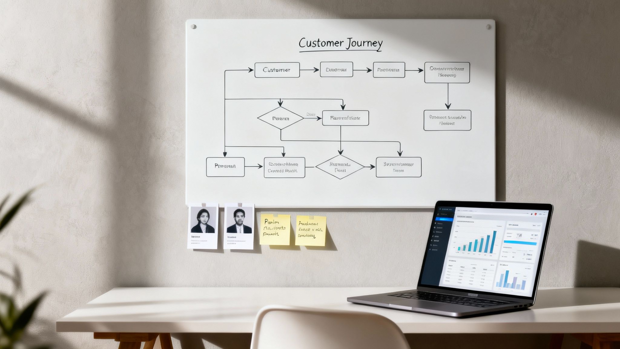
Mapping the Customer Journey
Okay, so you know who your customer is. Now you need to map out the path they take to find and interact with you. A customer journey map is a visual representation of every single touchpoint, from the first time they hear about your brand to the final purchase and even post-sale support.
Mapping this journey is critical for spotting roadblocks and friction points. You might discover that people are abandoning their carts because your shipping information is buried, or that the navigation from a blog post to a related product is clunky and confusing. These are the "leaks" in your conversion funnel that are costing you money.
This kind of analysis helps you be proactive instead of reactive. You're anticipating user needs and smoothing out the path before it becomes a problem. To really nail this, it's worth exploring different data-driven marketing strategies to get the deep insights you need for an accurate journey map.
Analyzing Your Competition
Finally, a solid foundation isn't complete without a clear-eyed look at the competition. Your customers are absolutely comparing your site to others, and you need to know what you're up against. This isn't about copying what they do; it's about spotting opportunities to do it better.
Go through their websites with a critical eye and look for:
- Strengths: What are they doing really well? Is their checkout process a breeze? Are their product photos amazing?
- Weaknesses: Where are they dropping the ball? Maybe their site is a nightmare on mobile, or they have zero social proof.
- Market Gaps: Is there a customer need that no one in your space is addressing properly?
This intelligence allows you to strategically position your own website to fill those gaps and deliver a superior experience. It makes sure your value proposition is not just clear, but genuinely unique in a crowded market.
Designing for Speed and a Seamless User Experience
In ecommerce, speed isn't a feature—it's everything. A slow, clunky website is probably the fastest way to lose a customer for good. If you're serious about building a conversion focused website design, you have to prioritize a lightning-fast experience that keeps people engaged and moving smoothly toward checkout.
Every millisecond really does count. Imagine your site loading in 1 second instead of 5. That tiny gap can actually triple your conversions. The data is pretty clear: B2C sites loading in 1 second see up to 2.5x higher conversion rates than those taking 5 seconds.
And it gets worse. Bounce rates can shoot up by 90% as load times stretch from 1 to 5 seconds. Every single second of delay can slash your conversions by another 7%.

Optimizing Your Technical Foundation
Long before a customer sees your beautiful design, their browser is working hard to download all the pieces that make up your page. This is where a lot of sites fall flat. The usual suspects? Bloated code, massive uncompressed images, and way too many third-party scripts.
Start with your images. Great product photography is non-negotiable, but those files don't need to be gigantic. Switch to modern image formats like WebP, which gives you fantastic quality at a much smaller file size compared to old-school JPEGs and PNGs.
Next, get ruthless with your third-party scripts. Every analytics tool, live chat widget, or social plugin adds to your load time. Take a hard look at each one. If it’s not providing a clear, measurable return, cut it loose.
Adopting a Mobile-First Design Philosophy
With more than half of all web traffic now coming from phones, a mobile-first approach isn’t just a good idea—it’s mandatory. This means you design the mobile experience first, then adapt it for tablets and desktops. Not the other way around. This simple shift forces you to prioritize what truly matters, leading to a much cleaner and more focused design for everyone.
A mobile-first mindset helps in a few key ways:
- It forces simplicity. You have limited screen space, so you have to cut the clutter and focus on the core user journey.
- It improves performance. Mobile-first designs naturally create lighter pages, which is a win for all users, no matter the device.
- It enhances usability. You’ll naturally use large, tappable buttons and readable fonts, making your site easier to navigate for everyone.
A common mistake I see all the time is brands just shrinking their desktop site to fit a mobile screen. This creates a terrible experience with tiny text and links that are impossible to tap. Real mobile-first design rebuilds the entire experience from the ground up, making sure every element is perfectly optimized for a smaller, touch-based screen.
Creating Clear and Intuitive Navigation
Once your site loads in a flash, the next hurdle is helping people find what they want without having to think about it. Confusing navigation is a certified conversion killer. A logical, predictable site structure removes friction and guides visitors effortlessly from your homepage all the way to checkout.
Keep your main navigation menu simple. Use clear, everyday language that your customers actually use. Don't get clever with jargon-filled labels. For instance, stick with "Men's Shoes" instead of something like "Gentlemen's Footwear."
A well-organized site also gives your SEO a nice boost, since it helps search engines understand your content hierarchy. To go deeper on this, check out our guide on improving ecommerce conversion rates for more strategies. A great experience isn't just about speed; it's about making the entire process feel obvious and effortless for the customer.
Crafting Persuasive Content and Visuals That Sell
A fast, seamless website gets users in the door, but it’s the persuasive content and compelling visuals that convince them to stay and actually make a purchase. This is where the art of conversion-focused design really comes alive, blending psychology with creative execution to build a narrative that sells.
It’s all about creating a cohesive message that not only grabs attention but also builds trust and systematically dismantles any hesitation a buyer might have. The synergy between words and images is incredibly powerful. A well-designed user interface can boost conversions by 200%, but pairing it with a thoughtful user experience can amplify that lift to a staggering 400%. This isn't about flashy gimmicks; it's about strategic communication that guides users toward a confident "yes."

Writing Copy That Connects and Converts
Your website's copy does the heavy lifting. It's your 24/7 salesperson, so it needs to be sharp, clear, and laser-focused on the customer. Every single headline and product description should answer one fundamental question for the visitor: "What's in it for me?"
Start by nailing your clear value proposition right on the homepage. This is a concise, punchy statement that explains the unique benefit you offer and why a customer should buy from you over anyone else. Forget the corporate jargon; use the language your customers actually use.
When it comes to product descriptions, you have to shift your focus from features to benefits. A feature is what something is (e.g., "water-resistant coating"). A benefit is what the customer gets from that feature (e.g., "stay dry and comfortable in any downpour"). This subtle change in perspective makes your products feel far more desirable.
Leveraging Visuals to Build Trust and Desire
People are visual creatures. Let's be honest—high-quality product photography and video aren't just nice-to-haves anymore; they are essential conversion tools. Your visuals should do more than just show the product—they should help the customer imagine it in their own life.
Here are a few visual elements that really drive sales:
- High-Resolution Photos: Show off your product from multiple angles, include in-context shots, and make sure there's a zoom function. Showcasing your product in a real-world setting helps customers visualize its value.
- Product Videos: A short video demonstrating a product in action can dramatically increase a shopper’s understanding and confidence to buy.
- 360-Degree Views: For complex products, allowing users to spin and inspect every single detail removes uncertainty and builds a ton of trust.
These assets help bridge the gap between shopping online and in-person, giving customers the tangible proof they need to click "Add to Cart."
Pro Tip: Your most important visuals and call-to-action (CTA) should stand out immediately. Use contrasting colors to make your CTA button "pop" against the background. For example, if your site's primary color is blue, an orange or yellow CTA will instantly draw the eye and encourage clicks.
Establishing Credibility with Trust Signals
Even with great copy and stunning visuals, shoppers are inherently skeptical online. Trust signals are the visual cues that reassure visitors your business is legitimate, secure, and valued by other customers. Remember, first impressions are 94% design-related, so these elements must be integrated seamlessly.
Sprinkle these trust-builders throughout your site, especially on product pages and during the checkout process:
- Customer Reviews and Ratings: Prominently display star ratings and authentic testimonials. Social proof is one of the most powerful motivators out there.
- Security Badges: Logos from well-known security providers (like Norton or McAfee) and payment options (Visa, PayPal) signal that financial information is safe.
- Guarantees and Policies: Clearly state your satisfaction guarantees, return policies, and shipping information to reduce any perceived risk.
These elements work together to lower a customer's defenses, making them feel secure enough to complete a purchase. Of course, a great way to serve these trust signals is through dynamic content, and you can learn more by exploring different ecommerce personalization software options that can help.
Optimizing Your Product Pages and Checkout Funnel
The journey from a curious browser to a paying customer hits its climax on your product pages and in the checkout funnel. These last few steps are where everything comes together—or falls apart. A single point of friction here can unravel all the hard work you’ve invested to get a customer this far.
Conversion focused website design treats these pages not just as transactional steps but as the final, most convincing arguments. Every element has to work together to build confidence, answer last-minute questions, and make the path to "buy" feel completely effortless and secure.
Anatomy of a High-Converting Product Page
Your product page is your digital showroom and your star salesperson rolled into one. It has to do more than just list features; it must create desire and erase any lingering doubt. It's time to think beyond static descriptions and focus on building a dynamic, reassuring experience.
A truly effective product page weaves together several key components:
- Clear Stock Indicators: Use urgency and scarcity ethically. Simple phrases like "Only 3 left in stock!" or "Selling fast" can give customers that gentle nudge they need to act now.
- Dynamic Pricing and Offers: Don't make customers hunt for a deal. Clearly display any discounts or special offers right upfront. If you have tiered pricing or bundles, present them in a clean, easy-to-compare format.
- Powerful Social Proof: Your reviews are your best marketing asset, so don't hide them. Feature star ratings prominently near the product title and showcase detailed customer testimonials further down the page. Even better? User-generated photos or videos.
- Smart Upsell and Cross-Sell Suggestions: Recommend related products intelligently. Instead of just a random list, suggest items that genuinely complement the one they're looking at, like "Frequently Bought Together" or "Complete the Look."
Key Insight: A common mistake is to treat the product page as a simple data sheet. Instead, view it as the climax of your customer's research. It should provide all the logical reasons to buy (specs, details) while also delivering the emotional triggers (reviews, lifestyle photos) that seal the deal.
Streamlining the Checkout Funnel for Maximum Conversions
The checkout process is where a shocking number of sales simply vanish. The average cart abandonment rate hovers around 70%, and a clunky or untrustworthy checkout is almost always the main culprit. Your goal here is ruthless simplification. Every field, every click, and every extra page load is a potential exit ramp.
One of the most powerful changes you can make is to eliminate distractions. Try removing elements like the main navigation bar from the checkout pages. This simple tweak forces the user to focus on a single task: completing their purchase. The impact can be huge; one famous A/B test saw signups jump from 3% to 6%—a 100% increase—just by removing the site header. It's a critical lesson that many ecommerce brands overlook, especially when you consider that top-performing sites convert at over 11%.
To really dial this in, exploring advanced features like customized web checkout solutions can dramatically improve the user experience and push conversion rates even higher.
Removing Friction Points Step-By-Step
To build a checkout funnel that actually converts, you have to get proactive about hunting down and eliminating those common friction points. Each optimization you make builds a little more trust and momentum, guiding the customer smoothly toward that final click.
The table below breaks down the most common issues in the checkout flow and the specific fixes that can have a major impact on your conversion rates.
Key Checkout Funnel Optimizations and Their Impact
| Friction Point | Optimization Strategy | Potential Impact |
|---|---|---|
| Forced Account Creation | Offer a prominent "Guest Checkout" option. | Reduces initial barrier, significantly lowering abandonment. |
| Surprise Shipping Costs | Display all costs (shipping, taxes) upfront in the cart. | Builds trust and transparency, addressing the #1 cause of abandonment. |
| Limited Payment Choices | Integrate multiple payment gateways (PayPal, Apple Pay, etc.). | Caters to user preferences and adds logos that act as security signals. |
| Long, Complex Forms | Use address autocomplete and combine fields (e.g., "Full Name"). | Speeds up the process and makes it feel less like work. |
Each of these strategies is designed to make the checkout process feel faster, safer, and more intuitive for the customer.
Here are the highest-impact optimizations you can implement today:
- Offer Guest Checkout: Forcing users to create an account is a notorious conversion killer. Always provide a prominent guest checkout option to get them through the door. You can always ask them to create an account on the "Thank You" page after the sale is complete.
- Be Upfront About All Costs: Nobody likes surprises at the end. Surprise shipping fees are the number one reason people abandon their carts. Display all costs, including shipping and taxes, as early as you possibly can. A shipping calculator in the cart is a great way to do this.
- Provide Multiple Payment Options: Cater to your customers' preferences by offering a variety of payment methods, including major credit cards, PayPal, Apple Pay, and Google Pay. The mere presence of trusted payment logos also acts as a powerful security signal.
- Simplify Form Fields: Only ask for the information you absolutely need to process the order. Use features like address autocomplete and a single field for "Full Name" instead of separate first and last name fields. Anything you can do to speed up the process helps.
Ultimately, a successful checkout process feels secure, transparent, and fast. For a deeper dive, our guide on how to improve conversion rates for ecommerce offers even more actionable strategies. By meticulously refining these final steps, you ensure that the traffic you worked so hard to attract actually turns into profitable, long-term customers.
Implementing a Continuous Optimization Framework
A conversion focused website design is never a "set it and forget it" project. It’s a living, breathing asset that should constantly evolve with your customers' needs. This is where a continuous optimization framework comes in, transforming your website from a static brochure into a data-driven sales engine.
The core idea is simple: stop guessing and start testing. This approach is all about making small, incremental improvements based on real user data. Over time, these tiny tweaks add up to massive gains in your most important metrics. Think of it as an ongoing conversation with your audience where their actions tell you exactly what you need to improve.
Setting Up Your Analytics Foundation
You can't optimize what you don't measure. Before you can make any meaningful improvements, you need a solid analytics foundation. This goes way beyond just tracking page views—you need to monitor the specific metrics that directly impact your bottom line and tell the story of your customer's journey.
Your analytics setup should give you clear answers to critical business questions. Where are people dropping off? Which pages are actually driving sales? What’s the true value of a customer coming from a specific marketing channel?
Key metrics you absolutely need to track include:
- Conversion Rate: The percentage of visitors who complete a goal, like making a purchase. This is your north star.
- Average Order Value (AOV): The average amount spent each time a customer places an order.
- Cart Abandonment Rate: The percentage of shoppers who add items to their cart but bail before buying. A high rate here signals friction.
- Customer Lifetime Value (CLV): The total revenue you can expect from a single customer over their entire relationship with your brand.
With this data in hand, you can move from vague hunches to educated guesses—or hypotheses—about potential improvements. This structured approach ensures every change you make is purposeful and, most importantly, measurable.
Forming and Testing Your Hypotheses
Once your analytics are humming along and you've spotted areas for improvement, it's time to form clear, testable hypotheses. A good hypothesis isn't a wild guess; it's a specific, predictive statement about what you believe will happen if you make a particular change.
It follows a simple structure: "If I change [X], then [Y] will happen, because [Z]. "
For example, "making the 'Add to Cart' button bigger might help" is a weak guess. A strong hypothesis is: "If we change the 'Add to Cart' button color from grey to bright orange, the conversion rate on product pages will increase because the button will be more visually prominent and grab the user's attention." See the difference?
This scientific approach is the heart of Conversion Rate Optimization (CRO). The most common ways to test these hypotheses are A/B testing and multivariate testing.
- A/B Testing (or Split Testing): You create two versions of a page—the original "A" and the variation "B"—and show them to different segments of your audience to see which one performs better. It’s a straight-up showdown.
- Multivariate Testing: This is a bit more complex. It lets you test multiple variations of several different elements on a page at the same time to find the absolute winning combination.
To keep your testing pipeline full of fresh ideas, it’s always a good idea to explore various actionable conversion rate optimization tips from around the industry.
Expert Insight: The most successful companies don't see testing as a one-off project; it's baked into their culture. Econsultancy research shows that 50% of firms view CRO as essential to their digital marketing, with the most dedicated testers running 50% more experiments and achieving incredible results.
The Power of Personalization in Optimization
Personalization takes your optimization efforts to a whole new level. Instead of showing the same generic website to everyone, you can deliver dynamic, tailored experiences to individual users based on their behavior, location, or past interactions.
This means you can present unique offers, relevant product recommendations, and calls-to-action that resonate on a personal level. Personalized CTAs are especially powerful. A returning customer seeing "Welcome Back, [Name]! See What's New" is far more compelling than a generic "Shop Now."
The numbers don't lie. Personalized "smart" CTAs have been shown to outperform static ones by an incredible 202%. It’s not just a trend; it's a proven strategy with an average ROI of 223%.
The checkout funnel below perfectly illustrates how you can visualize and optimize this path, guiding users smoothly from the product page to a completed order.
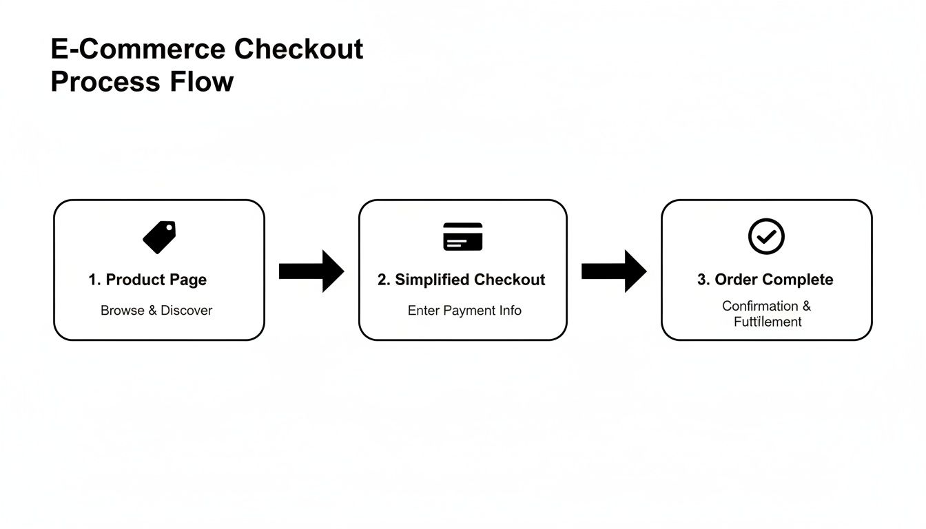
This visual highlights how a streamlined journey reduces friction at every turn. By implementing a data-driven framework, you ensure your website continuously evolves, turning valuable insights into higher revenue and a much better customer experience. To keep refining your strategy, it's worth reviewing some established conversion rate optimization best practices that can guide your testing roadmap.
Common Questions Answered
When you're diving into conversion-focused design, a few questions always seem to pop up. Let's tackle the most common ones I hear from clients and in workshops, so you can get clear, practical answers and move forward with confidence.
How Long Does It Take to Actually See Results From a Redesign?
It’s a fair question. You’ve just invested time and money, and you want to see a return.
You can often spot initial improvements—like a lower bounce rate or more time spent on pages—within just a few weeks of launching a clean, fast, and user-friendly site. These are great signs that visitors are finding it much easier to stick around and explore.
But the real, significant lift in your conversion rate? That usually takes shape after about two to three months of consistent testing and digging into the data. Think of the redesign as building a strong foundation, not the finish line. It's the iterative A/B testing that follows that truly unlocks sustainable growth.
What Is the Single Most Important Thing to Test First?
Every site is unique, but if I had to put my money on one thing, it's almost always the call-to-action (CTA). This isn't just about the button's color. You should test everything from the text ('Buy Now' vs. 'Add to Cart'), to its size, shape, and placement on the page.
Here's a pro tip: Don't underestimate personalization. CTAs that change based on user behavior have been shown to boost conversions by over 200%. A small tweak here can deliver an outsized impact.
Once you’ve dialed in your CTAs, shift your focus to the headlines and the core value proposition on your most important pages. These elements work together to grab a visitor's attention in those first critical seconds.
Can I Apply These Principles to My Amazon or Walmart Listings?
Absolutely. While you don't have control over the entire page layout on marketplaces like Amazon or Walmart, the core principles of persuasive design are just as powerful. Your job is to optimize the hell out of every element you can control.
Focus your energy here:
- Benefit-Driven Images: Use high-quality photos and infographics that show your product solving a real-world problem. Don’t just show the product; show the outcome.
- Persuasive Copy: Your titles and bullet points need to hit on customer pain points and highlight clear benefits. Think like your customer, not like a product engineer.
- Active Review Management: Get proactive about encouraging reviews and always respond to them—good or bad. This builds incredible social proof right where people are looking for it.
- Engaging A+/EBC Content: Use Enhanced Brand Content to tell a story. Break down features visually and create a brand experience that sets you apart from the sea of competitors.
Nailing these elements is how you stand out in a crowded marketplace and convince shoppers to click "add to cart."
Should I Focus on Driving Traffic or Conversion Optimization First?
This one’s a no-brainer for most businesses: focus on conversion optimization first.
Driving a flood of traffic to a website that leaks customers is like trying to fill a bucket full of holes. It's expensive, frustrating, and incredibly inefficient.
First, fix the leaks. Plug the holes in your user experience, polish your product pages, and streamline your checkout process. Once you've built a site that effectively turns visitors into customers, every dollar you spend on ads or SEO will generate a much, much higher return. Get your conversion rate healthy, then open the traffic floodgates for profitable growth.
Ready to stop guessing and start building a site that actually converts? The team at Next Point Digital specializes in data-driven ecommerce websites that turn casual browsers into loyal customers. Let's build a strategic roadmap for your brand's growth. Get in touch with us today!