Improving your ecommerce conversion rate isn’t about chasing some magic number. It’s about systematically turning more of your hard-earned website visitors into paying customers by smoothing out every bump in their buying journey.
The whole process boils down to three core pillars: creating an effortless user experience, building unbreakable trust, and simplifying the path to purchase. Even small, data-driven tweaks in these areas can lead to some seriously significant sales growth.
Your Starting Point for Higher Ecommerce Conversions
Struggling to turn website traffic into actual sales? You’re definitely not alone. It’s a classic challenge for online stores: plenty of visitors browse, but they just don’t buy. This guide is designed to move beyond generic advice and give you actionable strategies that create a real impact, focusing on the foundational principles that directly influence a customer’s decision to hit that “buy” button.
We’re going to walk through how to analyze your store’s performance, from the moment a user lands on your site to the final ‘thank you’ page. Pinpointing exactly where customers are dropping off is the first and most critical step to fixing the leaks in your sales funnel. For a deeper dive, check out these actionable strategies for mastering your ecommerce conversion rates.
Understanding Your Baseline
Before you can improve, you need to know where you stand. A benchmark is everything. While the global average ecommerce conversion rate hovers somewhere between 2% and 4%, that number hides some massive differences across industries.
For instance, personal care products often see a conversion rate of 6.8%. On the other hand, fashion, jewelry, and shoes lag behind at just 1.9%, and home decor sits even lower at 1.4%.
This data makes one thing crystal clear: a “good” conversion rate is completely relative. Your real goal should be continuous improvement against your own historical performance and your specific industry’s standards.
Key Takeaway: Stop chasing a universal conversion rate number. Instead, get to know your industry benchmarks and build a process for making incremental gains. For a high-traffic store, even a tiny 0.5% increase can translate into thousands in new revenue.
This visual breaks down the three core pillars for improving conversions: creating a smooth journey, building trust, and making the purchase process as simple as possible.
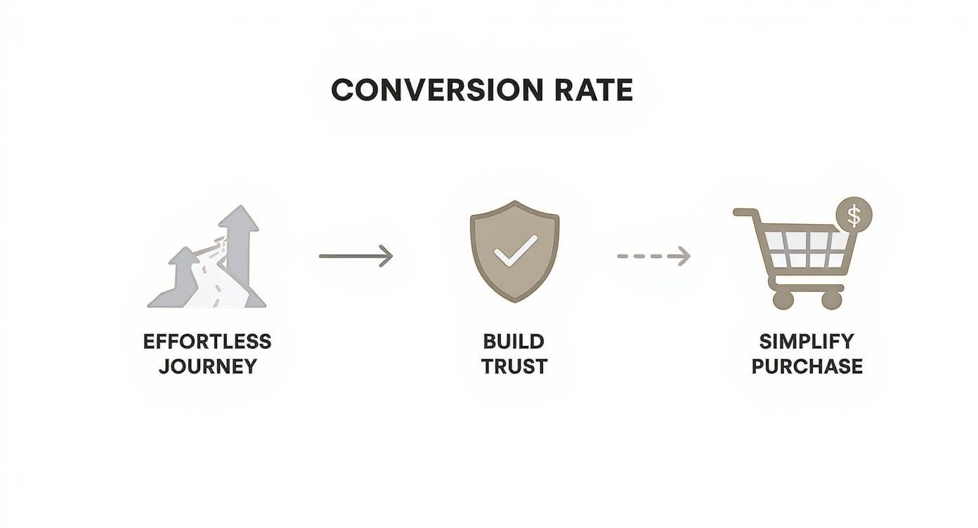
Each of these stages builds on the last, guiding a visitor from their initial interest all the way to a confident purchase decision.
To help you get started, this table outlines the most important areas to focus on for quick wins.
Key Focus Areas for Immediate Conversion Uplift
| Strategy Area | Common Problem It Solves | Primary Goal |
|---|---|---|
| Product Pages | Unclear value proposition, low-quality images, and missing social proof. | Build desire and answer customer questions before they’re asked. |
| Mobile Experience | Slow load times, difficult navigation, and tiny, unclickable buttons. | Create a seamless, intuitive experience for on-the-go shoppers. |
| Checkout Process | Surprise fees, mandatory account creation, and confusing forms. | Remove all friction and make paying as simple as possible. |
By homing in on these critical touchpoints, you can make strategic changes that will produce the most significant lift in your sales.
Pinpointing High-Impact Areas
If you want to effectively improve your ecommerce conversion rate, you have to know where to focus. Not all changes are created equal; some optimizations deliver far greater returns than others.
Based on my experience, the highest-impact areas are almost always:
- Product Pages: This is where the magic happens and desire is built. High-quality imagery, compelling descriptions, and clear social proof like reviews are completely non-negotiable.
- Mobile Experience: With most traffic now coming from mobile devices, a clunky, slow, or confusing experience is a direct leak in your revenue bucket. It has to be flawless.
- Checkout Process: This is the final hurdle, and it’s where most sales are lost. Surprise costs, mandatory account creation, and a long, complicated form are the top reasons people abandon their carts.
By concentrating your efforts on these critical touchpoints first, you can make strategic changes that produce the biggest and fastest lift in your sales.
Optimizing Your Digital Storefront and Product Pages
Your homepage and product pages are your digital storefront. This is where first impressions are made, where casual interest sharpens into a real desire to buy, and where the final decision happens. If you don’t get this part of the journey right, nothing else matters.
Step into your customer’s shoes for a second. When they land on your site, they’re firing off a bunch of subconscious questions: “Is this brand legit?”, “Will this product actually solve my problem?”, and “Can I trust them with my money?” Your job is to answer “yes” to all of them, and fast. That starts by creating an experience that’s both visually appealing and dead simple to use.
Crafting Product Pages That Sell
A great product page does more than just list features—it tells a story. It helps shoppers see the product in their own lives, answering every question and calming every doubt before it even pops into their head. And your best tool for that? High-quality visuals.
Shoppers don’t just want one or two photos; they expect to see a product from every possible angle in high resolution. But don’t stop there. A short video showing the product in action can be a game-changer for building confidence. If you sell clothes, show them on different body types. If you sell a gadget, show it solving a real-world problem.
Your product descriptions are just as crucial. Stop leading with jargon and technical specs. Lead with the benefits.
- Feature: “This backpack is made from water-resistant nylon.”
- Benefit: “Keep your laptop and books safe and dry, no matter the weather, with our durable water-resistant nylon backpack.”
See the difference? The benefit-driven copy connects the product to a real need, making the purchase feel both smart and satisfying. You can always tuck the technical details into an expandable “Specifications” section for those who want to dig deeper. To see how this ties into getting found in the first place, check out these ecommerce SEO best practices, which are vital for visibility.
The Power of Social Proof and Trust
Once a shopper is interested, their next move is to look for backup. “Do other people actually like this?” This is where social proof becomes your secret weapon. By placing customer reviews, ratings, and user-submitted photos right on the product page, you give them instant, unbiased credibility.
Shoppers trust other customers way more than they’ll ever trust your marketing copy. Highlighting detailed, honest reviews—even the occasional 4-star one—builds a kind of authenticity that slick ad copy just can’t touch.
Don’t just dump reviews on the page, either. Make them useful. Let customers filter reviews by rating, topic (like “fit” or “quality”), or even by the reviewer’s stats (like body type or skin type). This helps new shoppers find feedback from people just like them, making their decision that much easier.
Building an Intuitive Digital Storefront
Your homepage and category pages set the tone for the entire shopping experience. If they’re cluttered or confusing, you’ve already lost. The goal is to reduce what experts call “cognitive load”—basically, the amount of brainpower it takes to use your site. Make it effortless to find things.
Here are a few ways to make your storefront navigation a breeze:
- Simplify Your Main Menu: Don’t overwhelm people. Stick to a handful of essential top-level categories. Use simple, everyday language your customers would use, not your internal industry slang.
- Implement Smart Filters: On your category pages, let shoppers narrow down their choices with filters for size, color, price, brand, and whatever else is relevant. The easier you make it for them to find what they want, the more likely they are to buy it.
- Use High-Quality Banners: That banner on your homepage is prime real estate. Use it to show off your best offer, a new collection, or a seasonal sale. Just make sure the call-to-action (CTA) is crystal clear and links them right where they need to go.
When you focus on great visuals, benefit-focused copy, solid social proof, and simple navigation, you turn your product pages from static listings into powerful conversion tools. You’re no longer just showing a product; you’re building confidence and guiding the customer smoothly from browsing to buying.
Mastering the Mobile Shopping Experience

A clunky mobile experience isn’t just an annoyance anymore; it’s a direct leak in your revenue pipeline. Simply having a “mobile-friendly” site that shrinks to fit a small screen is old news. To truly move the needle on conversions, you need a “mobile-first” powerhouse designed from the ground up for the on-the-go shopper.
This shift in thinking is critical. While mobile devices account for the majority of online traffic, they lag significantly in actual sales. The numbers tell the story: desktop users convert at 4.8% compared to just 2.9% on mobile, even though mobile devices generate 73% of all e-commerce traffic.
That gap highlights a massive opportunity. Mobile cart abandonment rates soar to a staggering 77.2%, often due to solvable usability issues. If you want to dive deeper into these numbers, Speed Commerce has some great benchmarks.
Designing for Thumbs, Not Cursors
The way people use their phones is fundamentally different. They use thumbs to tap, swipe, and scroll, often with one hand while doing something else. Your design has to feel intuitive for that kind of behavior, not frustrating.
This means creating large, easily tappable buttons and interactive elements. You need ample space around links and calls-to-action to prevent accidental clicks—a common source of user rage. Your navigation menu should be simplified, with primary categories immediately accessible without requiring tiny, precise taps.
Think about it: a customer is trying to browse your new collection while waiting in line for coffee. If they have to pinch and zoom just to read a product title or hit a button, they’ll give up and close the tab before their latte is even ready.
Streamlining Forms and Information Entry
Let’s be honest, entering information on a mobile device is a pain. Small keyboards and aggressive autocorrect can turn a simple form into a major hurdle. Every single field you ask a customer to fill out adds friction and increases the odds they’ll just quit.
Your goal is to eliminate as many steps as you possibly can.
- Autofill is your best friend. Leverage browser autofill for addresses and contact information. This single feature can drastically cut down the time it takes to check out.
- Use numeric keypads. Automatically trigger the numeric keypad for fields like phone numbers and credit card details. It’s a small detail that shows you respect the user’s time.
- Offer guest checkout. Making account creation mandatory is a known conversion killer, especially on mobile. Always offer a prominent guest checkout option to get shoppers to the finish line faster.
Pro Tip: Go through your checkout form field by field and ask, “Is this absolutely essential to complete the purchase?” If you can get the information later or it isn’t truly necessary, cut it. A shorter form almost always leads to a higher completion rate.
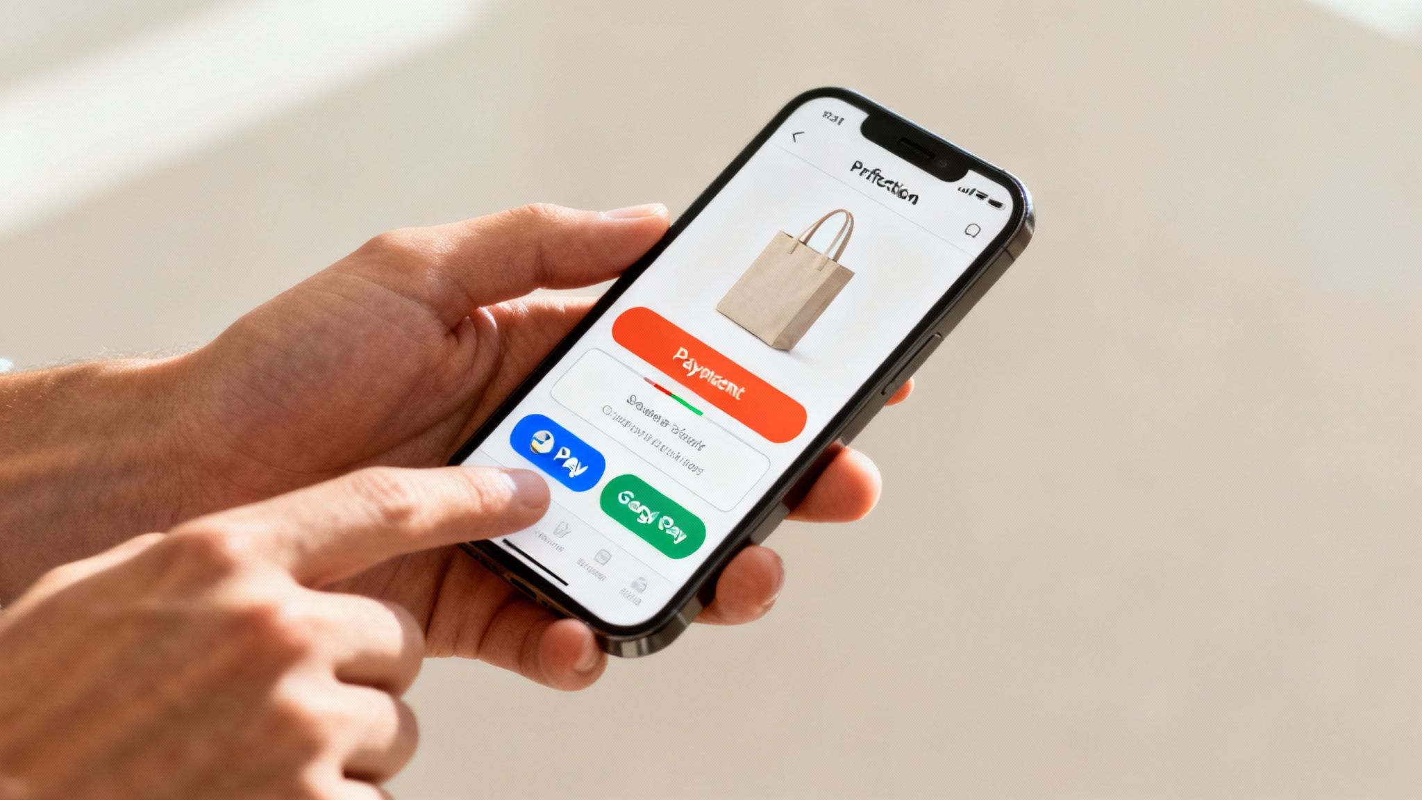
Integrating One-Click Payment Solutions
The final step—payment—is where so many mobile sales die. Fumbling with a wallet to find a credit card and manually entering 16 digits is the exact opposite of a seamless experience. This is where one-click payment options become a game-changer.
Integrating digital wallets like Apple Pay, Google Pay, and Shop Pay lets customers complete a purchase with a fingerprint or facial scan. This removes the single biggest point of friction in the entire mobile checkout process. It transforms a multi-step chore into a single, secure tap.
For brands trying to figure out how to increase online sales, this is a non-negotiable part of the strategy.
Ultimately, mastering the mobile experience means obsessing over speed, simplicity, and convenience at every touchpoint. When you build an interface that feels natural on a small screen, minimize data entry, and offer effortless payment methods, you close the gap between mobile traffic and mobile revenue. You start turning those casual browsers into loyal, paying customers.
Streamlining Your Checkout to Reduce Abandonment
You’ve done all the hard work. You got a visitor to your site, helped them find the perfect product, and they finally added it to their cart. Now comes the moment of truth: the checkout.
This is where the sale is either won or, all too often, lost. A clunky, confusing, or untrustworthy checkout is the fastest way to lose a sale you were seconds away from closing. Think of it as the final handshake—it needs to be smooth, reassuring, and completely transparent. Every single field, click, and loading screen is another chance for a customer to get frustrated and leave.
Eliminate Surprise Costs
Want to kill a sale instantly? Hit them with an unexpected fee. When a customer clicks “checkout,” they have a price in their head. Seeing that total jump because of high shipping costs or hidden taxes is a jarring experience that feels like a bait-and-switch. In fact, it’s the leading cause of cart abandonment.
Your most powerful tool here is transparency. Don’t hide the full cost until the very last step.
Key Takeaway: Be upfront with estimated shipping costs and taxes as early as you possibly can—ideally right on the cart page. Adding a shipping calculator or a clear banner like “Free shipping on orders over $50” manages expectations and builds trust right away.
This simple act of honesty prevents the sticker shock that derails countless sales. It shows respect for the customer’s budget and proves your brand operates with integrity. Our complete guide offers more insights on how to improve conversion rates for your ecommerce store by building this exact kind of trust.
Simplify the Path to Purchase
When it comes to checkout, less is always more. Every unnecessary field you force a customer to fill out adds friction and increases the odds they’ll just give up. The goal is to make the entire process feel effortless, guiding them to the finish line with as little thinking as possible.
Take a hard look at your checkout form. Do you really need their phone number? Is the “Company Name” field essential for a residential delivery? I’ve seen clients boost their completion rate just by removing one or two non-essential fields.
Make Guest Checkout Non-Negotiable
Forcing a first-time buyer to create an account before they can check out is a massive conversion killer. They aren’t ready for a long-term relationship yet; they just want to buy something. Making account creation mandatory feels like a tedious chore standing between them and their purchase.
You absolutely must offer a prominent, easy-to-find guest checkout option. You can always ask them to save their information and create an account after the purchase is complete. This simple shift in timing respects their immediate goal and cuts out a huge point of friction.
Here are a few quick wins to simplify your checkout flow:
- Use a Progress Indicator: Show shoppers exactly where they are in the process (e.g., Shipping > Payment > Review). This visual cue lets them know how much is left and makes the whole thing feel shorter.
- Leverage Autofill: Make sure your forms are properly coded to work with browser autofill for addresses and contact info. It saves time and prevents typos.
- Integrate Digital Wallets: Give them one-click payment options like Apple Pay, Google Pay, and Shop Pay. These bypass manual credit card entry entirely, creating a truly seamless transaction.
By relentlessly removing friction and building trust through transparency, you transform your checkout from a final hurdle into a smooth and reassuring end to the shopping journey. This final step is often the most impactful place to focus when you want to see a real lift in your conversion rate.
Use Personalization and Trust Signals to Your Advantage

In a market this crowded, a generic, one-size-fits-all shopping experience is a guaranteed way to get ignored. Today’s customers don’t just want you to understand their needs—they expect it. This is where personalization stops being a buzzword and starts driving real conversions.
But making shoppers feel understood is only half the battle. They also need to feel secure enough to pull out their wallets. By combining smart personalization with clear, undeniable trust signals, you create a powerful synergy that turns hesitant browsers into confident buyers. It’s the difference between a website that just sells products and one that builds relationships.
Make Every Customer Feel Seen
Effective personalization is about being helpful, not creepy. It means using customer data—like browsing history, past purchases, and even recently viewed items—to make their shopping journey smoother and more relevant. When you get it right, it feels less like an algorithm and more like a great store assistant guiding them to exactly what they need.
Think about it: a customer who only buys hiking gear shouldn’t be bombarded with ads for cocktail dresses. Instead, your homepage could feature new arrivals in outdoor apparel. Your product pages could suggest a waterproof jacket that pairs perfectly with the hiking boots they’re already looking at. That kind of relevance shows you’re paying attention.
When shoppers feel a brand understands them, they’re not just more likely to buy; they’re willing to spend more. Personalized recommendations can account for up to 31% of ecommerce revenue.
You don’t need a massive data science team to pull this off, either. Many platforms now offer tools that make this accessible. The goal is to move beyond generic “bestseller” lists and toward suggestions that feel uniquely curated for each visitor. If you’re exploring options, understanding the different ecommerce personalization software available is a great place to start.
Build an Unbreakable Foundation of Trust
Personalization gets a customer’s attention, but trust is what closes the deal. Shoppers are constantly, even subconsciously, looking for signs that your business is legitimate, secure, and will stand by its products. These “trust signals” are the visual and informational cues that calm their anxieties.
Put yourself in their shoes for a second. They’re about to hand over sensitive credit card information to a website they might have just discovered. They need reassurance, and fast.
This reassurance comes from a handful of key elements placed strategically throughout your site:
- Customer Reviews and Ratings: This is the most powerful form of social proof, hands down. Feature real reviews prominently on your product pages.
- SSL Certificates: That little padlock icon in the browser’s address bar is a non-negotiable sign that their connection is secure.
- A Clear Return Policy: A fair and easy-to-find return policy removes the risk from the purchase. If a customer knows they can easily send something back, they’re far more likely to buy it in the first place.
- Visible Contact Information: A phone number, email address, and physical address show there’s a real company with real people behind the website.
Where to Place Your Trust Signals for Maximum Impact
It’s not enough to just have these trust signals; you need to put them where they’ll have the most impact. The checkout process, in particular, is a high-anxiety zone where trust is everything. This is where many sales are won or lost.
Consider adding these small but powerful elements right at the finish line:
- Security Badges: Display logos for trusted payment options like Visa, Mastercard, and PayPal directly below the credit card fields.
- Money-Back Guarantees: A simple icon or a line of text like “30-Day Money-Back Guarantee” right next to the “Complete Purchase” button can be the final nudge a hesitant buyer needs.
- A Quick Testimonial: Even a short, impactful quote from a happy customer within the checkout flow can reinforce their decision to buy.
By weaving these signals of trust and personalization throughout the entire shopping experience, you address both the logical and emotional sides of a purchase. You show customers you know what they want while proving you’re a brand they can count on—creating a conversion-focused environment from the first click to the final thank you.
Let Data and Testing Drive Your Improvements
Boosting your e-commerce conversion rate isn’t a one-and-done task. It’s a constant loop of learning, testing, and fine-tuning. You can’t improve what you don’t measure, and this is the point where you trade gut feelings for hard data, letting real user behavior guide every single change you make to your site.
This whole process is called Conversion Rate Optimization (CRO). Think of it as a framework for systematically figuring out why your visitors aren’t converting and then testing smart solutions to fix those problems. It’s how you achieve sustainable growth by swapping guesswork for a data-backed method.
Finding Opportunities in Your Analytics
Your analytics platform—whether it’s Google Analytics, Shopify Analytics, or something else—is an absolute goldmine. It tells you exactly where your sales funnel is leaking customers. Don’t get overwhelmed by the sheer volume of data; instead, zoom in on a few key metrics that pinpoint the real problem areas.
A great place to start is the user flow or funnel visualization report. This map shows you the step-by-step journey people take, from landing on a page to checking out, and it’ll immediately highlight where the biggest drop-offs are happening. Is there a massive exit rate on one particular product page? Are people ditching the first step of your checkout in droves? These are your clues.
Keep a close eye on these critical metrics:
- Bounce Rate: The percentage of visitors who land on a page and leave without clicking anything else. A high bounce rate on a key landing page often signals a mismatch between your ad and what the page actually offers.
- Cart Abandonment Rate: The percentage of shoppers who add items to their cart but never finish the purchase. This is a massive red flag pointing to friction in your checkout process.
- Average Session Duration: How long visitors are sticking around. If it’s low, it might mean your content isn’t engaging or your navigation is a confusing mess.
These numbers don’t just tell you what’s happening. They point you toward why it’s happening, giving you a solid foundation for your improvement strategy.
Developing and Testing Your Hypothesis
Once you’ve identified a problem spot, it’s time to form a hypothesis—an educated guess about what change will produce a better result. A solid hypothesis isn’t just a vague idea; it’s specific, measurable, and totally testable.
Steer clear of fuzzy ideas like, “making the button bigger will help.” A professional frames it like this:
We believe that changing the ‘Add to Cart’ button color from grey to bright orange will increase clicks by 15% because it will create a stronger visual contrast, making the primary call-to-action more noticeable.
See the difference? This statement clearly identifies the problem (low visibility), proposes a specific solution (color change), and sets a measurable goal (15% increase in clicks). With a hypothesis this sharp, you’re ready for A/B testing.
The Fundamentals of A/B Testing
A/B testing, or split testing, is simply comparing two versions of a webpage to see which one performs better. In a typical test, you show the original version (the “control” or “A”) to one group of visitors and the new version (the “variation” or “B”) to another.
The beauty of A/B testing is you can test almost anything, from a tiny tweak to a complete overhaul.
- Headlines: Does a benefit-driven headline pull in more clicks than a feature-focused one?
- Call-to-Action (CTA) Text: Does “Buy Now” outperform “Add to Basket”?
- Images and Videos: Does a lifestyle photo of the product in use convert better than a boring studio shot?
- Page Layout: Would moving customer reviews higher up the page build more trust and drive more sales?
Running these tests gives you quantitative, black-and-white data on what your specific audience truly responds to. You’re no longer guessing; you’re making informed decisions based on real user behavior. For those who want to build a more robust framework, our guide on implementing data-driven marketing strategies offers a much deeper dive into this process.
This ongoing cycle of analysis, hypothesis, and testing is the engine that drives consistent growth. It turns the big, daunting question of “how to improve my conversion rate” into a manageable, step-by-step process that builds momentum with every single successful test.
Frequently Asked Questions
Digging into conversion rate optimization always brings up questions. Below are some quick, no-nonsense answers to the challenges I see e-commerce owners wrestling with the most.
What Is a Good Ecommerce Conversion Rate?
Everyone wants to know the magic number, but the truth is, a “good” e-commerce conversion rate is a moving target. The industry benchmark sits somewhere between 2% and 4%, but this number can be misleading.
Your industry and price point change everything. A grocery store selling low-cost, high-frequency items might hit 5% without breaking a sweat. Meanwhile, a luxury furniture brand could be celebrating a 1.5% rate because their average order value is thousands of dollars.
My advice? Stop chasing a universal number. Benchmark against your direct competitors, but focus more on improving your own baseline, month after month. That’s the only metric that truly matters.
How Can I Quickly Improve My Mobile Conversion Rate?
If you want to see a fast lift in mobile sales, zero in on three things: speed, simplicity, and payments.
First, get obsessive about your mobile site’s load time. Mobile shoppers are notoriously impatient, and a delay of even a few seconds will send them running to a competitor.
Next, simplify everything. Your navigation, your forms, your checkout process—cut out any field, button, or step that isn’t absolutely critical to making a purchase.
Finally, the biggest and fastest win is almost always payments. Adding one-click options like Apple Pay, Google Pay, or Shop Pay is a game-changer. It gets rid of the painful process of typing in credit card details on a tiny screen, which is where a ton of mobile sales die.
What Is the Single Most Important Factor for Conversions?
If I had to boil it all down to one thing, it’s trust. It’s that simple. A shopper who doesn’t feel secure or confident in your brand will never complete a purchase.
Trust isn’t built with a single badge or promise. It’s the result of many small signals all working together seamlessly.
This includes things like:
- A professional, modern site design that looks credible.
- High-quality product photos that show exactly what the customer is getting.
- Transparent pricing—no surprise fees sprung at the last minute.
- Customer reviews and social proof placed where people can see them.
- Visible security badges (like SSL certificates) during checkout.
- A clear, fair, and easy-to-find return policy.
Without this foundation of trust, every other tweak you make will only have a limited impact.
How Do I Know What to A/B Test on My Site?
Stop guessing and let your data show you the way. Dive into your analytics and hunt for pages with high traffic but a steep exit rate. This might be a product page, a category page, or the first step in your checkout flow. These “leaky” pages are your biggest opportunities.
Once you find a problem area, form a clear hypothesis based on what you see. For example: “We believe adding customer testimonials directly below the ‘Add to Cart’ button will boost conversions because it will ease buyer hesitation right at the moment of decision.”
From there, you test that one specific change. That’s how you get real, actionable insights instead of just throwing ideas at the wall.
Ready to stop guessing and start growing? Next Point Digital specializes in data-driven strategies that turn more of your visitors into loyal customers. We analyze every touchpoint in your sales funnel to uncover hidden opportunities and implement proven tactics to boost your conversion rate. Let’s build your growth roadmap today.