Improving your conversion rate is all about turning the traffic you already have into more revenue. It’s a simple concept, but it’s incredibly powerful.
It starts with digging into your sales funnel to see where people are dropping off. From there, you can start optimizing key pages—like your product and checkout pages—and continuously test your changes to see what actually moves the needle. Even a tiny lift can seriously boost your profitability without you having to spend a dime more on ads.
Why Your Ecommerce Conversion Rate Is Your Most Important Metric
Let's get real for a second. Your conversion rate isn't just another number on a marketing dashboard; it's the heartbeat of your store. While getting traffic from ads and SEO is crucial, CRO is what makes sure that investment actually pays off. Think of it as your single biggest growth lever—you're working with customers who are already at your digital doorstep.
When you truly understand how to improve your ecommerce conversion rates, you shift your business from a traffic-chasing machine into a revenue-generating engine. It’s amazing how small, strategic adjustments can have such an outsized impact on your bottom line. The whole game is about systematically removing friction and building trust at every single step of the customer journey.
The core of any effective CRO strategy is a straightforward, repeatable process: you diagnose the problem areas, roll out targeted optimizations, and then test everything to validate the impact.
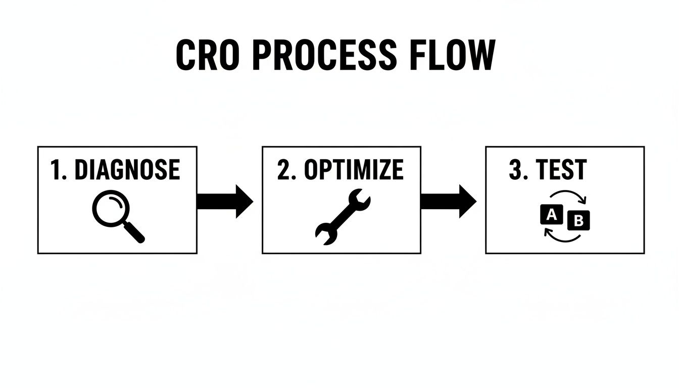
This simple workflow—Diagnose, Optimize, Test—is what turns guesswork into a structured, reliable strategy for sustainable growth.
The Financial Impact of Small Improvements
So, what does a “good” conversion rate even look like? The global average has been floating between 2% and 4% for the last few years. Unsurprisingly, desktop tends to convert higher (around 3.9–4.8%) than mobile (1.8–2.9%).
But here’s where it gets interesting. Nudging your rate up by just 0.5%—say, from 2.0% to 2.5%—translates to a 25% increase in orders from the exact same amount of traffic. This is why CRO consistently delivers one of the highest ROIs of any marketing activity you can do.
To set realistic goals, it helps to understand what is a good ecommerce conversion rate for your specific industry and audience.
The goal of CRO isn't just about tweaking buttons. It's about deeply understanding customer behavior and creating an experience so seamless and trustworthy that purchasing becomes the natural next step.
Your Roadmap to Higher Conversions
This guide is designed to be a clear, actionable roadmap grounded in proven data-driven marketing strategies. We’ll walk through everything you need to know, from the initial diagnostic deep-dive to running your first A/B tests.
To give you a quick preview, here are the most impactful strategies we’ll cover in this guide. Think of these as the primary levers you can pull to drive real change.
Key Levers for Ecommerce Conversion Rate Optimization
| Strategy Area | Primary Tactic | Expected Impact |
|---|---|---|
| Diagnostics & Funnel Analysis | Analytics review, heatmaps, session recordings | High |
| Quick Wins & Low-Hanging Fruit | CTA optimization, clear value propositions | Medium |
| Product Detail Page (PDP) Optimization | High-quality images, social proof, detailed descriptions | High |
| UX & Checkout Streamlining | Guest checkout, simplified forms, multiple payment options | Very High |
| A/B Testing & Experimentation | Data-backed testing on key pages and elements | High |
| Personalization & Upsells | Product recommendations, targeted offers | Medium |
These areas offer the biggest opportunities for growth. Now, let’s break down exactly how to tackle each one, starting with diagnosing your funnel.
Diagnosing Your Sales Funnel to Find the Leaks
Before you touch a single button on your site, you need to put on your detective hat. So many brands jump straight into testing random things—changing button colors, tweaking headlines—without knowing why. That’s like navigating without a map. You’ll burn through time and money making changes that don't actually fix the real problems.
Your first job is to find exactly where your sales funnel is leaking customers.
The good news? You probably already have the tools you need. Platforms like Google Analytics 4 (GA4) or the built-in analytics on Shopify are perfect for this initial diagnostic work. They let you build a clear picture of your customer journey, from the moment someone lands on your site to the second they hit that "thank you" page.
This whole process is called funnel analysis, and it's less about staring at spreadsheets and more about understanding human behavior. It shines a massive spotlight on the specific steps where you're losing the most people. That's your starting point.
Mapping Your Customer Journey with Analytics
First things first, you need to define the key stages of your funnel. For most ecommerce stores, it looks something like this:
- Homepage/Landing Page Visit: The first impression.
- Category/Product Page View: They're browsing and showing interest.
- Add to Cart: A huge signal of buying intent.
- Initiate Checkout: They're ready to pull out their wallet.
- Purchase Confirmation: The sale is complete.
Once you map these steps out in a tool like GA4’s Funnel Exploration report, the data will start telling a story. You’ll see the conversion rate between each step and, more importantly, the drop-off rate. A massive drop between any two stages is a giant red flag waving you down.
Key Takeaway: Funnel analysis isn’t about finding every tiny issue at once. It’s about zeroing in on the single biggest leak so you can focus your resources where they’ll actually move the needle.
For example, maybe you see that 90% of users who add an item to their cart never complete the purchase. That’s a goldmine of an insight. It tells you the problem probably isn't your product pages—it’s something happening in your cart or checkout flow. This alone can save you from weeks of pointless A/B testing on elements that weren't the real issue. While broad trends are useful, drilling down into specific marketplace data, like we cover in our guide to understanding Amazon sales data, can offer an even sharper perspective.
Uncovering the Why with Qualitative Data
Analytics tells you what is happening, but it almost never explains why. A huge drop-off after "Add to Cart" is a critical clue, but what’s the cause? Is it sticker shock from unexpected shipping costs? A clunky form that’s impossible to fill out on mobile? Forcing people to create an account?
This is where qualitative tools come in. They add the human story to your quantitative data.
- Heatmaps: Tools like Hotjar or Crazy Egg create visual overlays on your site, showing you exactly where people click, move their mouse, and how far they scroll. A heatmap might reveal that everyone is clicking on a fancy image that isn't actually a link, which points to a clear design flaw.
- Session Recordings: These are like watching over a user's shoulder (anonymously, of course). Watching a few recordings of people abandoning their carts can be an eye-opening, and sometimes painful, experience. You can see their frustration in real-time as they hunt for a coupon code field or get stuck on a broken dropdown menu.
When you pair these two data sources, you get the complete picture. You need to combine this with dedicated web usability testing to boost UX conversions to truly understand what's going through your customers' minds.
Your analytics point to the leak, and your qualitative tools show you the crack that needs fixing. This data-driven approach turns your optimization efforts from a guessing game into a precise, targeted strategy.
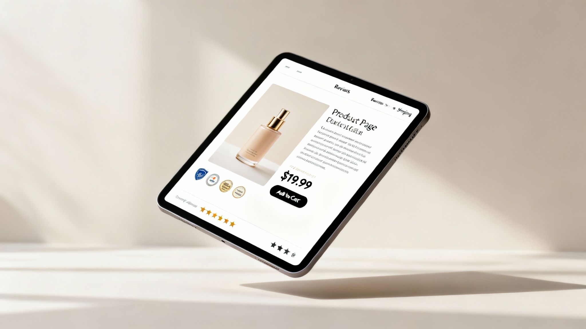
Optimizing Product Pages and Pricing for Quick Wins
You’ve found the leaks in your funnel. Now what? It’s time to hunt for the highest-impact changes you can make this week. Nine times out of ten, your product detail pages (PDPs) are the best place to start.
This is where a casual browser decides whether they're interested enough to click "Add to Cart." Small tweaks here can deliver an immediate lift.
The anatomy of a high-converting product page goes far beyond just having good photos. It’s about anticipating a customer's questions and answering them preemptively with compelling copy, clear visuals, and undeniable social proof. Every element has to work together to build confidence and kill hesitation.

This isn’t about a complete redesign. We're talking about surgical improvements designed to make the buying decision a no-brainer. Focus on clarity, trust, and communicating value.
Crafting Compelling Product Descriptions
So many brands make the mistake of writing product descriptions that just list features. A high-converting description, on the other hand, translates those features into tangible benefits and real-life outcomes for the customer.
People don't buy a product; they buy a solution to a problem or a better version of themselves.
Instead of writing "100% organic cotton," try "Breathe easier in fabric that’s softer on your skin." The second version helps the shopper imagine the experience, making the value feel real.
Your goal is to make your copy effortless to scan. Try these tactics:
- Use Bullet Points: Break up dense paragraphs by highlighting the top 3-5 benefits in a scannable list.
- Incorporate Icons: Pair text with simple icons to explain key features like "Machine Washable" or "Free Returns." This reduces the mental effort needed to understand the perks.
- Speak Their Language: Use the same words and phrases your actual customers use in reviews and feedback. This builds an instant connection.
Leveraging Social Proof and Visuals
In e-commerce, confidence is often the final barrier to a sale. Since customers can't physically touch your product, you need to use visuals and social proof to fill that sensory gap.
High-resolution images from multiple angles are non-negotiable, but you can take it so much further.
Include photos and videos that show the product in a real-world context. For clothing, show it on different body types. For a piece of cookware, show it sizzling on a stovetop. This helps shoppers mentally "test drive" the product, which is a powerful psychological trigger.
Key Takeaway: Social proof isn't just about star ratings. It's about showing relevant, outcome-driven feedback from people your target customer can relate to. Displaying reviews that mention a specific problem your product solves is far more powerful than a generic five-star rating.
Displaying user-generated content (UGC) like customer photos or videos is another great way to build trust. It feels more authentic and relatable than polished brand photography, answering the crucial question: "Will this work for someone like me?"
Strategic Pricing and Perceived Value
Your pricing strategy directly influences your conversion rate. Sure, deep discounts can drive sales, but they can also wreck your margins and cheapen your brand. A smarter approach is to use psychological pricing tactics to increase the perceived value of your offer.
Charm pricing, the classic move of ending prices in .99 or .97, is still around for a reason—it works. The brain tends to round down, making $29.99 feel significantly cheaper than $30.00.
Another powerful tactic is creating product bundles. Offering a "Frequently Bought Together" package not only increases your Average Order Value (AOV) but can also make the overall purchase feel like a better deal. For example, bundling a camera with a memory card and a case at a slight discount is more appealing than selling each item separately. Of course, setting the right price from the start is fundamental, and our guide on how to determine the price of a product provides a detailed framework for this process.
Finally, be transparent about all costs. One of the top reasons for cart abandonment is unexpected shipping fees. Clearly communicate your shipping information—costs, timelines, and policies—directly on the product page. A simple banner that says "Free Shipping on Orders Over $50" can be enough to remove a major point of friction and push a hesitant shopper over the edge.
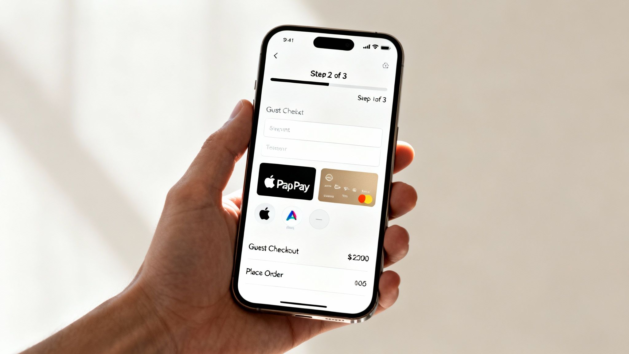
Streamlining Checkout to Reduce Cart Abandonment
You've done the hard work. You’ve diagnosed your funnel, optimized your product pages, and persuaded a shopper to click "Add to Cart." This is the moment of truth, but it’s also where an astonishing number of sales completely fall apart. The checkout process is the final boss of ecommerce, and even the slightest friction can send your customers running for the hills.
Checkout friction is the silent killer of sales. This is where you transform high-intent shoppers into paying customers—or lose them forever. Across major markets, the average cart abandonment rate is a staggering 71.3%, and that number climbs to 77.2% on mobile devices. In simple terms, this means only about one in four shoppers who add an item to their cart will actually complete the purchase.
Think about that. Recovering even a fraction of those abandoned carts is one of the most cost-effective ways to immediately boost your revenue.
Eliminate Surprise Costs and Mandatory Accounts
The two biggest conversion killers in any checkout flow are unexpected shipping costs and forced account creation. A shopper might be perfectly happy with a $50 product price, but an unexpected $8.99 shipping fee at the final step feels like a betrayal. This last-minute surprise shatters trust and is the number one reason people abandon their carts.
The solution is radical transparency. Display shipping costs, taxes, and any other fees upfront, ideally on the product page or in the cart itself. No surprises.
Similarly, demanding that users create an account before they can give you their money introduces unnecessary friction. People are protective of their data and wary of signing up for yet another marketing list. Forcing them to create a password is a major roadblock.
Key Takeaway: Always offer a guest checkout option. Make it the most prominent, easiest path forward. You can always invite customers to create an account on the "thank you" page after the sale is complete, when they are feeling positive about their purchase.
Design a Visually Simple and Trustworthy Path
A cluttered, confusing checkout page breeds anxiety. Your goal is to create a clean, linear path to purchase that feels secure and effortless. Each field and button should have a clear purpose.
Here’s how to build that trust and clarity:
- Visual Progress Bar: Show shoppers exactly where they are in the process (e.g., Shipping > Payment > Review). This manages expectations and reduces the feeling of being trapped in an endless series of forms.
- Trust Badges: Prominently display security seals (SSL certificates) and accepted payment logos (Visa, Mastercard, PayPal). These visual cues reassure customers that their financial information is safe.
- Mobile-First Design: Your checkout must be flawless on a small screen. Use large form fields, clear buttons, and avoid anything that requires pinching or zooming.
One of the best ways to improve your entire site experience is by exploring our detailed guide on how to improve conversion rates for ecommerce from top to bottom.
Offer Modern Payment Options and Reduce Keystrokes
The less a customer has to type, the more likely they are to convert. Every keystroke is an opportunity for a typo or a moment of frustration. Modern payment solutions are designed to eliminate this manual entry.
Integrating digital wallets is no longer a "nice-to-have"; it's essential for a competitive checkout experience.
- Apple Pay & Google Pay: These options allow mobile users to complete a purchase with a fingerprint or face scan, pulling their saved shipping and payment details automatically.
- PayPal & Shop Pay: These services provide a familiar, trusted one-click payment experience for millions of online shoppers, letting them bypass manual form filling.
By streamlining these final steps, you remove the last hurdles between your customer and a completed sale. This isn't just about good design—it's about respecting your customer's time and making it as easy as possible for them to buy from you.
Using Personalization to Increase Average Order Value
Getting your conversion rate up is a massive win, but it’s only half the battle. The real magic happens when you start increasing the value of each one of those conversions. Think about it: a 10% lift in your Average Order Value (AOV) can hit your bottom line just as hard as a 10% lift in your conversion rate, often with a lot less heavy lifting.
This is where smart personalization really shines. It's about moving beyond those generic, annoying pop-ups and creating a shopping experience that actually feels helpful to each user. The goal isn’t to be pushy; it’s to figure out what a customer needs and offer a solution at the exact right moment.
When you get this right, you don’t just boost AOV. You make shoppers feel seen and understood, which is exactly what builds loyalty.
Implementing Strategic Cross-Sells and Upsells
Cross-selling and upselling are easily two of the most powerful tools for pumping up AOV, but they only work if they’re relevant. An irrelevant offer feels cheap and desperate, while a relevant one feels like a genuinely helpful recommendation from a friend.
- Cross-selling is all about offering complementary items that make the original purchase even better. This is your classic "Frequently Bought Together" section.
- Upselling is about nudging a customer toward a more premium version of the item they’re already looking at.
The trick is to place these offers where they feel natural in the customer’s journey. A product page is a prime spot for a cross-sell. If someone is looking at a new digital camera, it just makes sense to show them a bundle with a memory card and a carrying case. It’s an intuitive, helpful suggestion.
Key Takeaway: The best upsells and cross-sells solve a problem the customer might not have even considered yet. They should feel like an organic part of the shopping experience, not an interruption.
The cart is another high-impact place for these offers. Once a customer has decided to buy something, they’re in a different mindset. That's the perfect time to present a low-cost, high-value add-on. For a skincare brand, this could be a travel-sized version of a popular serum for $5 at checkout. It's an easy "yes" that adds a little extra to the order total.
Leveraging AI for Hyper-Relevant Recommendations
Let's be real—you can't manually create custom product recommendations for every single person who visits your site. It’s just not possible. That’s why AI-driven personalization tools are such a game-changer. These platforms analyze a user's real-time behavior—what they’re clicking on, searching for, and have bought before—to serve up product suggestions that are almost spookily relevant.
This is worlds away from a generic "You May Also Like" carousel. A modern personalization engine can:
- Analyze Purchase Patterns: It can spot which products are most often bought together by thousands of other customers and create data-backed bundles on the fly.
- Understand Context: The AI can recognize when someone is shopping for a specific occasion, like a holiday, and recommend items that fit the theme.
- Personalize On-Site Banners: Homepage banners and promo content can dynamically change to match a user's browsing history or known preferences.
For example, if a customer has only ever purchased vegan-friendly products from your store, the AI can make sure that all future recommendations and promotions they see are also vegan. That level of detail makes the entire experience feel effortless and tailored, which not only builds loyalty but also encourages bigger carts. It's a win-win.
Building a System for Continuous A/B Testing
You’ve tightened up your product pages, simplified the checkout process, and even added some personalization. Great. But if you think the work is done, you're missing the point. Conversion optimization isn't a one-and-done project; it’s a constant cycle of improvement.
The most successful brands I’ve worked with treat CRO as a core business function, not just a task to check off a list. They build a system for constant learning and iteration. This is where A/B testing, or split testing, becomes your best friend. It’s the engine that turns your optimization efforts from educated guesses into a scientific process. By showing two different versions of a page to different segments of your audience, you can definitively measure which one actually makes you more money.
From Data to a Strong Hypothesis
Good A/B testing doesn’t start with random ideas like "let's change the button color." It begins with a solid, data-backed hypothesis you uncovered during your initial funnel diagnosis. Random tests get random results.
A proper hypothesis follows a simple but powerful structure: "If I [make this specific change], then [this specific outcome will happen], because [this is the data-driven reason why]."
For instance, let's say your session recordings show users hesitating on a product page. They scroll up and down, almost like they're looking for something, before eventually adding to their cart—or worse, leaving. This observation is your starting point.
Hypothesis Example: "If we move the customer reviews section higher on the product page, directly below the hero image, then the add-to-cart rate will increase by 5%, because our session recordings show users are actively hunting for social proof before making a decision."
See how that works? It connects a proposed solution directly to an observed problem and sets a clear, measurable goal. No guesswork involved.
Prioritizing Your Tests for Maximum Impact
Once you start looking for opportunities, you'll quickly build a long list of potential tests. To avoid getting bogged down, you need a way to prioritize. A simple framework like PIE (Potential, Importance, and Ease) works wonders.
Just score each test idea from 1 to 10 across these three categories:
- Potential: How much of an improvement do you realistically expect this change to make? A small copy tweak or a complete page redesign?
- Importance: How valuable is the traffic to this page? A test on your checkout page is way more important than one on your "About Us" page.
- Ease: How quickly and easily can your team implement this test? Is it a 30-minute fix or a multi-week development project?
Multiply the scores to get a final priority number. Tackle the tests with the highest scores first. This ensures you’re always working on changes that can deliver the biggest wins with the least amount of friction. If you want to get even more structured, you can dig into other conversion rate optimization best practices.
Choosing Your Tools and Measuring Success
You don't need a massive budget to get started with A/B testing. For those just dipping their toes in, tools like Google Optimize (now part of Google Analytics 4) offer a free and pretty accessible entry point. As you get more serious and your needs grow, you might look into more advanced platforms like VWO or Optimizely.
Once your test is live, the key is patience. Let it run long enough to collect enough data to reach statistical significance—you’re usually aiming for a 95% confidence level. This is critical. It’s what proves your results aren't just a random fluke.
When you have a clear winner, roll out the change and—this is important—document what you learned. Even a failed test is a win because it gives you valuable insight into what doesn't work for your audience. This cycle of hypothesizing, testing, analyzing, and iterating is what turns a good store into a great one. It becomes a conversion machine that’s always getting smarter.
Answering Your Top Ecommerce CRO Questions
As you start putting these CRO tactics into play, you're bound to run into a few questions. It happens to everyone. This section tackles the most common hurdles ecommerce managers face, giving you direct answers so you can reinforce your strategy and keep moving forward with confidence.
What Is a Good Ecommerce Conversion Rate?
Everyone wants to know "the number," but a "good" conversion rate is always relative. If you need a benchmark, the industry average usually lands somewhere between 2% and 4%. The top-tier stores, however, can hit 5-8% or even higher.
Honestly, the most important benchmark is your own. Your goal should be steady, incremental improvements over what you did last month or last quarter, not chasing some universal number.
Also, remember that mobile conversion rates are often about half of what you see on desktop. Always segment your data by device, or you'll be looking at a misleading average.
How Do Product Pages Impact Conversions?
Your product pages are where the magic happens—or doesn't. This is the make-or-break moment where a casual browser decides whether to become a buyer. These pages directly influence your ability to close the deal by building confidence when it matters most.
To get them right, you need to focus on a few key things:
- Use high-quality visuals. Think multiple angles, in-context shots, and maybe even a short video. You have to replace the hands-on experience of a physical store.
- Showcase authentic customer reviews. Nothing builds trust faster than social proof from real people who have already bought and loved your product.
- Write benefit-driven descriptions. Don't just list features. Answer the customer's real question: "What's in it for me?"
What Are the Easiest Ways to Boost Purchase Intent?
If you're looking for quick wins, they almost always come from reducing friction and dialing up the trust signals. Tiny changes here can have a surprisingly big impact on your bottom line.
Adding trust signals like free shipping offers, money-back guarantees, and security logos right next to your "Add to Cart" button can immediately squash hesitation and make people feel better about clicking.
Simplifying your checkout is another huge lever you can pull. Things like offering a guest checkout option or integrating one-click digital wallets like Apple Pay remove the biggest roadblocks that lead to abandoned carts. You’re just making it easier for customers to give you their money.
Ready to turn your traffic into real, measurable growth? At Next Point Digital, we build data-driven strategies that optimize your entire sales funnel, from product pages to checkout. Let's unlock your store's full potential.